Main Body
Chapter 1. Introduction to Economics
1.1 Introduction to the Study of Economics
1.1.1 Economics is Important and Interesting!
The Economics of food and agriculture is important and interesting! Food and agricultural markets are in the news and on social media every day. Numerous fascinating and complex issues are the subject of this course: food prices, food safety, diet and nutrition, agricultural policy, globalization, immigration, agricultural labor markets, obesity, use of antibiotics and hormones in meat production, hog confinement, and many more. As we work through the course material this semester, please find examples of the economics of food and agriculture in the news. Application of economic principles to food and agricultural issues in real time will enhance the relevance, timeliness, and importance of learning economics.
1.1.2 Scarcity
Economics can be defined as, “the study of choice.” The concept of scarcity is the foundation of economics. Scarcity reflects the human condition: fixed resources and unlimited wants, needs, and desires.
Scarcity = Unlimited wants and needs, together with fixed resources.
Since we have unlimited desires, and only a fixed amount of resources available to meet those desires, we can’t have everything that we want. Thus, scarcity forces us to choose: we can’t have everything. Since scarcity forces us to choose, and economics is the study of choice, scarcity is the fundamental concept of all economics. If there were no scarcity, there would be no need to choose between alternatives, and no economics!
1.1.3 Microeconomics and Macroeconomics
The subject of economics is divided into two major categories: microeconomics and macroeconomics.
Microeconomics = The study of individual decision-making units, such as firms and households.
Macroeconomics = The study of economy-wide aggregates, such as inflation, unemployment, economic growth, and international trade.
This course studies microeconomics, the investigation of firm and household decision making. Our basic assumption is that firms desire to maximize profits, and households seek to maximize utility, also called satisfaction.
1.1.4 Economic Models and Theories
The real world is enormously complex. Think of how complicated your daily life is: just waking up and getting ready for class has a huge number of possible complications! Since our world is complicated, we must simplify the real world to understand it. A Model is a simplified representation of the world, not intended to be realistic.
Model = A theoretical construct, or representation of a system using symbols, such as a flow chart, schematic, or equation.
We frequently use models in physical sciences such as biology, chemistry, and physics. Think of the model of an atom, with the atomic particles: neutron, proton, and electrons. No one has ever seen an atom, but there is significant evidence for this model. It is easy to be critical of economic models, since we are in many cases more familiar with economic events than scientific observations. When we simplify supply and demand into a model, we can think of many oversimplifications and limitations of the theory… the real world is complicated. However, this is how all science works: we must simplify the complex real world in order to understand it.
1.1.4.1 The Scientific Method
Our economic models are built and used following the Scientific Method.
Scientific Method = A body of techniques for investigating phenomena, acquiring new knowledge, or correcting and integrating previous knowledge.
The major characteristic of the scientific method is to use measurable evidence to support or detract from a given model or theory. Following this method, economists will keep a theory as long as evidence backs it up. If the evidence does not support the model, the theory will be modified or replaced. Science, or knowledge, advances in this imperfect manner. To repeat, “We have to simplify the real world in order to understand it.” Science is limited, and the human condition continues to be one of imperfect knowledge, finite lives, and an enduring search for solutions to poverty, pain, and suffering.
1.1.5 Positive Economics and Normative Economics
As social scientists, economists seek to be unbiased and objective in their study of the world. Economists have developed two terms to separate factual statements from value judgments, or opinions.
Positive Economics = Statements that include only factual information, with no value judgments. “What is.”
Normative Economics = Statements that include value judgments, or opinions. “What ought to be.”
In our study of food and agriculture, we will strive to purge our discussions, analysis, and understanding from opinions and value judgments. Our background and experience can make this challenging. For example, a corn producer might say, “The price of corn is higher, which is a good thing.” But, the buyer of the corn, a livestock feedlot operator, might see things differently. All price changes have winners and losers, so economists try to avoid describing price movements in terms of “good” or “bad.”
Economists who study food and agriculture seek to be neutral, unbiased, and professional in their work. This can be challenging at times, when we present our finding and observations to individuals or groups who may not like the outcomes. For example, an economist might be asked to study organic, natural, or local foods and report eh results to farmers and ranchers of conventional food products. Economists could be asked to study and report Chipotle’s impact on the demand for beef, or the profit margins on cage-free eggs. Although some individuals may not like the results of these studies, economists try to be unbiased and objective in reporting their scientific work.
1.2 Supply and Demand
The study of markets is a powerful, informative, and useful method for understanding the world around us, and interpreting economic events. The use of supply and demand allows us to understand how the world works, how changes in economic conditions affect prices and production, and how government policies and programs affect prices, producers, and consumers. A huge number of diverse and interesting issues can be usefully analyzed using supply and demand.
1.2.1 Supply
The Supply of a good represents the behavior of firms, or producers. Supply refers to how much of a good will be produced at a given price.
Supply = The relationship between the price of a good and quantity supplied, ceteris paribus.
Notice the important term, “ceteris paribus” at the end of the definition of supply. Recall the complexity of the real world, and how economists must simplify the world to understand it. Use of the concept, ceteris paribus, allows us to understand the supply of a good. In the real world, there are numerous forces affecting the supply of a good: weather, prices, input prices, just to name a few.
Ceteris Paribus = Holding all else constant (Latin).
When studying supply, we seek to isolate the relationship between the price and quantity supplied of a good. We must hold everything else constant (ceteris paribus) to make sure that the other supply determinants are not causing changes in supply. An example is the supply of organic cotton. Patagonia spearheaded the movement into using organic cotton in the production of clothing. Nike and other clothing manufacturers are increasing organic clothing production to meet the growing demand for this good. Interestingly, conventional (non-organic) cotton is the most chemical-intensive field crop, and can result in agricultural chemical runoff in the soil and groundwater. A small but convicted group of consumers are willing to pay high premiums for clothing made with organic cotton, to reduce the potential environmental damage from agricultural chemicals used in cotton production. Notice that this graph has two items on each axis: (1) a label, and (2) units. Every graph drawn must have both labels and units on each axis to effectively communicate what the graph is about.
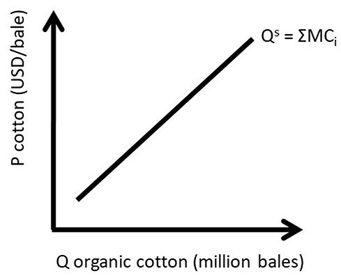
Figure 1.1 Market Supply Curve of Organic Cotton
The supply curve seen in Figure 1.1 is a market supply curve, as it represents the entire market of organic cotton (note that cotton is sold in bales). The market supply curve was derived by horizontal summation all of the individual firm supply curves. This is indicated by the notation Qs = ΣMCi in Figure 1.1. The individual firm supply curve is the firm’s marginal cost curve (MC) for all prices above the shut down point, and equal to zero for all prices below the shut down point. The shut down point is the minimum point on the firm’s average variable cost curve (AVC), as shown in Figure 1.2
Since the market supply curve is the sum of all of the individual firms’ marginal cost curves (ΣMCi), the market supply curve represents the cost of production: the total amount that a business firm must pay to produce a given quantity of a good.
There are three properties of a market supply curve.
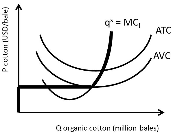
Figure 1.2 Individual Firm Supply Curve of Organic Cotton
1.2.1.1 Properties of Supply
1. Upward-sloping: if price increases, quantity supplied increases,
2. Qs = f(P), and
3. Ceteris Paribus, Latin for “holding all else constant.”
The first property reflects the Law of Supply, which states that there is a direct relationship between price and quantity supplied.
Law of Supply = There is a direct, positive relationship between the price of a good and the quantity supplied, ceteris paribus.
The second property demonstrates that price (P) is the independent variable, and quantity supplied (Qs) is the dependent variable. Graphs of supply and demand are drawn “backward” with the independent variable (P) on the vertical axis. In all other fields of mathematics and science, when a function such as y=f(x) is graphed, the independent variable (x) appears on the horizontal axis, and the dependent variable (y) is drawn on the vertical axis. Supply and demand graphs are drawn, “backwards” due to economist Alfred Marshall, who drew the original supply and demand graphs this way in his Principles of Economics book in 1890. The third property reflects the need to simplify all of the determinants of supply to isolate the relationship between price and quantity supplied, using the ceteris paribus assumption.
1.2.1.2 The Determinants of Supply
There are numerous determinants of supply, so we will focus on five important ones. The most important supply determinant, or driver, is price (P). Other determinants include input prices (Pi), the prices of related goods (Pr), technology (T), and government taxes and subsidies (G).
(1.1) Qs = f(P, Pi, Pr, T, G)
To draw a supply curve, we focus on the most important determinant of supply: the good’s own price. We hold all of the other determinants constant. To show this in equation form, we use a vertical bar to designate ceteris paribus: all variables that appear to the right of the vertical bar are held constant. Equation 1.2 shows the relationship between quantity supplied and price, holding all else constant. This relationship is the market supply curve in Figure 1.1 and in supply and demand graphs.
(1.2) Qs = f(P| Pi, Pr, T, G)
Input prices (Pi) are important determinants of supply, since the supply curve represents the cost of production. Prices of related goods (Pr) represent prices of substitutes and complements in production. Substitutes in production are goods that are produced either/or, such as corn and soybeans. One land parcel can be used to grow either corn or soybeans. Complements in production are goods that are produced together in a fixed ratio. Beef and leather are complements in production. Technology (T) is major driver of supply, as new methods and techniques become available, they increase the amount of food produced. Technological change allows more output to be produced with the same level of inputs. Restated, the same level of output can be produced with fewer inputs. Government policies and programs (G) can shift the supply of a good through taxes or subsidies.
1.2.1.3 Movements Along vs. Shifts In Supply
The supply curve represents the mathematical relationship between the price and quantity supplied of a good. Therefore, when a good’s own price changes, it is as a movement along the supply curve. When any of the other supply curve determinants change, it will shift the entire curve.
A movement along a supply curve, caused by a change in the good’s own price, is called a change in quantity supplied (left panel, figure 1.3). A shift in the supply curve, caused by a change in any supply determinant other than the good’s own price, is called a change in supply (right panel, figure 1.3). The change in supply shown in Figure 1.3 is an increase in supply, since it increases the quantity supplied at any given price.
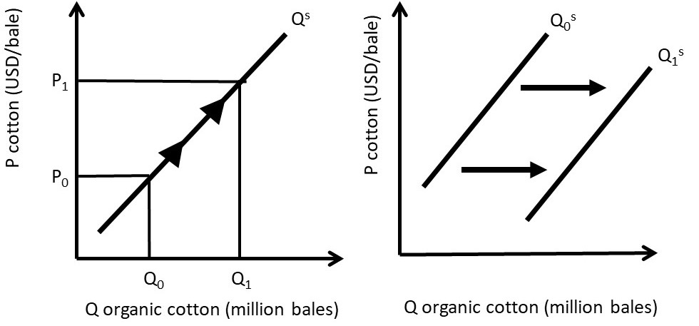
Figure 1.3 Movement Along and Shift in the Supply of Organic Cotton
Notice that the supply curve has shifted down, yet this represents an increase in supply. The supply change is measured on the horizontal axis, so a movement from left to right represents an increase in supply. The shift shown could be the impact of technological change on organic cotton supply: suppose that biotechnology allows for higher yielding varieties of organic cotton.
1.2.2 Demand
The Demand of a good represents the behavior of households, or consumers. Demand refers to how much of a good will be purchased at a given price.
Demand = The relationship between the price of a good and quantity demanded, ceteris paribus.
Figure 1.4 shows the market demand curve for beef (Qd), derived by the summation of all individual consumers demand curves (Σqi). Note that beef is measured in units of one hundred pounds, or a “hundredweight” (cwt).
Demand represents the willingness and ability of consumers to purchase a good. As with supply, there are three properties of demand.
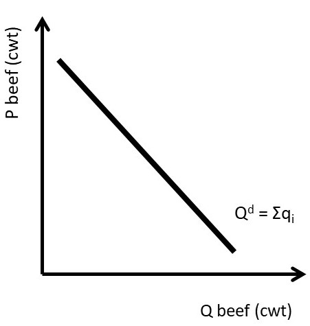
Figure 1.4 Market Demand for Beef
1.2.2.1 Properties of Demand
1. Downward-sloping: if price increases, quantity demanded decreases,
2. Qd= f(P), and
3. Ceteris Paribus, Latin for holding all else constant.
The first property reflects the Law of Demand, which states that if the price of a good increases, the quantity demanded of that good decreases, holding all else constant.
Law of Demand = There is an inverse relationship between the price of a good and the quantity supplied, ceteris paribus.
The Law of Demand is one of the major “take home messages” of economic principles. Price increases lead to smaller quantities of goods purchased. The Law of Demand does not say that all consumers will stop buying a good, it says that at least some consumers will decrease consumption of the good. The magnitude of the decrease will depend on the price elasticity of demand for the good, as will be discussed in Section 1.4 below.
1.2.2.2 The Determinants of Demand
There are numerous demand shifters, or determinants of demand. Six of the most important determinants are included in the demand equation in Equation 1.3. The good’s own price (P) is the most important determinant. Demand is also influenced by: the price of related goods (Pr), futures prices (Pf), income (I), tastes and preferences (T), and government programs and policies (G).
(1.3) Qd = f(P, Pr, Pf, I, T, G)
Related goods include substitutes and complements in consumption. Substitutes in consumption are goods that are purchased either/or, such as hot dogs and hamburgers. If the price of hot dogs increases, at least some consumers will shift out of hot dogs and into hamburgers. Complements in consumption are goods that are consumed together, for example hot dogs and hot dog buns. If the price of hot dogs increases, consumers will purchased fewer hot dogs and fewer buns.
Expectations of future prices (Pf) have a large influence on consumption decisions today. If the price of corn was expected to increase in the future, corn demand would increase today, as corn buyers would seek to buy prior to the price increase. This would allow traders to “buy low and sell high,” providing profit from arbitrage across time.
Income (I) can have a large impact on purchase decisions. Cars, houses, and other expensive items will be affected by changes in income. Inexpensive items such as used clothes or ramen noodles are also influenced greatly by income changes. During the great recession of 2008-2010, Walmart had high profit levels, while boat manufacturers and country clubs lost profits due to significant decreases in income.
Tastes and preferences (T) shift the demand for goods and services based on the diverse wants, needs, and desires of consumers in the market. Taxes and subsidies, as well as other government programs, policies, and regulations (G) influence demand, sometimes significantly. Government programs and policies will be explored in Sections 1.4 through 1.6, and in Chapter 2 below.
To draw a demand curve, the most important determinant of demand is isolated: the good’s own price. We hold all of the other determinants constant, ceteris paribus.
(1.4) Qd = f(P | Pr, Pf, I, T, G)
1.2.2.3 Movements Along vs. Shifts In Demand
The demand curve represents the mathematical relationship between the price and quantity demanded of a good. Therefore, when a good’s own price changes, it is depicted as a movement along the demand curve. When any of the other demand curve determinants change, it will shift the entire curve.
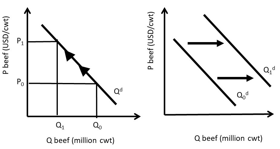
Figure 1.5 Movement Along and Shift in the Demand for Beef
As with supply, if the good’s own price changes, it results in a movement along the demand curve, called a change in quantity demanded. If any other demand determinant changes, it causes a shift in demand, called a change in demand. The shift shown in the right panel of Figure 1.5 is an increase in demand, since the demand curve has shifted upward and to the right.
Supply and demand form the foundation for the study of markets. Markets are defined as the interaction of supply and demand. Market analysis is the core concept and foundation of all of economics, and will be explored in the next section.
1.3 Markets: Supply and Demand
In the previous section, supply and demand were introduced and explored separately. In what follows, the interaction of supply and demand will be presented. The market mechanism is a useful and powerful analytical tool. The market model can be used to explain and forecast movements in prices and quantities of goods and services. The market impacts of current events, government programs and policies, and technological changes can all be evaluated and understood using supply and demand analysis. Markets are the foundation of all economics!
A market equilibrium can be found at the intersection of supply and demand curves, as illustrated for the wheat market in Figure 1.6. An equilibrium is defined as, “a point from which there is no tendency to change.” Wheat is traded in units of metric tons (MT), or 1000 kilograms, equal to approximately 2,204.6 pounds.
Equilibrium = a point from which there is no tendency to change.
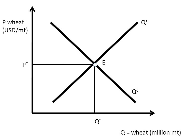
Figure 1.6 Wheat Market
Point E is the only equilibrium in the wheat market shown in Figure 1.6. At any other price, market forces would come into play, and bring the price back to the equilibrium market price, P*. At any price higher than P*, such as P’ in Figure 1.7, producers would increase the quantity supplied to Q1 million metric tons of wheat, and consumers would decrease the quantity demanded to Q0 million metric tons of wheat. A surplus would result, since quantity supplied is greater than quantity demanded (Q1 > Q0).
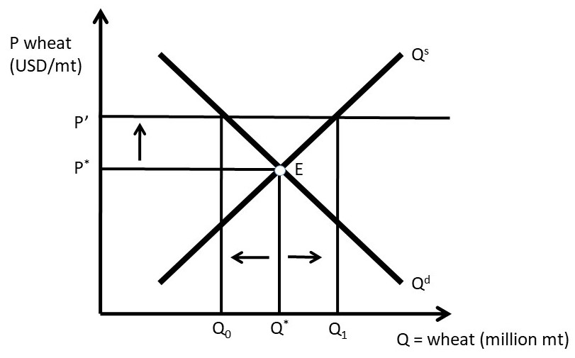
Figure 1.7 Wheat Market Surplus
A wheat surplus such as the one shown in Figure 1.7 would bring market forces into play since Qs ≠ Qd. Wheat producers would lower the price of wheat in order to sell it. It would be preferable to earn a lower price than to let the surplus go unsold. Consumers would increase the quantity demanded along Qd and producers decrease the quantity supplied along Qs until the equilibrium point E was reached. In this way, any price higher than the market equilibrium price will be temporary, as the resulting surplus will bring the price back down to the equilibrium price P*.
Market forces also come into play at prices lower than the equilibrium market price, as shown in Figure 1.8. At the lower price P’’, producers reduce the quantity supplied along Qs to Q0, and consumers increase the quantity demanded to Q1. A shortage occurs, since the quantity demanded is greater than the quantity supplied Q1 > Q2. The shortage will bring market forces into play, as consumers will bid up the price in order to purchase more wheat and producers will produce more wheat along Qs. This process will continue until the market price returns to the equilibrium market price, P*.
The market mechanism that results in an equilibrium price and quantity performs a truly amazing function in the economy. Markets are self-regulating, since no government intervention or coercion is needed to achieve desirable outcomes. If there is a drought, the price of wheat will rise, causing more resources to be devoted to wheat production, which is desirable, since wheat is in short supply during a drought. If good weather causes a surplus, the price will fall, causing wheat producers to shift resources out of wheat and into more profitable opportunities. In this fashion, the market mechanism allows voluntary trades between willing parties to allocate resources to the highest return. Efficiency of resource use and high incomes are a feature of market-based economies.
Although markets provide huge benefits to society, not everyone wins from free market economies, and market changes over time. Price increases help producers, but hurt consumers. Technological change has provided lowered food prices enormously over time, but has led to farm and ranch consolidation, and the large migration of farmers and their families out of rural regions and into urban areas.
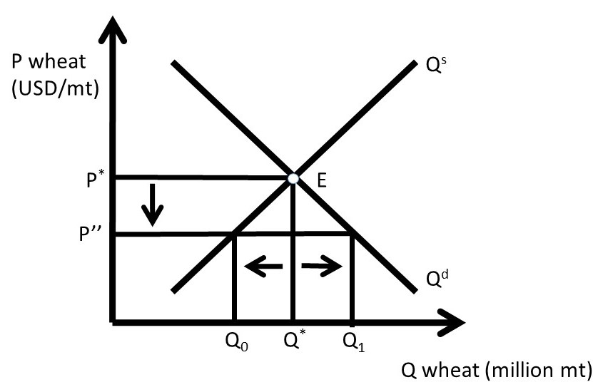
Figure 1.8 Wheat Market Shortage
The market graphs of supply and demand are based on the assumption of perfectly competitive markets. Perfect competition is an ideal state, different from actual market conditions in the real world. Once again, economists simplify the complex real world in order to understand it. We will begin with the extreme pure case of perfect competition, and later introduce realism into our analysis.
1.3.1 Competitive Market Properties
A competitive market has four properties:
1. homogeneous product,
2. numerous buyers and sellers,
3. freedom of entry and exit, and
4. perfect information.
The first property of perfect competition is a homogeneous product. This means that the consumer can not distinguish any differences in the good, no matter which firm produced it. Wheat is an example, as it is not possible to determine which farmer produced the wheat. A John Deere tractor is an example of a nonhomogeneous good, since the brand is displayed on the machine, not to mention the company’s well known green paint and deer logo.
The assumption of numerous buyers and sellers means something specific. The word, “numerous” refers to an industry so large that each individual firm can not affect the price. Each firm is so small relative to the industry that it is a price taker.
Freedom of entry and exit means that there are no legal, financial, or regulatory barriers to entering the market. A wheat market allows anyone to produce and sell wheat. Attorneys and physicians, however, do not have freedom of entry. To practice law or medicine, a license is required.
Perfect information is an assumption about industries where all firms have access to information about all input and output prices, and all technologies. There are no trade secrets or patented technologies in a perfectly competitive industry. These four properties of perfect competition are stringent, and do not reflect real-world industries and markets. Our study of market structures in this course will examine each of these properties, and use them to define industries where these properties do not hold. Competitive markets have a number of attractive properties.
1.3.2 Outcomes of Competitive Markets
Competitive markets result in desirable outcomes for economies. A competitive market maximizes social welfare, or the total amount of well-being in a market. Competitive markets use voluntary exchange, or mutually beneficial trades, to achieve this result. In a market-based economy, no one is forced, or coerced, to do anything that they do not want to do. In this way, all trades are mutually beneficial: a producer or consumer would never make a trade unless it made him or her better off. This idea will be a theme throughout this course: free markets and free trade lead to superior economic outcomes.
It should be emphasized that free markets and free trade are not perfect, since there are negative features associated with markets and capitalism. Income inequality is an example. Markets do not solve all of society’s problems, but they do create conditions for higher levels of income and wealth than other economic organizations, such as a command economy (as found in a communist or fascist nation). There are winners and losers to market changes. An example is free trade. Free trade lowers prices for consumers, but often causes hardships for producers in importing nations. Similarly, open borders allow immigrants to improve their conditions and earnings by moving from low-income nations to high-income nations such as the United States (US) or the European Union (EU). Workers in the US and the EU will face competition from a larger labor supply, causing reductions in wages and salaries. A simple example of markets is an increase in the price of corn. Corn producers are made better off, but livestock producers, the major buyers of corn, are made worse off. Thus, the market shifts that allow prosperity also create winners and losers in a free market economy.
1.3.3 Supply and Demand Shift Examples
Given our knowledge of markets and the market mechanism, current events and policies can be better understood.
1.3.3.1 Demand Increase
China was a command economy until 1986. At that time, the government introduced the Household Responsibility System, which allowed farmers to earn income based on how much agricultural output they produced. The new policy worked very well, and China moved from being a net food importer to a net food exporter. Soon, the policy was extended to all industries, and China was on its way to a market-based economy. The result has been a truly unprecedented increase in income. China has gone from a low income nation to a middle income nation, and the rates of economic growth are higher than any nation in history. And, these growth rates are for the world’s most populous nation: 1.4 billion people (for comparison, the United States (USA) has approximately 326 million people).
This historical income growth in China has been good for US farmers and ranchers. As incomes increase, consumers shift out of grain-based diets such as rice and wheat, and into meat. There has been a large increase in beef consumption in China as incomes increased. This is an increase in the demand for US beef, as shown in Figure 1.9. The units for beef are hundredweight (cwt), or one hundred pounds. This is called an increase in demand (do you remember why this is not an increase in quantity demanded?). The outward shift in demand results in a movement from equilibrium E0 to E1. The movement along the supply curve for beef is called an increase in quantity supplied. The equilibrium market price increases from P0 to P1, and the equilibrium market quantity increases from Q0 to Q1. An increase in demand results in higher prices and higher quantities. As a result, the best way to increase profitability for a firm is to increase demand.
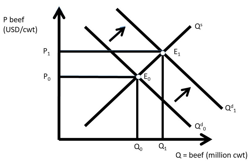
Figure 1.9 Increase in China Income Impact on US Beef Market
Interestingly, income growth in China is beneficial to not only US beef producers, who face an increased demand for beef, but also for grain farmers in the USA. The major input into the production of beef is corn, sorghum (also called milo), and soybeans. These grains are fed to cattle in feedlots. Seven pounds of grain are required to produce one pound of beef. Therefore, any increase in the global demand for beef will result in an increase in demand for beef, and a large increase in the demand for feed grains.
1.3.3.2 Demand Decrease
In the United States, the demand for beef offals (tripe, tongue, heart, liver, etc.) has decreased in the past few decades. As incomes increase, consumers shift out of these goods and into more expensive meat products such as hamburger and steaks. The demand for offals has decreased as a result, as in Figure 1.10. This is a decrease in demand (shift inward), and a decrease in quantity supplied (movement along the supply curve). The outcome is a decrease in the equilibrium market price and quantity of beef offals.
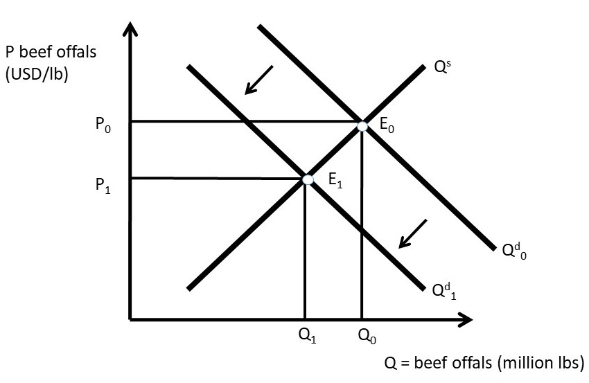
Figure 1.10 Increase in US Income Impact on US Beef Offal Market
1.3.3.3 Supply Decrease
A large share of citrus fruit in the US is grown in Florida and California. If there is bad weather in either State, the market for oranges, lemons, limes, and grapefruit is affected. An early freeze can damage the citrus fruit, resulting in a decrease in supply (Figure 1.11).
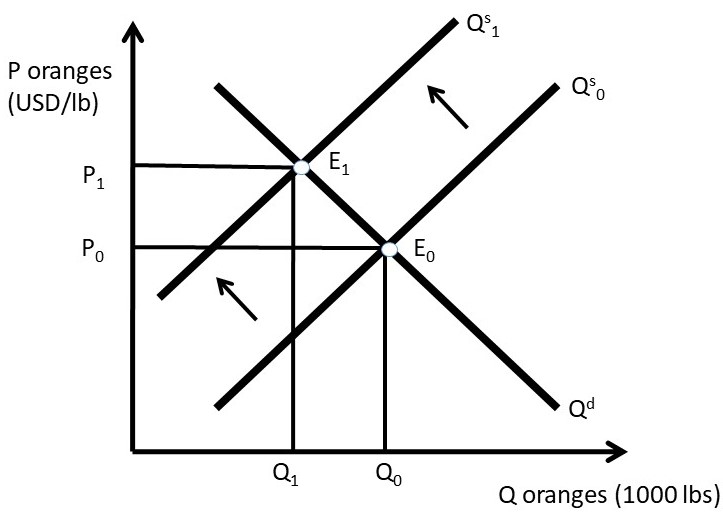
Figure 1.11 Frost Damage Impact on US Orange Market
The supply decrease is a shift in the supply curve to the left, resulting in a movement along the demand curve: a decrease in quantity demanded. The equilibrium price increases, and the equilibrium quantity decreases.
1.3.3.4 Supply Increase
Technological change is a constant in global agriculture. Science and technology has provided more output from the same levels of inputs for many decades, and especially since 1950. Biotechnology in field crops has been a recent enhancement in the world food supply. Biotechnology is also referred to as genetically modified organisms (GMOs). Although GMOs are often in the news media as a potential health risk or environmental risk, they have been produced and consumed in the US for many years, with no documented health issues. However, the herbicide glyphosate has been determined to be a carcinogen in recent studies. Glyphosate is the ingredient in “RoundUp,” a widely used herbicide in corn and soybean production. Genetically modified corn and soybeans are resistant to this herbicide, so it has been used extensively since the introduction of GM crops. Biotechnology has increased the availability of food enormously, and is considered the largest technological change in the history of agriculture. The impact of biotechnology is shown in Figure 1.12.
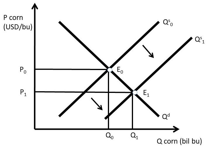
Figure 1.12 Biotechnology Impact on Corn Market
Biotechnology results in an increase in supply, the rightward shift in the supply curve. This supply shift results in a movement along the demand curve, an increase in quantity demanded. The equilibrium quantity increases, and the equilibrium price decreases. It may seem that the decrease in price is bad for corn producers. However, in a global economy, this keeps the US competitive in global grain markets. Since a large fraction of US grain crops are exported, this provides additional income to the corn industry.
1.3.4 Mathematics of Supply and Demand
The above market analyses are qualitative, or non-numerical. Numbers can be added to the supply and demand graphs to provide quantitative results. The numbers used here are simple, but can be replaced with actual estimates of supply and demand to yield important and interesting quantitative results to market events.
As an example, consider the phone market. Let the inverse demand for phones be given by Equation 1.5. The equation is called, “inverse” because the independent variable (P) appears on the left-hand side and the dependent variable (Qd) appears on the right hand side. Traditionally, the independent variable (x) is on the right, and the dependent variable (y) is on the left. We use inverse supply and demand equations for easier graphing, since P is on the vertical axis, typically used for the dependent variable (can you remember why these graphs are backwards?).
(1.5) P = 100 – 2Qd
In the inverse demand equation, P is the price of phones in USD/unit, and Q is the quantity of phones in millions. The inverse supply equation is given in Equation 1.6.
(1.6) P = 20 + 2Qs
These examples of inverse supply and demand functions are called “price-dependent” for ease of graphing. The equations can be quickly and easily inverted to “quantity-dependent” form. To do this, use simple algebra to isolate Qd or Qs on the left-hand side of the equations.
To find equilibrium, set Qs = Qd = Qe. This is the point where the market “clears,” and supply is equal to demand. By inspection of the market graph (Figure 1.13), there is only one price where this can occur: the equilibrium price: Pe.
P = 100 – 2Qe = 20 + 2Qe
80 = 4Qe
Qe = 20
To find the equilibrium price, plug Qe into the inverse demand equation:
Pe = 100 – 2Qe = 100 – 2*20 = 100 – 40 = 60.
This result can be checked by plugging Qe = 20 into the inverse supply equation:
Pe = 20 + 2Qe = 20 + 2*20 = 20 + 40 = 60
The equilibrium price and quantity of phones are:
Pe = USD 60/phones, and Qe = 20 million phones.
Notice that these equilibrium values have both labels (phones) and units.
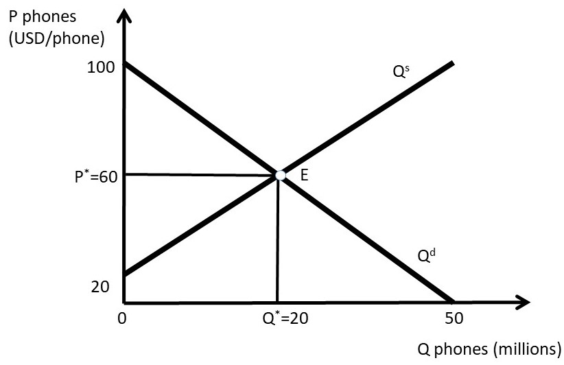
Figure 1.13 Phone Market Equilibrium
We will be using quantitative market analysis throughout the rest of the course. If you have any questions about how to graph the functions, or how to solve for equilibrium price and quantity, be sure to review the material in this chapter carefully. We will be using these graphs throughout our study of market structures!
1.4 Elasticities
1.4.1 Introduction to Elasticities
An elasticity is a measure of responsiveness.
Elasticity = How responsive one variable is to a change in another variable.
An elasticity (E), or responsiveness, is measured by the percentage change of each variable. The change in a variable is the ending value (X1) minus the initial value (X0), or ΔX = X1 – X0. A percentage change in a variable is defined as the change in the variable divided by the initial value of the variable: %ΔX = ΔX/X0. Using this formula, Equation 1.7 shows the responsiveness of Y to a change in X:
(1.7) E = %ΔY/%ΔX = (ΔY/Y)/(ΔX/X) = (ΔY/ΔX)(X/Y).
Elasticities can be calculated for any two variables. Elasticities are widely used in economics to measure how responsive producers and consumers are to changes in prices, income, and other economic variables. Elasticities have a very desirable property: they do not have units. Since the two variables are measured in percentage changes, the units of each variable are cancelled, and the resulting elasticity has no units. This allows elasticities to be compared to each other, when prices and quantities cannot be directly compared. For example, the quantity of apples cannot be directly compared to the quantity of orange juice, since they are in different units. However, the elasticities of oranges and apples can be compared directly, since there are no units for elasticities.
1.4.2 Own Price Elasticity of Demand: Ed
The own-price elasticity of demand (most often called simply the “price elasticity of demand” or the “elasticity of demand”) measures the responsiveness of consumers to a change in price, as shown in Equation 1.8:
(1.8) Ed = %ΔQd/%ΔP = (ΔQd/ΔP)(P/Qd).
Own Price Elasticity of Demand = the percentage change in quantity demanded given a one percent change in the good’s own price, ceteris paribus.
The own-price elasticity of demand is the most important thing that a business firm can know. The price elasticity informs the business about how a change in price will affect the quantity demanded. If consumers are responsive to price changes, the firm may think twice before raising the price and losing customers to the competition. On the other hand, if consumers are relatively unresponsive to price changes, the firm may increase the price, and most customers will continue to purchase the good at the higher price. Food is an example of an inelastic good, since we all need to eat.
The price elasticity of demand (Ed) depends on the availability of substitutes. If there are no substitutes for a good (food, toilet paper, toothpaste), the good is called, “price inelastic.” Consumers will purchase the good even at a high price. If substitutes are available, the good is considered to be “price elastic:” a higher price will cause customers to decrease consumption of the good by buying the substitute good. Green shirts are an example: if the price of green shirts is increased, consumers will shift purchases to blue shirts, or shirts of a different color.
The price elasticity of demand is the most critical aspect of a business firm, since it provides the most crucial information about customers! Knowledge of the price elasticity of demand provides information to a business firm on how consumers would react to price changes, allowing the firm to identify the profit-maximizing price to charge consumers.
1.4.2.1 Price Elasticity of Demand Example
Suppose that the price of wheat is equal to USD 4/bu of wheat, and increases to USD 6/bu. Due to the higher price, suppose that wheat millers reduce their purchases of wheat from 10 million bushels (m bu) to 8 million bushels. The price elasticity of demand for wheat can be calculated using Equation 1.9. By convention, the initial values of P and Qd are used in the elasticity calculation for the variables P and Qd.
(1.9) Ed = %ΔQd/%ΔP=(ΔQd/ΔP)(P/Qd) = (8-10 m bu)/(6-4 USD/mt)*(4 USD/bu)/(10 m bu)
Notice that the units cancel: there are (m bu) in both the numerator and denominator, and (USD/bu) also appears in both numerator and denominator. This allows the math to be greatly simplified:
Ed = (-2/2)*(4/10) = (-1)/(0.4) = -0.4
The price elasticity of demand is always negative, due to the Law of Demand. By convention, economists take the absolute value to make Ed positive. For example, in this case, Ed= – 0.4, then |Ed|= 0.4. The own price elasticity of demand provides important information about the wheat market: how responsive wheat buyers are to a change in price. To interpret the elasticity, it means that for a one percent increase in price, the quantity demanded of wheat will decrease by 0.4 percent. This is a relatively inelastic response, since the change in quantity demanded is smaller than the price change.
Elasticities are classified into three categories, based on consumer responsiveness to a one percent change in price.
Price elastic |Ed| > 1
Price inelastic |Ed| < 1
Unitary elastic |Ed| = 1
Goods that are price elastic have substitutes available, and the percentage change in quantity demanded will decrease more than the percentage increase change in price (%ΔQd > %ΔP, therefore |Ed|> 1). A price inelastic good, on the other hand, will have a smaller percentage change in quantity demanded than the percentage increase in price (%ΔQd < %ΔP, therefore |Ed|< 1). For unitary elastic goods, the percentage change in quantity demanded is equal to the percentage change in price (%ΔQd = %ΔP, therefore |Ed|= 1).
1.4.2.2 Elastic and Inelastic Demand Examples
To compare elastic and inelastic demands, think of a student who would like to purchase a pack of cigarettes during a late night study session for an exam. If the student arrives at the convenience store to find that the price of Marlboros, her usual brand, has doubled, she could switch to many other brands: Lucky Strikes, Winstons, etc. The demand for Marlboro cigarettes is price elastic (left panel, Figure 1.14). The price elasticity of demand depends on the availability of substitutes. An elastic demand will have a relatively flat slope, since a small change in price results in a relatively larger change in quantity demanded.

Figure 1.14 Price Elasticity of Demand for Marlboros and Cigarettes
On the other hand, if the convenience store increases the price of all cigarettes, the student will pay for a pack, since there are no substitutes for all cigarettes (right panel, Figure 1.14). More narrowly defined goods will have larger absolute values of own price elasticities, since there are more substitutes for narrowly defined goods. For example, apples are more price elastic than all fruit, and green shirts are more price elastic than all shirts. An inelastic good will have a steep slope, since the change in quantity demanded is small relative to the change in price.
Figure 1.15 shows a range of own price elasticities, from perfectly inelastic to perfectly elastic.
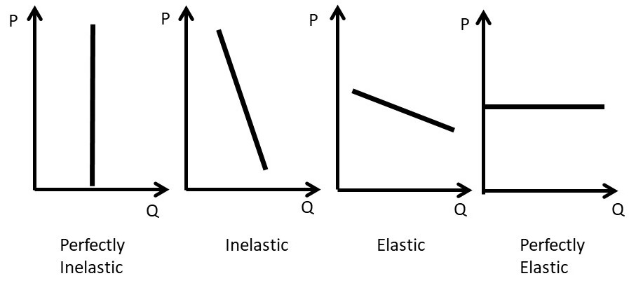
Figure 1.15 Price Elasticity of Demand
A good that is perfectly inelastic is one that consumers purchase no matter what the price is. Within a certain range of prices, this could be food or electricity. In this case, quantity demanded is completely unresponsive to changes in price: |Ed|= 0. An inelastic demand is one where the percentage change in price is larger than the percentage change in quantity demanded: %ΔQd < %ΔP, and |Ed|< 1. Goods that are price inelastic are characterized by consumers being unresponsive to price changes. Goods that are price elastic exhibit relatively high levels of consumer responsiveness to price movements. For elastic goods, the percentage change in quantity demanded is larger than the percentage change in price: %ΔQd > %ΔP, and |Ed|> 1. A perfectly elastic good is characterized by a horizontal demand curve. In this case, if the price of the good is increased even one cent, all customers decrease purchases of the good to zero. An individual wheat farmer’s crop is an example. If the farmer tries to raise the price by one cent more than the prevailing market price, no consumers would purchase her wheat. There are a large number of perfect substitutes available from other wheat farmers, so the price elasticity is infinite, and the good is called, “perfectly elastic.”
1.4.3 Own Price Elasticity of Supply: Es
Producer responsiveness to a change in price is measured with the own price elasticity of supply, often called the price elasticity of supply, or the elasticity of supply (Es). The formula for the price elasticity of supply is given in Equation 1.10:
(1.10) Es = %ΔQs/%ΔP.
Own Price Elasticity of Supply = the percentage change in quantity supplied given a one percent change in the good’s own price, ceteris paribus.
The own price elasticity of supply is always positive, because of the Law of Supply: there is a direct, positive relationship between the quantity supplied of a good and the good’s own price, ceteris paribus. Similar to the price elasticity of demand, the price elasticity of supply is categorized into three elasticity classifications.
Price elastic Es > 1
Price inelastic Es < 1
Unitary elastic Es = 1
A good with an elastic supply is one where the percentage change in quantity supplied is greater than the percentage change in price: %ΔQs > %ΔP, and Es > 1. Since Es is always positive, the absolute value is not necessary (redundant). A good with an inelastic supply has a smaller percentage change in quantity supplied, given a percent change in price: %ΔQs < %ΔP, and Es < 1. A good with unitary elasticity of supply has equal percent changes in quantity supplied and price: %ΔQs = %ΔP, and Es = 1. Figure 1.16 illustrates the different categories of the own price elasticity of supply.
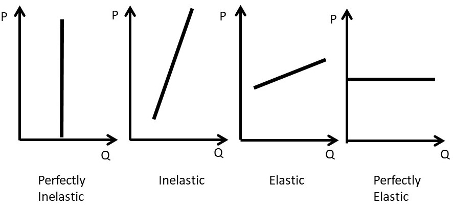
Figure 1.16 Price Elasticity of Supply
1.4.4 Income Elasticity: Ei
The income elasticity (Ei) measures how consumers of a good respond to a one percent increase in income (I), as shown in Equation 1.11:
(1.11) Ei = %ΔQd/%ΔI.
The income elasticity is defined in a similar way as the price elasticities.
Income Elasticity = the percentage change in demand given a one percent change in income, ceteris paribus.
Income elasticities are also categorized into responsiveness classifications. A normal good is one that increases with an increase in income (Ei > 0). There are two subcategories of normal goods: necessities and luxury goods. Notice that necessity goods and luxury goods are normal goods. They represent subgroups of the normal category, since Ei is positive in both cases.
Normal Good Ei > 0
Necessity Good 0 < Ei < 1
Luxury Good Ei > 1
Inferior Good Ei < 0
The graphs of the relationship between income and demand are called, “Engel Curves,” named for Ernst Engel (1821-1896), a German statistician who first investigated the impact of income on consumption.
A necessity good is a normal good that has a positive, but small, increase in demand given a one percent increase in income. Food is an example, since consumers increase the consumption of food with an increase in income, but the total amount of food consumed reaches an upper limit. This is shown in Figure 1.17, left panel.
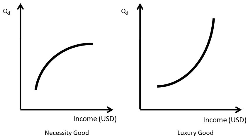
Figure 1.17 Engel Curves for Necessity Goods and Luxury Goods
A luxury good is one that has increasing demand as income increases, as shown in the right panel of Figure 1.17. Good such as boats, golf club memberships, and expensive clothing are examples of luxury goods. Inferior goods (Figure 1.18) are characterized by lower levels of consumption as income increases: ramen noodles and used clothes are examples.
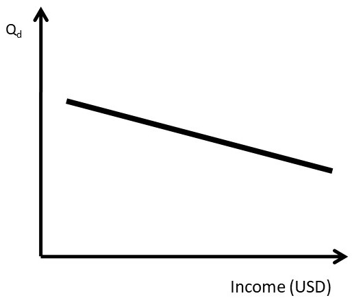
Figure 1.18 Engel Curve for an Inferior Good
It is important to point out that a good can be a normal good at low income levels, and an inferior good at higher income levels. Hamburger (ground beef) is an example. At low levels of income, hamburger consumption might increase when income rises (Figure 1.19). However, at higher levels of income, consumers might shift out of ground beef and into more expensive meats such as steak. Figure 1.19 shows that the same good can be both a normal good and an inferior good, at different levels of income.
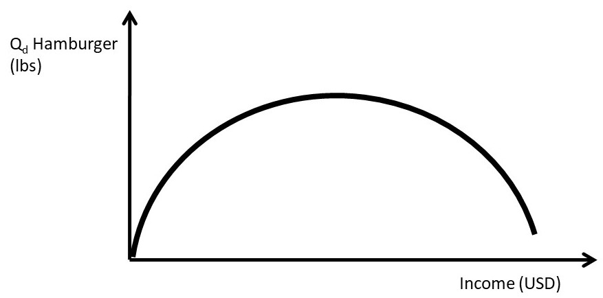
Figure 1.19 Engel Curve for Hamburger: A Necessity Good and An Inferior Good
1.4.5 Cross Price Elasticity of Demand: Edxy
The cross price elasticity of demand measures the responsiveness of demand for one good with respect to a change in the price of another good.
(1.12) Edxy = %ΔQdy/%ΔPx
Cross Price Elasticity of Demand = the percentage change in the demand of one good given a one percent change in a related good’s price, ceteris paribus.
The cross price elasticity is important for two categories of related goods: substitutes and complements in consumption. Substitutes in consumption will have a positive cross price elasticity of demand, since consumers will decrease purchases of the good that has the price increase, and buy more substitute goods. Complements in consumption are goods that are consumed together, like macaroni and cheese. If the price of macaroni increases, then consumption of both macaroni and cheese decreases.
Substitutes in Consumption Edxy = %ΔQdy/%ΔPx > 0
Complements in Consumption Edxy = %ΔQdy/%ΔPx < 0
Unrelated Goods in Consumption Edxy = %ΔQdy/%ΔPx = 0
Unrelated goods have a cross price elasticity of demand equal to zero. This is because a change in the price of a good has no effect on the quantity demanded of an unrelated good.
1.4.6 Cross Price Elasticity of Supply: Esxy
The cross price elasticity of supply captures the responsiveness of the supply of one good, given a change in the price of another good.
(1.13) Esxy = %ΔQsy/%ΔPx
Cross Price Elasticity of Supply = the percentage change in the supply of one good given a one percent change in a related good’s price, ceteris paribus.
Substitutes in production are goods that are produced “either/or,” such as corn and soybeans. The same resources (land, machinery, labor, etc.) could be used to produce either corn or soybeans, but the two crops can not be grown on the same land at the same time. The cross price elasticity of supply of substitutes in production is negative. If the price of corn increases, for example, then producers will devote more land to corn and less to soybeans.
Substitutes in Production Esxy = %ΔQsy/%ΔPx < 0
Complements in Production Esxy = %ΔQsy/%ΔPx > 0
Unrelated Goods in Production Esxy = %ΔQsy/%ΔPx = 0
Complements in production are goods that are produced together, such as beef and leather. Complements in production have a positive cross price elasticity: if the price of beef increases, both more beef and more leather will be supplied to the market. Unrelated goods in production have a cross price elasticity of supply equal to zero, since the price of an unrelated good has no impact on the demand of the other unrelated good.
1.4.7 Price Elasticities and Time
The magnitude of the price elasticity of supply measures how easy it is for the firm to adjust to price changes. In the immediate run (a short time period), the firm can not adjust the production process, so the supply is typically perfectly inelastic. In the short run, a time period when some inputs are fixed and some inputs are variable, the firm may be able to adjust some inputs, so supply is inelastic, but not perfectly inelastic. In the long run, all inputs are variable, and the firm can make adjustments to the production process. In this case, supply is elastic. As more time passes, the price elasticity of supply increases.
This relationship also holds for the price elasticity of demand. If the price of a good increases in the immediate run, there is little consumers can do other than purchase the good. Air travelers who have an emergency that they need to attend to will pay a high price of an airline ticket on the same day of the flight. As time passes, there are more options available to the consumer, and the price elasticity of demand becomes more elastic with the passage of time.
1.4.8 Elasticity of Demand along a Linear Demand Curve
Interestingly, the elasticity of demand changes along a linear demand curve. This is due to the calculation of the own price elasticity of demand as percentage change in quantity demanded caused by a percentage change in the price of the good. In Figure 1.20, the slope of the demand function is constant: it does not change over the entire demand curve.
For example, suppose that the inverse demand function is given by: P = 10 – Qd, where P is the price of the good and Qd is the quantity demanded. In this case, the vertical intercept (y-intercept) is equal to 10, and the slope is equal to negative one. It should be emphasized that, in this case, the slope is constant and equal to minus one for the entire demand curve.
The elasticity of demand, however, changes in value quite dramatically from the y-intercept to the x-intercept. It changes from a value of zero on the x-axis to a value of negative infinity on the y-axis. The cause is the calculation of percentage change.
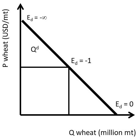
Figure 1.20 The Price Elasticity of Demand along a Linear Demand Curve
Consider an example of a mouse and an elephant. If both gain one pound, the weight gain is identical, but the percentage change is vastly different. Suppose that the mouse weighs one-tenth of a pound, the elephant weighs 10,000 pounds, and the total weight gain for both the mouse and the elephant is one pound. The percentage weight gain is %ΔWG = ΔWG/WG0, where ΔWG is the change in weight, and WG0 is the initial weight gain. For the mouse,
(1.14) %ΔWG mouse = ΔWG/WG0 = 1 lb/0.1 lbs = 10 = 1000 percent!
For the elephant,
(1.15) %ΔWG elephant = ΔWG/WG0 = 1 lb/10,000 lbs = 0.0001 = 0.01 percent!
The take home message of the story is that the total weight gain was identical for both the elephant and the mouse (one pound), whereas the percentage weight gain was enormously different.
This is also true of the elasticity of demand along the linear demand curve. Consider the point where the linear demand curve crosses the x-axis. At this point, the price is equal to zero. Suppose that we raised the price by one unit to find out how responsive consumers are to an increase in price. The price elasticity of demand is:
(1.16) Ed = %ΔQd/%ΔP.
At the x-intercept, the percentage change in price (%ΔP) is equal to ΔP/P = 1/0 = infinity. The elasticity of demand is equal to the percentage change in quantity demanded (%ΔQ) divided by the percentage change in price (%ΔP= infinity). Thus, Ed = 0 at the x-intercept, since dividing any number by infinity is equal to zero.
How responsive are consumers to a change in price at the vertical axis? At the y-intercept, the percentage change in quantity demanded (%ΔQd) is equal to ΔQd/Qd = 1/0 = infinity. Therefore, the elasticity of demand is equal to the percentage change in quantity demanded (%ΔQ = infinity) divided by the percentage change in price (%ΔP). Thus, |Ed|= infinity at the y-intercept.
At the midpoint, the price elasticity of demand is equal to negative one.
(1.17) Ed = %ΔQd/%ΔP = (ΔQd/ΔP)(P/Qd) = -1
At the midpoint, the slope of the demand curve is equal to minus one (ΔQd/ΔP = 1), and the price is equal to the quantity demanded (P = Qd). Therefore the own price elasticity of demand at the midpoint of a linear demand curve is equal to minus one (ΔQd/ΔP)(P/Qd) = -1.
A valuable lesson is learned in this example: be careful to distinguish between the slope of a demand curve and the elasticity of demand. When interpreting graphs, the slope is not a good determinant of elasticity, since a graph could be drawn steep or shallow depending on the units. The elasticity is related to the slope, but it is not equal to the slope!
1.4.9 Agricultural Policy Example of Elasticity of Demand
The impact of agricultural policies depends critically on the elasticity of demand. It was claimed earlier that the price elasticity of demand is the most important thing that a business firm can know. This section provides evidence of the importance of the price elasticity of demand. The own price elasticity of demand for food is inelastic in a domestic economy with no trade. Everyone must eat, and the caloric intake will not be greatly influenced by the price of food.
This changes enormously in a global economy. In an open economy that has international trade, there are many overseas customers for food exports, and many competing nations that export food. For example, the US is a major wheat exporter. Other wheat exporting nations include: Canada, Australia, Argentina, the European Union (EU), and many of the former Soviet nations in Eastern Europe such as Ukraine. In this case, the US faces a highly elastic demand for wheat in the global economy: if the US increased the price of wheat above the world price, wheat importers would shift purchases from the US to other wheat exporters. A global economy changes the effectiveness of price policies enormously.
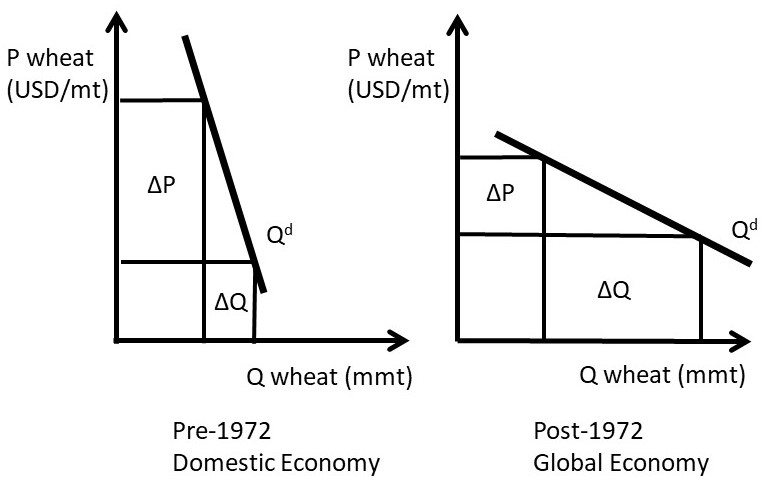
Figure 1.21 Price Elasticity and Price Policies
Prior to 1972, the United States agricultural sector could be characterized as a domestic economy, with less food and agricultural trade. In this case, the demand for food was primarily domestic, and thus relatively inelastic (Figure 1.21, left panel).
Starting in 1933, agricultural price supports increased the price of wheat above the market equilibrium level. This policy worked well, as long as the surplus was eliminated. One way to eliminate the surplus was through acreage restrictions, which limited the number of acres planted to wheat (ΔQ in the left panel of Figure 1.21). Acreage limitations and production quotas were used to decrease the quantity of wheat in the market. These policies worked well prior to 1972, since the US agricultural economy was primarily domestic, characterized by an inelastic demand curve. The decrease in quantity led to a larger increase in price (ΔP > ΔQd), given the inelastic demand in a domestic economy.
In 1972, major changes in international exchange rate policies, together with poor weather in Asia, led to the globalization of US food and agricultural markets. A larger percentage of the US wheat crop was exported, and the inelastic demand that prevailed prior to 1972 became more elastic in the globalized environment (right panel, Figure 1.21). Although the wheat market became globalized, the policies did not. During the 1980s, the US maintained price supports and production controls in the seven basic commodities (defined by the USDA as: wheat, corn, sorghum, sugar, cotton, rice, and tobacco). These policies were counterproductive, as they priced the grain out of the world market. The US attempted to increase the market share of wheat trade, only to find that the US price was higher than the other major wheat exporters.
Figure 1.21 shows why the policies implemented in 1933 were hurting more than they were helping. Production controls were decreasing the quantity of wheat. In the domestic economy (left panel of Figure 1.21, pre-1970), this achieved the objectives of the policies: wheat producer were made better off, since the increase in price was greater than the decrease in quantity. This all changed in the globalized world after 1972 (right panel of Figure 1.21, post 1972). With an elastic demand, the decrease in quantity did not result in large price increases. Price supports raised the US price above the world price of wheat. These policies were not working, and in 1996, they were changed to make the US grain industry more competitive in the global market. Today, a large fraction of all grain produced in the US is exported.
In summary, policies intended to help producers have greatly divergent outcomes, depending on the price elasticity of demand. In a domestic economy, the demand for food and agricultural products is typically inelastic. In this case, production controls and price supports will achieve the policy goal of helping producers: the price increases will be larger than the quantity decreases (left panel, Figure 1.21). In a global economy, the demand for food and agricultural goods is elastic: there are many nations that export grains (right panel, Figure 1.21). In this case the policy that helps producers the most is technological change, which will shift the supply curve to the right. With an elastic demand, the increase in quantity is larger than the decrease in price.
This is the same strategy that Walmart utilizes: everyday low prices. Sam Walton found that the increase in sales due to low prices more than offset the decrease in price (ΔQd > ΔP). This is true in any market characterized by an elastic demand. Since most consumer goods in the United States have many substitutes, Walton’s lower-price strategy led to Walmart becoming the most successful retailer in the history of the world.
1.4.10 Calculation of Market Supply and Demand Elasticities
In Section 1.3.4 above, inverse supply and demand curves were used to calculate the equilibrium price and quantity of phones.
The inverse demand and supply functions were:
(1.18) P = 100 – 2Qd
(1.19) P = 20 + 2Qs
Where P is the price of phones in USD/unit, and Q is the quantity of phones in millions. By setting the two equations equal to each other, the intersection of the inverse supply and demand curves was found, yielding the equilibrium market price and quantity:
Pe = USD 60/phones, and
Qe = 20 million phones.
The graph of the phone market is replicated in Figure 1.22.
To calculate the own price elasticities of supply and demand, simple calculus provides an easy solution. Recall the definition of the own price elasticity of demand:
(1.20) Ed = %ΔQd/%ΔP = (ΔQd/ΔP)(P/Qd) = (∂Qd/∂P)(P/Qd)
The delta sign (Δ) refers to a small change in a variable. This is the same as the derivative sign, “∂.” The difference is that the derivative indicates in infinitesimally small change, whereas the delta sign is a discrete change, which is the same idea, just larger. Therefore, the delta signs can be replaced with the derivative signs in the equation that defines the price elasticity of demand. For example, the slope of a function is Δy/Δx. The slope of the function at a given point on the function is ∂y/∂x.
The last expression in the equation shows that to calculate Ed, use the derivative of quantity with respect to price, and the levels of P and Q. At the equilibrium point, the equilibrium levels of P and Q are known. To find the derivative, begin by taking the derivative of the inverse demand equation (Equation 1.18).
(1.21) ∂P/∂Qd = – 2
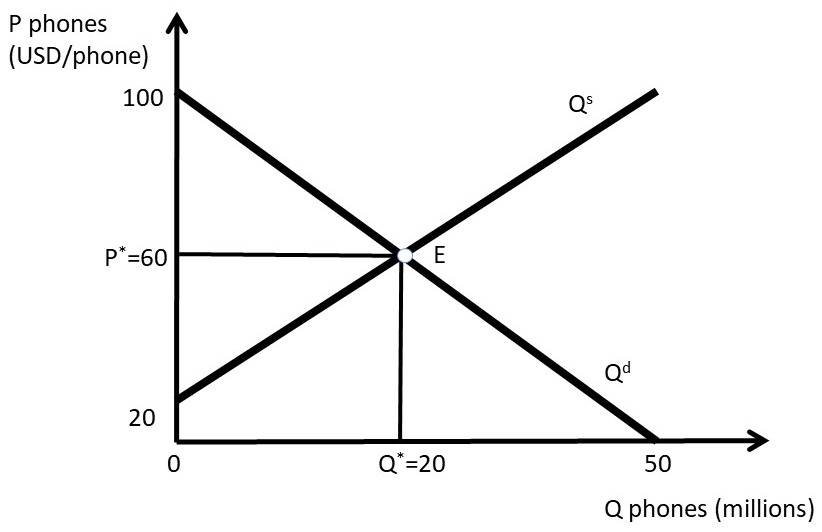
Figure 1.22 Phone Market Equilibirum
This is simply the power function rule from calculus [if y =axb, then ∂y/∂x = abx(b-1)]. Notice something important: the derivative of the inverse demand equation is the inverse of what is needed to calculate the price elasticity. This is due to the inverse demand function being, “price-dependent,” with P on the left hand side. To find the derivative ∂Qd/∂P, invert the derivative by dividing one by the derivative.
(1.22) ∂Qd/∂P = – (1/2)
(1.23) Ed = %ΔQd/%ΔP = (ΔQd/ΔP)(P/Qd) = (∂Qd/∂P)(P/Qd) = (-1/2)(60/20) = -1.5
The absolute value of the own price elasticity of demand at the equilibrium point is:
| Ed| = 1.5. The demand for phones is elastic: if the price were increased one percent, the decrease in phone purchases would be 1.5 percent.
The own price elasticity of supply can be found using the same procedure:
(1.24) Es = %ΔQs/%ΔP = (ΔQs/ΔP)(P/Qs) = (∂Qs/∂P)(P/Qs)
First, take the derivative of the inverse supply function (equation 1.19).
(1.25) ∂P/∂Qs = + 2
Invert this derivative to find the derivative needed to calculate the price elasticity of supply:
(1.26) ∂Qs/∂P = + (1/2).
Then plug in the ingredients of the own price elasticity of supply:
(1.27) Es = %ΔQs/%ΔP = (ΔQs/ΔP)(P/Qs) = (∂Qs/∂P)(P/Qs) = (1/2)(60/20) = 1.5
The price elasticity of supply is also elastic: a one percent increase in price results in a 1.5 percent increase in the quantity supplied of phones.
Two points are worth mentioning here. First, the price elasticities of supply and demand are not always symmetrical, as they are in this case (-1.5 and +1.5). The elasticities depend on the shape of the inverse supply and demand functions. The symmetry of the functions used here can be seen in Figure 1.22. When the inverse supply and demand functions are not symmetrical, the absolute values of the elasticities will be of different magnitudes. The second important point concerns the use of inverse supply and demand functions. The inverse functions are used to align with the “backwards” nature of the supply and demand graphs: price is the independent variable, but appears on the vertical axis. To find the derivative needed to calculate the price elasticities, the procedure above first took the derivative of the inverse function, then inverted it to achieve ∂Q/∂P. This derivative could also be found be first, inverting the inverse function to get the quantity isolated on the left hand side, then taking the derivative. This alternative procedure will result in the same elasticity calculation as the one used above. To test your knowledge, try this procedure to double check your answers!
1.5 Welfare Economics: Consumer and Producer Surplus
1.5.1 Introduction to Welfare Economics
Welfare economics is concerned with how well off individuals and groups are. Welfare economics is not about government programs to assist the needy… that is a different type of welfare. In economics, welfare economics is used to see how the welfare, or well-being of individuals and groups changes with a change in policies, programs, or current events.
Welfare Economics = The study and calculation of gains and losses to market participants from changes in market conditions and economic policies.
1.5.2 Consumer Surplus and Producer Surplus
The two most important groups that are studied in welfare economics are producers and consumers. The concepts of Consumer Surplus (CS) and Producer Surplus (PS) are used to measure the wellbeing of consumers and producers, respectively.
Consumer Surplus (CS) = A measure of how well off consumers are. Willingness to pay minus the price actually paid.
Producer Surplus (PS) = A measure of how well off producers are. Price received minus the cost of production.
The intuition of consumer surplus provides a good method of learning the concept. Suppose that I am on my way to the store to purchase a hammer, and I think to myself, “I am willing to pay six dollars for the hammer.” When I arrive at the store, I find that the price of the hammer is four dollars. My consumer surplus is equal to two dollars: the willingness to pay minus the actual price paid. In this manner, we can add up all consumers in the market to measure consumer surplus for all consumers. This can be seen in Figure 1.23. If each point on the demand curve is considered an individual consumer, then CS is the difference between each point on the demand curve and the price line. The demand curve represents the consumers’ willingness and ability to pay for a good. The CS area is a triangle, and equal to the level of consumer surplus in the market (Figure 1.23).
Similarly, the intuition of producer surplus is a good place to start. If a wheat producer can produce a bushel of wheat for four dollars, and she receives six dollars per bushel when she sells her wheat, then her level of producer surplus is equal to two dollars. Producer surplus is the price received minus the cost of production. In Figure 1.23, this is the difference between the price line and the supply curve. The market supply curve was derived by summing all individual firms’ marginal cost curves. Therefore, the supply curve represents the cost of production. The PS area is the area identified in Figure 1.23.
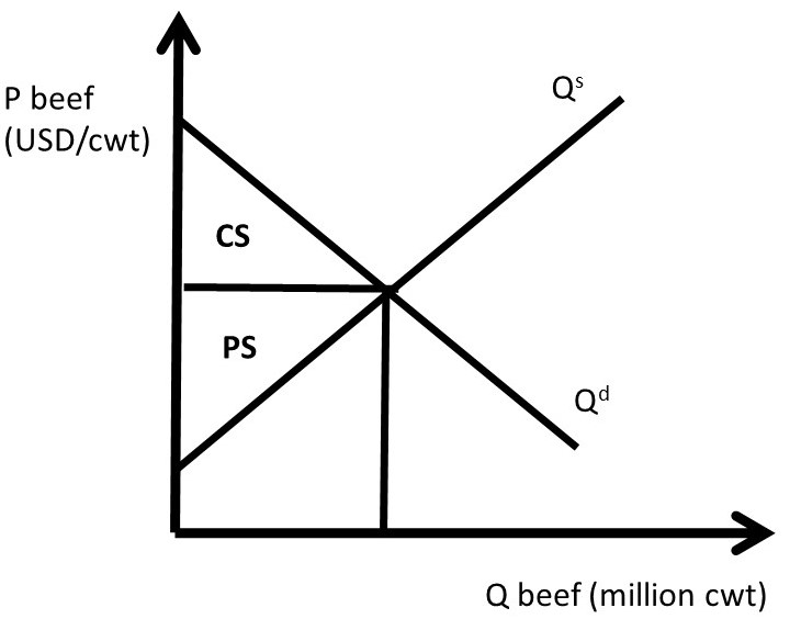
Figure 1.23 Welfare Economics of the Beef Market
These areas can be quantified, or measured, to find the dollar value of consumer surplus and producer surplus. These measures place a dollar value on the wellbeing of producers and consumers.
1.5.3 Mathematics of Consumer and Producer Surplus: Phone Market
Remember that the inverse supply and demand for phones was given by:
(1.28) P = 100 – 2Qd, and
(1.29) P = 20 + 2Qs.
Where P is the price of phones in dollars/unit, and Q is the quantity of phones in millions. The equilibrium price and quantity of phones were calculated above in section 1.4.10:
Pe = USD 60/phone
Qe = 20 million phones.
These values, together with the supply and demand functions, allow us to measure the well-being of both consumers and producers. From geometry, the area of a triangle is one half base times height. To calculate CS and PS, multiply the base of the triangle times the height of the triangle in Figure 1.24, then multiply by one half, or 0.5 (Equations 1.30 and 1.31).
(1.30) CS = 0.5(100 – 60)(20) = 0.5(40)(20) = 400 million USD
(1.31) PS = 0.5(60 – 20)(20) = 0.5(40)(20) = 400 million USD
We will use the concepts of consumer surplus and producer surplus extensively in what follows, where we will explore the consequences of policies, international trade, and immigration in food and agriculture.
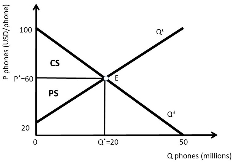
Figure 1.24 Consumer and Producer Surplus Calculations in the Phone Market
The units for both CS and PS are in terms of dollars (USD). These measures capture how well off consumers and producers are in dollars, or the dollar value of their happiness, or well-being. The units are price units multiplied by quantity units, or (USD/phone)*(million phones). Notice that the phone units are in both the numerator and denominator, so they are cancelled, leaving million dollars.
1.6 The Motivation for and Consequences of Free Trade
1.6.1 The Motivation for Free Trade and Globalization
Globalization and free trade result in enormous economic benefits to nations that trade. These benefits have led to high incomes in many nations throughout the world, particularly since 1950. As with all national policies, there are benefits and costs to international trade: there are winners and losers to globalization. When trade is voluntary, the gains are mutually beneficial, and the overall benefits are greater than the costs. There is a strong motivation to trade, and the nations of the world continue to become more globalized over time.
A nation’s consumption possibilities are vastly increased with trade. In nations North of the equator such as the USA, Japan, EU, and China, fresh fruit and vegetables can be purchased during the winter from nations in the Southern hemisphere. In the United States, tropical products including coffee, sugar, bananas, cocoa, and pineapple are imported, since the costs of producing these goods are much lower in tropical climates than in the USA.
The principle of comparative advantage provides large benefits to individuals, nations, and firms that specialize in what they do best, and trade for other goods. This process greatly expands the consumption possibilities of all nations, due to efficiency gains that arise from specialization and gains from trade. For example, if Canada specializes in wheat production, and Costa Rica produces bananas, both nations could be better off through specialization and trade.
A nation that does not trade with other nations is called a closed economy.
Closed Economy = A nation that does not trade. All goods and services consumed must be produced within the nation. There are no imports or exports.
Open Economy = A nation that allows trade. Imports and exports exist.
If a nation does not trade, then consumers in the closed economy must only consume what it produces. In this case, quantity supplied must equal quantity demanded (Qs = Qd). Trade allows this equality to be broken, providing the opportunity for imports (Qs < Qd) or exports (Qs > Qd). The concepts of Excess Supply and Excess Demand will be introduced in the next section to aid in understanding the motivation and consequences of free trade.
1.6.2 Excess Supply and Excess Demand
We will use wheat as an example to see how and why trade occurs. We will investigate wheat trade between the USA and Japan. Japan is one of the largest international buyers of wheat from the United States. The USA is a wheat exporter. The left panel of Figure 1.25 show the USA wheat market. Define Pe to be the price of wheat in the exporting nation. At price Pe, domestic consumption (Qd) is equal to domestic production (Qs).
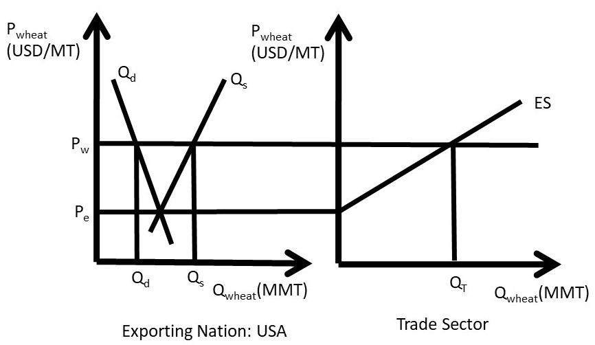
Figure 1.25 The Excess Supply of Wheat
Excess supply is defined to be the quantity of exportable surplus, or Qs – Qd. At prices higher than Pe, the quantity supplied becomes greater than the quantity demanded, and excess supply exists.
Excess Supply (ES) = Quantity supplied minus quantity demanded at a given price, Qs – Qd.
At prices higher than Pe, wheat producers increase the quantity supplied along the supply curve Qs due to the Law of Supply. Wheat consumers decrease purchases of wheat along the demand curve Qd, due to the Law of Demand. The result is a surplus, or excess supply, at the higher price. If excess supply existed in a closed economy, market forces would come into play to bring the higher price back down to the market equilibrium level, Pe. In an open economy, however, it is possible to maintain the high market price through exports. In the right-hand panel of Figure 1.25, the ES function represents excess supply, equal to the horizontal distance between Qs and Qd in the left-hand panel. Note that ES = 0 at Pe, and becomes larger as the price of wheat increases.
Free trade allows the USA to use its resource to produce more wheat than it consumes, and export what is left over to enhance what producer revenues. Trade also provides the opportunity to buy imported goods from other nations.
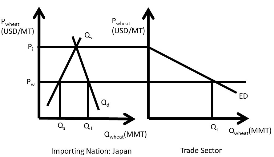
Figure 1.26 The Excess Demand of Wheat
Define Pi to be the price of wheat in the importing nation (Japan in this case). An importing nation such as Japan is characterized by a price lower than the domestic market equilibrium price (Pi), where Qs = Qd (Figure 1.26). In an importing nation, quantity demanded is greater than quantity supplied (Qs < Qd), and the price is lower than the market equilibrium price. If the price is lower than Pi in Figure 1.26, consumers increase purchases of the good due to the Law of Demand, and producers decrease production of the good, following the Law of Supply. This results in an Excess Demand for the good.
Excess Demand (ED) = Quantity demanded minus quantity supplied at a given price, Qd – Qs.
Note that any shift in either supply or demand of wheat in the importing nation will shift the ED curve. Domestic events in the markets for traded goods have international consequences. What happens in China has a large impact on USA wheat producers. Next, the exporting and importing nations will be linked through international trade.
The ED curve shown in the right-hand panel of Figure 1.26 represents excess demand, equal to the horizontal distance between Qd and Qs in the left-hand panel. Note that ED = 0 at Pi, and becomes larger as the price of wheat decreases.
1.6.3 Three Panel Diagram of Trade between Two Nations
Now consider the wheat exporting nation (USA) and wheat importing nation (Japan) in the same diagram, Figure 1.27. The wheat market in the exporting nation is shown in the left panel, and the wheat market in the importing nation is shown in the right panel (Figure 1.27). The trade sector is in the middle panel. Excess demand (ED) is downward sloping, and is derived from the domestic supply (Qsi) and demand (Qdi) in the importing nation, Japan in this case. Excess Supply (ES) is upward sloping, derived from the supply (Qse) and demand (Qde) curves in the exporting nation, the USA. In reality, the right panel is composed of many nations: all countries that import wheat. For simplicity, the model here is for one importing nation and one exporting nation. As price (Pi) decreases in Japan, quantity demanded (Qdi) increases and quantity supplied (Qsi) decreases, causing ED to have a negative slope. Similarly, price (Pe) increases in the exporting nation (USA) result in a higher quantity supplied of wheat (Qse) and a lower quantity demanded (Qde). Equilibrium in the global wheat market is found in the center panel at the point where ED = ES.
The quantity of wheat traded (QT) is equal to ED at the world price (Pw), which is also equal to ES at the world price. Note that it must be true that ED=ES: any imported goods in one nation must be exported by the other nation. Therefore, QT = ED = ES = (Qdi – Qsi) = (Qse – Qde).
In a multi-nation model, this equilibrium would occur when the sum of all wheat supplied from all exporting nations (= ΣES = Qse – Qde) is equal to the sum of all wheat demanded from all importing nations (= ΣED = Qdi -Qsi). The equilibrium quantity traded (QT) is equal to the quantity of wheat imported by Japan (EDi) and the quantity of wheat exported by the USA (ESe) since exports must equal imports (QT = exports = imports). This equilibrium in the world market determines the world price (Pw), which is the price of wheat for all trading partners, Japan and the USA in this model.
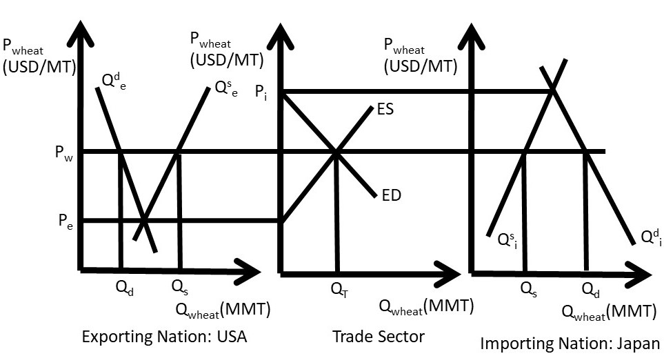
Figure 1.27 International Trade in Wheat: USA and Japan
The three-panel diagram demonstrates two important characteristics about free trade. First, the motivation for trade is simple: “buy low and sell high.” If a price difference exists between two locations, arbitrage provides profit opportunities for traders. A firm (or nation) that buys wheat at a lower price in the USA and sells the wheat at a higher price in Japan can earn profits. Note that this simple model ignores transportation costs and exchange rates. Second, anything that affects the supply or demand of wheat in either trading nation affects the global price and quantity of wheat. Therefore, all consumers and producers of a good are interconnected: the welfare of all wheat producers and consumers is affected by weather, growing conditions, food trends, and all other supply and demand determinants in all trading nations.
This point is enormously important in a globalized economy: the well-being of all producers and consumers depends on people, politicians, and current events all over the globe. The three-panel diagram is useful in understanding the determinants of food and agricultural exports: all supply and demand shifters in all wheat exporting and importing nations.
