Main Body
Chapter 2. Welfare Analysis of Government Policies
2.1 Price Ceiling
In some circumstances, the government believes that the free market equilibrium price is too high. If there is political pressure to act, a government can impose a maximum price, or price ceiling, on a market.
Price Ceiling = A maximum price policy to help consumers.
A price ceiling is imposed to provide relief to consumers from high prices. In food and agriculture, these policies are most often used in low-income nations, where political power is concentrated in urban consumers. If food prices increase, there can be demonstrations and riots to put pressure on the government to impose price ceilings. In the United States, price ceilings were imposed on meat products in the 1970s under President Richard M. Nixon. Price ceilings were also used for natural gas during this period of high inflation. It was believed that the cost of living had increased beyond the ability of family earnings to pay for necessities, and the market interventions were used to make beef, other meat, and natural gas more affordable.
Price ceilings are often imposed on housing prices in US urban areas. Rent control has been a longtime feature in New York City, where rent-controlled apartments continue to have low rental rates relative to the free market rate. The boom in the software industry has increased housing prices and rental rates enormously in the San Francisco Bay Area, Seattle, and the Puget Sound region. Rent control is being considered in both places to make San Francisco and Seattle more affordable for middle-class workers.
2.1.1 Welfare Analysis
Welfare analysis can be used to evaluate the impacts of a price ceiling. In what follows, we will compare a baseline free market scenario to a policy scenario, and compare the benefits and costs of the policy relative to the baseline of free markets and competition. Consider the price ceilings imposed on the natural gas markets. The purpose, or objective, of this policy was to help consumers. We will see that the policy does help some consumers, but makes other consumers worse off. The policy also hurts producers.
This unanticipated outcome is worth restating: price ceilings help some consumers, but hurt other consumers. All producers are made worse off. This outcome is not the intent of policy makers. Economists play an important role in the analysis and communication of policy outcomes to policy makers.
The baseline scenario for all policy analysis is free markets. Figure 2.1 shows the free market equilibrium for the natural gas market. The quantity of natural gas is in trillion cubic feet (tcf) and the price of natural gas in in dollars per million cubic feet (USD/mcf).
Social welfare is maximized by free markets, because the size of the welfare area CS + PS is largest under the free market scenario. As we will see, any government intervention into a market will necessarily reduce the total level of surplus available to consumers and producers. All price and quantity policies will help some individuals and groups, hurt others, and have a net loss to society. Policy makers typically ignore or downplay individuals and groups who are negatively affected by a proposed policy. The two triangles CS and PS are as large as possible in Figure 2.1.
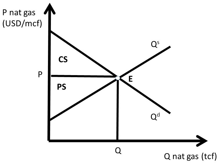
Figure 2.1 Natural Gas Market Baseline Scenario: Free Markets
The price ceiling policy is evaluated in Figure 2.2, where P’ is the price ceiling. Here, the government has passed a law that does not allow natural gas to be bought or sold at any price higher than P’ (P’ < P). For a price ceiling to have an impact, it must be “binding.” This occurs only when the price ceiling is set below the market price (P’ < P). If the price ceiling were set above P (P’ > P), it would have no effect, since the good is bought and sold at the market price, which is below the price ceiling, and legally permissible. Such a law would not be binding on market transactions.
If the price ceiling is set at P’, then the new equilibrium quantity under the price ceiling (Q’) is found at the minimum of quantity demanded (Qd) and quantity supplied (Qs), as in Equation 2.1.
(2.1) Q’ = min(Qs, Qd)
This condition states that the quantity at any nonequilibrium price (P) will be the smallest of production or consumption. At the low price P’, producers decrease quantity supplied, and consumers increase quantity demanded, resulting in Q’ = Qs (Figure 2.2). This is the maximum amount of natural gas placed on the market, although consumers desire a much larger amount.
The first step in the welfare analysis is to assign letters to each area in the price ceiling graph. Next, the letters corresponding to the baseline free market scenario are recorded (initial, or baseline, values have a subscript 0), followed by the surpluses under the price ceiling (ending values have a subscript 1). Finally, the change from free markets to the price policy are calculated to conclude the qualitative analysis of a price ceiling. If the supply and demand curves have numbers (actual data) associated with them, a numerical analysis can be conducted.
The initial, baseline, free market values in the natural gas market at market equilibrium price P are:
CS0 = A + B, and
PS0 = C + D + E.
Social welfare is defined as the total amount of surplus available in the market, CS + PS:
SW0 = A + B + C + D + E.
After the price ceiling is put in place, the price is P’, and the quantity is Q’. New surplus values are found in the same way as under free markets. Consumer surplus is the willingness to pay minus price actually paid, or the area beneath the demand curve and above the price line at the new price P’: (A + C). Producer surplus is the price received minus the cost of production, or the area above the supply curve and below the price line (E):
CS1 = A + C,
PS1= E, and
SW1 = A + C + E.
Recall that social welfare (SW) is equal to the sum of all surpluses available in the market: SW = CS + PS. The welfare analysis outcomes are found by calculating the changes in surplus:
ΔCS = CS1 – CS0 = + C – B
ΔPS = PS1 – PS0 = – C – D
ΔSW = SW1 – SW0 = – B – D
The results are fascinating, since the sign of the change in consumer surplus is ambiguous: the sign of ΔCS depends on the relative magnitude of areas C and B. If demand is elastic, and supply is inelastic, the price ceiling is more likely to yield a positive change in consumer surplus (C > B). The policy makes some consumers better off, and some consumers worse off. The consumers located on the demand curve between the origin (0, 0) and Q’ are made better off by area C, as they purchase natural gas at a lower price (P’ < P). Consumers located on the demand curve between Q’ and Q have a lower willingness to pay than consumers located between the origin and Q’, and are made worse off by the price ceiling (-B) since they are unable to purchase natural gas at the lower price ceiling (P’ <P). The price ceiling created a shortage of natural gas, as natural gas producers reduce the quantity supplied in reaction to the legislated lower price. The decrease in quantity supplied of natural gas makes these consumers unable to buy the good.
Natural gas producers are made unambiguously worse off by the price ceiling: both the price (P) and the quantity (Q) are decreased (P’ < P; Q’ < Q), and the change in producer surplus due to the policy is unambiguously negative (– C – D)
The term deadweight loss (DWL) is used to designate the loss in surplus to the market from government intervention, in this case a price ceiling. Deadweight loss is found by reversing the negative sign on the change in social welfare (–ΔSW):
DWL = –ΔSW = B + D.
The deadweight loss area BD is called the welfare triangle, and is typical for market interventions. Interestingly, and perhaps unexpectedly, all government interventions have deadweight loss to society. Free markets are voluntary, with no coercion. Any price or quantity restriction will necessarily reduce the surplus available to producers and/or consumers in a market.
In current debates over rent control in congested urban areas, economists continue to point out the potential impact of rent control policies: a reduction in affordable housing. These policies are often put in place in spite of economic views, with mixed results. Renters who can find a rent-controlled property win, but many renters are unable to find housing, and must relocated outside the urban center and commute to work from a distant home.
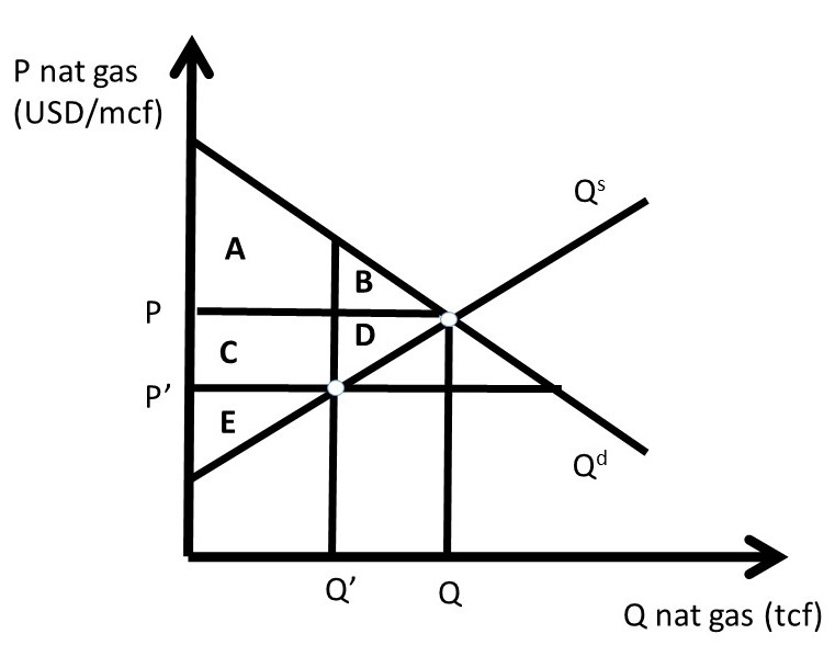
Figure 2.2 A Price Ceiling in the Natural Gas Market
As indicated above, price ceilings on food and agricultural products are most often used in low-income nations, such as in Asia and Sub-Saharan Africa. Price supports for food and agricultural products are most often used in high-income nations such as the US, European Union (EU), Japan, Australia, and Canada.
2.1.2 Quantitative Analysis
In this example, that beef consumers lobby the government to pass a price ceiling on beef products. This happened in the USA in the 1970s, during a period of high inflation. Beef consumers believe that prices are too high and democratically elected officials give their constituents what they want. Suppose that the inverse supply and demand for beef are given by:
(2.1) P = 20 – 2Qd, and
(2.2) P = 4 + 2Qs.
Where P is the price of beef in USD/lb, and Q is the quantity of beef in million lbs. The equilibrium price and quantity of beef can be calculated by setting the inverse supply and demand equations equal to each other to achieve:
Pe = USD 12/lb beef, and
Qe = 4 million lbs beef.
These values, together with the supply and demand functions, allow us to measure the well-being of both consumers and producers before and after the price ceiling policy is implemented (Figure 2.3).
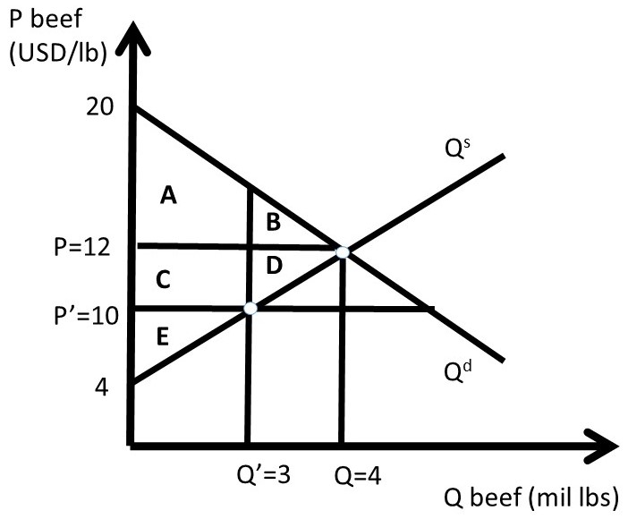
Figure 2.3 A Quantitative Price Ceiling in the Beef Market
The free-market equilibrium levels of CS and PS are designated with the subscript 0, calculated in equations 2.3 and 2.4.
(2.3) CS0 = A + B = 0.5(20 – 12)(4) = 0.5(8)(4) = USD 16 million
(2.4) PS0 = C + D + E = 0.5(12 – 4)(4) = 0.5(8)(4) = USD 16 million
The level of social welfare is the sum of all surplus in the market, as in equation 2.5.
(2.5) SW0 = A + B + C + D + E = 0.5(20 – 4)(4) = 0.5(16)(4) = USD 32 million
Assume that the price ceiling is set by the Government at P’ = 10 USD/lb beef. The quantity is found by finding the minimum of quantity supplied and quantity demanded. In the case of a binding price ceiling (P’ < P), the quantity supplied will be the relevant quantity, since producers will produce only Q’ lbs of beef. Consumers will desire to purchase a much larger amount at P’ < P, but are unable to at the lower price P’, since production falls from Q to Q’. The quantity of Q’ is found by substituting the new price into the inverse supply equation.
(2.6) P = 4 + 2Qs = 10 = 4 + 2Qs therefore, Q’ = 3
The price ceiling (P’) and reduced quantity (Q’) can be seen in Figure 2.3. Next, the levels of CS, PS, and SW are calculated at the price ceiling level. To find the surplus level of area A, split the shape into one triangle and one rectangle by substitution of Q’ = 3 into the inverse demand curve to get P = 14. Area A is equal to: 0.5(20 – 14)3 + (14 – 12)3 = 9 + 6 = 15 million USD. We are now ready to calculate the level of surplus for the price ceiling.
(2.7) CS1 = A + C = 15 + (12 – 10)(3) = 15 + 6 = USD 21 million
(2.8) PS1 = E = 0.5(10 – 4)(3) = 0.5(6)(3) = USD 9 million
(2.9) SW1 = A + C + E = 21 + 9 = USD 30 million
The changes in welfare due to the price ceiling are:
(2.10) ΔCS = CS1 – CS0 = + C – B = 21 – 16 = USD + 5 million
(2.11) ΔPS = PS1 – PS0 = – C – D = 9 – 16 = USD – 7 million
(2.12) ΔSW = SW1 – SW0 = – B – D = 30 – 32 = USD – 2 million
The Dead Weight Loss (DWL) of the price ceiling is the loss to social welfare, of the negative of the change in social welfare:
(2.13) DWL = – ΔSW = 2 USD million.
The quantitative analysis of a price ceiling provides timely, important, and interesting results. First, only a subset of consumers are made better off due to a price ceiling. These consumers win because they pay a lower price for the good under the price ceiling than in the free market (P’ < P). Second, some consumers are made worse off due to the price ceiling, since the quantity of the good available is reduced (Q’ < Q). This is because producers reduce the quantity supplied if the price is lowered (the Law of Supply). Third, all producers of the good are made unambiguously worse off due to the price ceiling, since both price and quantity are reduced (P’ < P; Q’ < Q).
The magnitude of the consumer gains and losses are determined by the elasticities of supply and demand. Elastic demand and inelastic supply provide larger consumer benefits, since area B in Figure 2.3 is relatively small under these conditions. If demand is inelastic and supply is elastic, consumers are less likely to gain from the price ceiling, as area C in Figure 2.3 is relatively small in this case.
2.2 Price Support
This section continues the welfare analysis of price policies by investigating the welfare analysis of a price support, also called a minimum price. Price supports are intended to help producers. The outcome of the welfare analysis demonstrates that price supports can increase producer surplus, but in many cases at a large cost to the rest of society. Figure 2.4 shows the impact of a price support in the wheat market. This policy is more likely to be enacted in a high-income nation where agricultural producers are a small group that can be more easily subsidized by a large economy.
Price Support = A minimum price policy enacted to help producers.
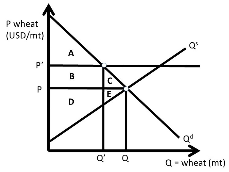
Figure 2.4 Case One: Price Support in Wheat Market, No Surplus
The price support mandates that all wheat be bought or sold at a minimum price of P’. If the price support were set at a level lower than the market equilibrium price (P’ < P), it would have no effect (it would not be “binding”). The quantity of wheat on the market depends on how the policy works. There are three possibilities for how the price support is implemented: (1) no surplus exists, (2) the surplus exists, and (3) the government purchases the surplus. Each case will be described in detail in what follows.
2.2.1 Case One: Price Support with No Surplus
The first case is the simplest, but least realistic. In Case One, we assume that producers correctly forecast the quantity demanded, and produce only enough to meet demand. No surplus exists. In Figure 2.4, the price support is set by the government at P’. It is assumed in this case that producers forego increasing quantity supplied along the supply curve to price P’, and instead produce only enough wheat to meet consumer needs, Q’:
Q’ = min(Qs, Qd).
In Case One, no surplus exists. The producers produce and sell only enough wheat to meet the low level of quantity demanded, Q’. The initial, free market surplus levels are:
CS0 = A + B + C
PS0= D + E
SW0 = A + B + C + D + E
After the price support is put in place, the new levels of surplus are;
CS1 = A,
PS1= B + D, and
SW1 = A + B + D.
Changes in surplus from free markets to the price support with no surplus are:
ΔCS = – B – C,
ΔPS = + B – E,
ΔSW = – C – E, and
DWL = – ΔSW = C + E.
Consumers are unambiguously worse off: price is higher (P’ > P) and quantity is lower (Q’ < Q), relative to the free market case. Producers may or may not be better off, depending on the relative size of areas B and E. If demand is inelastic and supply is elastic, it is more likely that producer surplus is higher with the price support (B > E). This reflects the analysis of price support in the previous chapter. The producers with low production costs, located on the supply curve between the origin (0, 0) and Q’, are made better off since they receive a higher price for the wheat that they produce (P’ > P). The high-cost producers, located on the supply curve between Q’ and Q, are made worse off, since they no longer produce wheat.
The deadweight loss (DWL) equals welfare triangle CE. The price support helps producers, if demand is sufficiently inelastic, but at the expense of the rest of society. In high-income nations such as the US, this policy transfers surplus from the average consumer to producers. Wheat producers have higher levels of income and wealth than the average consumers, so the policy represents a transfer of income to individuals who are better off than the consumers.
2.2.2 Case Two: Price Support When Surplus Exists
Case Two is more realistic than Case One. In Case Two, wheat producers increase quantity supplied to Q’’, found at the intersection of P’ and the supply curve. This is shown in Figure 2.5. At the price support level P’, consumers purchase only Q’, so a surplus exists equal to Q’’ – Q’.
Surplus = Quantity supplied minus quantity demanded = Qs – Qd.
Note that this surplus of quantity shared the same world as consumer surplus and producer surplus, but refers to an excess quantity instead of an excess value. The initial values of surplus at free market levels are:
CS0 = A + B + C,
PS0= D + E, and
SW0 = A + B + C + D + E.
After the price support is put in place, the new levels of surplus reflect the large costs of producing the surplus, with no buyers at the high price (P’ > P). The cost of producing the surplus is the area under the supply curve, between Q’ and Q’’: GHI. The area GHI is the cost of producing the surplus, Q’’ – Q’, because it is the area under the supply curve. The surplus levels with the price support, assuming that the surplus exists are:
CS1 = A,
PS1= B + D – G – H – I, and
SW1 = A + B + D – G – H – I.
Changes in surplus from free markets to the price support with the surplus are:
ΔCS = – B – C,
ΔPS = + B – E – G – H – I,
ΔSW = – C – E – G – H – I, and
DWL = – ΔSW = C + E + G + H + I.
The impact on consumers remains the same as in Case One, but the impact on producers is much costlier. The surplus is costly to produce, and does not have a buyer. If this policy were to be implemented, the government would have to do something with the surplus of wheat created by the policy, or market forces would put pressure on the wheat market to return to equilibrium.
If the surplus remained, market forces would put downward pressure on the price of what making the price support more difficult and more expensive to maintain. This leads to Case Three, where the government purchases the surplus grain and removes it from the market, described in the next section.

Figure 2.5 Case Two: Price Support in Wheat Market, Surplus Exists
2.2.3 Case Three: Price Support When Government Purchases Surplus
The surplus created by a price support is costly to producers, and if nothing is done to eliminate the surplus, the policy does not achieve the objective of helping producers. There are three methods for the government to eliminate the surplus:
(1) Destroy the surplus,
(2) Give the surplus away domestically, or
(3) Give the surplus away internationally.
In all three cases, the government purchases the surplus at the price support level. This is the only way to maintain the price support. Without government purchases, the surplus would result in market forces that put downward pressure on the price of wheat. Destroying the surplus is not politically popular, since it involves eliminating food when there are hungry people in the world. The US did this in earlier decades by dumping surplus grain in the ocean, killing baby pigs, and dumping milk on the ground. This was not popular with consumers, producers, or politicians. The practice of destroying food to maintain higher food prices is not used today.
Domestic food programs make more sense as a method for eliminating the surplus. School breakfast and school lunch programs make use of the food surpluses by assisting those in need. Food aid is using the surplus food from the USA to alleviate hunger in other nations. Food aid and other forms of international assistance are popular programs that help the US producers and the recipient nation’s consumers. Food aid can be controversial, since it lowers food prices in receiving nations, and can cause “dependency” of the recipient on the donor nation.
Food aid results in lower prices, which cause a decrease in the quantity of food supplied in the recipient nation. Although food aid may alleviate hunger and/or starvation, it decreases the incentives for a nation to produce food. This is a true paradox, making food and agricultural policy a challenge for policy makers: there are winner and losers that result from all public policies.
Case Three is shown in Figure 2.6, where the government purchases the surplus (Q’’ – Q’).
As in the two previous cases, the initial values of surplus at free market levels are:
CS0 = A + B + C,
PS0= D + E,
G0 = 0, and
SW0 = A + B + C + D + E.
Note that the government (G) is included in this case of the price support. After the price support is put in place, the new levels of surplus reflect the large costs of the government buying the surplus. The cost of producing the surplus (Q’’ – Q’) at the price support level equals P’ multiplied by (Q’’ – Q’), which is equal to area CEFGHI (Figure 2.6), the cost of producing the surplus. The surplus levels with the price support, assuming that the surplus exists are:
CS1 = A,
PS1= B + C + D + E + F,
G1 = – C – E – F – G – H – I, and
SW1 = A + B + D – G – H – I.
Changes in surplus from free markets to the price support with the surplus are:
ΔCS = – B – C,
ΔPS = + B + C + F,
ΔG = – C – E – F – G – H – I,
ΔSW = – C – E – G – H – I, and
DWL = – ΔSW = C + E + G + H + I.

Figure 2.6 Case Three: Price Support in Wheat Market, Government Purchases Surplus
The total societal surplus changes are identical in Cases Two and Three: DWL = CEGHI in both cases. The distribution of benefits is quite different, however. In Case Two, the producers bear the large costs of overproduction: -GHI. In Case Two, the government has attempted to help producers, but has decreased producer surplus due to the unintended consequence of wheat growers producing too much food at the high level of the price support. If the government does purchase the surplus as in Case 3, these high costs are shifted to taxpayers, and producers are helped by the price support program.
The price support does meet the objective of helping producers in Case 3, but at a high cost to society. As in the case of the price ceiling, the price support results in losses to society (DWL > 0). This is true of all government interventions into the market. The maximum level of surplus occurs with free markets and free trade. In food and agriculture, there are numerous cases of government intervention into markets, reflecting objectives other than maximizing social welfare.
In some circumstances, policy makers determine that the distributional consequences of a policy are more important than maximizing social welfare. In these cases, who gets what determines policy outcomes, rather than the overall efficiency of the market.
2.2.4 Quantitative Analysis of a Price Support
In this example, wheat producers are successful in their efforts to convince Congress to pass a law that authorizes a price support for wheat. Suppose that the inverse supply and demand for wheat are given by:
(2.1) P = 10 – Qd, and
(2.2) P = 2 + Qs.
Where P is the price of wheat in USD/MT, and Q is the quantity of wheat in million metric tons (MMT). The equilibrium price (Pe) and quantity of wheat (Qe)are calculated by setting the inverse supply and demand equations equal to each other to achieve:
Pe = USD 6/MT wheat, and
Qe = 4 MMT wheat.
These values, together with the supply and demand functions, allow us to measure the changes in surpluses for both consumers and producers due to the price support (Figure 2.7).
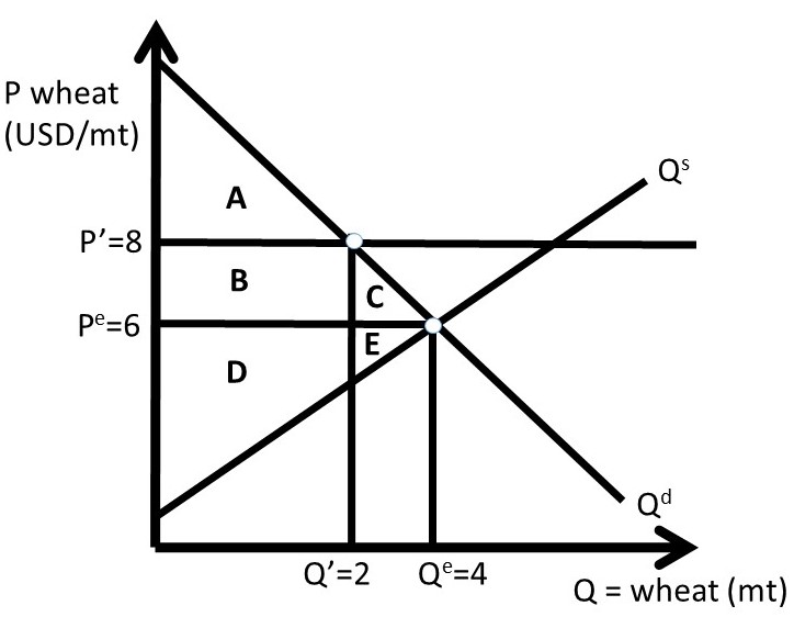
Figure 2.7 Case One: Quantitative Price Support in Wheat Market, No Surplus
The calculations will proceed by directly determining the changes in surplus, rather than calculating the initial and ending values of surplus, as we did above for the price ceiling. To find the dollar values of the areas in Figure 2.7, recall that you can always find a price or quantity by substitution of a P or Q into the inverse supply or inverse demand curve. There is always enough information provided to find prices, quantities, and the areas that represent surplus values.
Assume that the price support is set at P’ = 8 USD/MT wheat. The quantity is found by the minimum of quantity demanded (Qd) and quantity supplied (Qs): min(Qs, Qd). Therefore, the quantity is Q’ = Qd, the quantity demanded. Surplus changes are:
ΔCS = – B – C = – 4 – 2 = – 6 USD million
ΔPS = + B – E = + 4 – 2 = + 2 USD million
ΔG = 0
ΔSW = – C – E = – 2 – 2 = – 4 USD million
DWL = – ΔSW = C + E = + 4 USD million
The government does nothing in Case One, and wheat producers supply only enough wheat to the market to meet consumer demand. Case Two is shown in Figure 2.8. In Case Two, producers produce a large amount of wheat (Q’’) due to the high price P’. There is a large surplus created, but in this case there is no intervention by the government. Wheat producers have very large costs, since they produce 6 million metric tons (Q’’), and consumers only purchase 2 million metric tons (Q’, Figure 2.8).
Figure 2.8 Case Two: Quantitative Price Support in Wheat Market, Surplus Exists
ΔCS = – B – C = – 4 – 2 = – 6 USD million
ΔPS = + B – E – G – H – I = + 4 – 26 = – 22 USD million
ΔG = 0
ΔSW = – C – E – G – H – I = – 28 USD million
DWL = – ΔSW = C + E + G + H + I = + 28 USD million
In Case Three, the government intervenes and buys the surplus. This allows the price to stay at the price support level, P’. Quantity supplied and quantity demanded are at the same levels as in Case Two, but the government’s expenses are large, and wheat producers benefit from the high price (P’ > Pe) and larger quantity sold (Q’’ > Qe, Figure 2.9).
Figure 2.9 Case Three: Quantitative Wheat Price Support, Government Buys Surplus
ΔCS = – B – C = – 4 – 2 = – 6 USD million
ΔPS = + B + C + F = 4 + 2 + 4 = + 10 USD million
ΔG = – C – E – F – G – H – I = – 32 USD million
ΔSW = – C – E – G – H – I = – 28 USD million
DWL = – ΔSW = C + E + G + H + I = + 28 USD million
In Case Three, the price support has large costs, paid for by the government. One benefit that is not explicitly included is the food aid that could be provided to domestic and foreign consumers. These benefits would provide noneconomic gains, but no added surplus value to the program. Price supports can increase producer surplus, but at a cost. Government interventions often have unintended consequences, such as the surplus of grain in this case.
After World War II, European nations subsidized food and agriculture heavily. Since they had experienced massive food shortages during the War, Europeans did not want to rely on other nations for food. The large subsidies resulted in large surpluses of food that had to be exported at below-market prices to maintain the high food prices within Europe. In the next section, we will discuss quantitative restrictions as another means of increasing prices in food and agriculture.
2.3 Quantitative Restriction
Governments in high income nations often subsidize agricultural producers. A price support is one public policy intended to increase producer surplus. The unintended consequence of the price support is a large surplus that is costly to either producers, the government, or both. Another policy intended to help producers is a quantitative restriction, also called output control or supply control. The idea of supply control is to decrease output in order to increase the price. The analysis of elasticity in Chapter One demonstrated that this policy would work only if the demand for the good is inelastic.
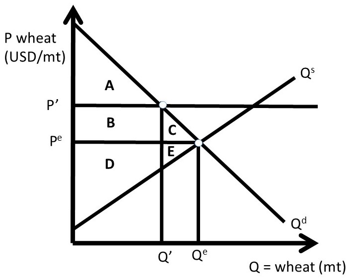
Figure 2.10 Quantitative Restriction in Wheat Market
A quantitative restriction in the wheat market is shown in Figure 2.10. Wheat output is restricted to Q’ < Qe, resulting in a higher price P’ > Pe. The welfare analysis of this policy is identical to that of a price support: if wheat output is reduced by an amount that raises the price to P’, the policy is equivalent to Case One of the Price Support analyzed in the previous section. Therefore, the welfare analysis of the quantitative restriction in Figure 2.10 is:
ΔCS = – B – C,
ΔPS = + B – E,
ΔSW = – C – E, and
DWL = – ΔSW = C + E.
The magnitudes of these welfare changes depend on the elasticities of supply and demand. Note that producers only gain if the demand curve is sufficiently inelastic. If wheat demand is sufficiently inelastic relative to the elasticity of supply, then B > E, and the change in producer surplus is positive. However, if the demand is sufficiently elastic relative to the elasticity of supply, then B < E, and producers lose. This result emphasizes one of the important agricultural policy conclusions of this course: in a global economy, the demand for agricultural goods is elastic due to global competition, and price supports and supply control will hurt producers more than they will help them. This was the result found in Section 1.4.9 above. The welfare analysis of the quantitative restriction highlights this important policy contribution.
The benefit of the quantitative restriction is the lack of a surplus, which is a costly weakness of price supports. One difficulty with supply control is administration and enforcement. Wheat producers will not be free to choose how much wheat that they produce. Instead, the government will allow only a certain amount of wheat produced by each farmer, called a quota. This quantitative restriction can be accomplished through acreage controls also, where wheat producers can only plant a percentage of their total acreage to wheat. This is an imperfect policy, since producers could increase yield per acre on the acres that they are allowed to plant. If the output is restricted, it is difficult to enforce the policy, and if overproduction occurs, it is difficult to remove the surplus.
Although government programs and policies are well intended, they often cause unintended consequences. Price supports and quantitative restrictions can help producers, but at the expense of consumers.
2.4 Import Quota
The large benefits of free trade have been emphasized in this book. Free markets and free trade are based on voluntary, mutually-beneficial transactions that make both trading partners better off. The global economic gains from free trade have been enormous, as they enhance efficiency of resource use. Comparative advantage and gains from trade allow each individual, firm, or nation to “do what they do best, and trade for the rest.”
Not everyone wins from trade, however. As was emphasized in Section 1.6.3 above, the overall net benefits are positive, but there are winners and losers from trade. Specifically, producers in importing nations and consumers in exporting nations lose due to price changes that negatively affect them. Like all public policies, free trade has winners and losers. The overall size of the economy is maximized under free markets and free trade, but there are distributional consequences that result in winners and losers.
Trade barriers are most often erected to protect domestic producers from imports. Sugar is produced in the United States, but at higher production costs than sugar production in tropical climates found in Cuba, the Dominican Republic, and Haiti. If free trade prevailed, all sugar consumed in the USA would be imported, since it is cheaper to buy sugar than to produce it domestically. Sugar producers are interested in maintaining sugar production in the USA, as this is how they make their living. Agricultural trade policy has limited sugar imports to a much smaller amount than the free trade level, through a sugar quota, demonstrated in Figure 2.11. The import reduction makes sugar in the USA more scarce, and therefore more valuable.
In a closed economy, market forces ensure that supply and demand are equal (Qs = Qd). If the USA were a closed economy, the price of sugar would be very high, well above the world market price of sugar Pw. Suppose that the USA is a “small nation” purchaser of sugar: this means that the USA is a “price taker,” facing a constant world price of sugar for all quantities purchased. The assumption of an importing nation being a small nation, or price taker, simplifies our analysis. In the real world, the importer may be large enough to influence the world price of sugar through large purchases of sugar on the global market.
This is represented as a horizontal line at Pw in Figure 2.11. At the world price of Pw, the USA would produce Qs domestically and consume Qd. The difference between quantity demanded and quantity supplied is imports (Qd – Qs). The equality of domestic supply and demand has been broken by the ability to import less expensive sugar from other nations. Note that in a situation with no imports, the domestic price in the USA would be at the intersection of Qs and Qd.
Domestic sugar producers lobby the government for protection, and receive it in the form of a sugar quota, meaning a maximum amount of sugar imports. The right to import sugar is auctioned off to the highest bidders, who pay for the right to import sugar. Suppose that the quota is set at Qd’ – Qs’. This level of quota is binding, since (Qd’ – Qs’) < (Qd – Qs).
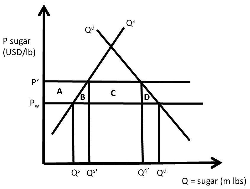
Figure 2.11 Sugar Import Quota
This level of imports is the horizontal distance between Qd’ and Qs’ in Figure 2.11. At this quota level, the price of sugar increases to P’, since the quantity of sugar in the market is reduced from free market levels. At this high price (P’ > Pw), quantity supplied increases from Qs to Qs’, and quantity demanded decreases from Qd to Qd’. These changes are due to the quota, which decreases the amount of sugar allowed into the country. Sugar producers are pleased with this policy, since the price is higher and domestic quantity supplied (Qs’ > Qs) larger.
2.4.1 Welfare Analysis of an Import Quota
The welfare analysis of the import quota identifies the changes in economic surplus of producers, consumers, and the government. The government gains from selling the import quota permits to the sugar importers. These firms will compete with each other to win the right to import sugar. The firms will bid up the price in an auction until the price is equal to the market value of the quota. In this case, the market value is equal to (P’ – Pw), since this is the gain from importing one pound of sugar into the USA. The complete welfare analysis is:
ΔCS = – A – B – C – D,
ΔPS = + A,
ΔG = + C,
ΔSW = – B – D, and
DWL = B + D.
Producers gain, but with large costs to consumers. The government gains from the sale of the quota permits (or licenses) to sugar importers. Sugar consumers are made much worse off from this policy. The area B is called the “production loss” of the policy. This area is equal to the losses of using scarce resources to produce sugar in the USA instead of buying it at the world price. Area B represents the production costs, since it is the area under the supply curve, and above the world price (Pw). These resources could be more efficiently used producing something other than sugar. Area D is called the “consumption loss” of the import quota. This is the area under the demand curve and above the world price (Pw), which represents the extra dollars spent by US consumers buying domestic sugar instead of low-cost imported sugar. Areas B and D represent the loss in social welfare, or the deadweight loss, of the government intervention. Free markets and free trade would provide efficiency of resource use and lower costs to consumers.
In the USA, sugar prices are typically one to two times higher than the world price, resulting in billions of dollar losses to sugar consumers. This policy also has an interesting unintended consequence. High fructose corn syrup (HFCS) is a perfect substitute in consumption for sucrose (sugar made from sugar cane or sugar beets). Corn producers lobby the government to maintain the sugar import quota, to keep the price of sugar high. When the sugar price is high, buyers of sugar (Coca Cola, Pepsi, Mars, etc.) switch out of sucrose and into fructose. Corn farmers are among the largest supporters of the sugar import quota! The positive impact on corn producers is a truly unique and unanticipated cause and effect of protection of domestic sweetener producers from foreign competition.
2.4.2 Quantitative Welfare Analysis of an Import Quota
Suppose that the inverse demand and supply of sugar are given by:
P = 100 – Qd, and
P = 10 + Qs,
Where P is the price of sugar in USD/lb, and Q is the quantity of sugar in million pounds. Suppose also that the world price of sugar is given by Pw = 20 USD/lb, as shown in Figure 2.12. In a closed economy, there would be no imports or exports, so Qs = Qd at this market equilibrium, where supply is equal to demand:
Qe = 45 million pounds of sugar and Pe = 55 USD/lb.
This is a high price of sugar relative to the world price, occurring at the intersection of Qs and Qd in Figure 2.12. If imports are allowed, the USA can break the equality of production and consumption (Qs ≠ Qd) through imports of less expensive sugar (Qs < Qd). If we assume that the USA is a “small nation” in sugar trade, then the USA is a price taker, and can import as much or as little sugar as it desires at the world price. Note that a “large nation” means that a country is a price maker, and has enough market power to influence the price of the imported good.

Figure 2.12 Quantitative Sugar Import Quota
The free market equilibrium in an open economy can be calculated by substitution of the world price into the inverse supply and demand functions. At the world price, Qs = 10 m lbs sugar and Qd = 80 m lbs sugar. Imports are equal to Qs – Qd = 70 m lbs sugar. Social welfare is maximized at this free trade equilibrium, since sugar is produced by the lowest cost producers. Ten million pounds of sugar are produced by domestic producers along the supply curve below the world price, and 70 m lbs are produced by foreign sugar producers at the world price of 20 USD/lb.
Now assume that a sugar import quota is implemented, equal to 50 m lbs of sugar. To be binding, the import quota must be less than the free-market level of imports. Since this is less than the free trade import level, it will decrease the amount of sugar available in the USA, and cause price to increase. The sugar price that results from the quota (P’) can be calculated using the inverse supply and demand curves and the import quota:
Qd’ – Qs’ = 50,
P’ = 100 – Qd’, and
P’ = 10 + Qs’.
Rearranging the first equation: Qd = 50 + Qs. Substitution of the first equation into the inverse demand equation yields:
P’ = 100 – (50 + Qs’) = 50 – Qs’.
This equation can be set equal to the inverse supply equation:
P’ = 50 – Qs’ = 10 + Qs’.
Solving for Qs’:
2Qs’ = 50 – 10, or Qs’ = 40/2 = 20 m lbs sugar.
Substituting this into the import equation and the inverse supply function yield:
P’ = 30 USD/ lb, and
Qd’ = 70 m lbs sugar.
These values are all shown in Figure 2.12. Notice that quantity supplied has increased (Qs’ > Qs) and quantity demanded has decreased (Qd’ < Qd) due to the import quota and the resulting higher price (P’ > Pw). The welfare analysis can now be conducted by calculation of the areas in the graph.
ΔCS = – A – B – C – D = – 750 USD million
ΔPS = + A = + 150 USD million
ΔG = + C = + 500 million
ΔSW = – B – D = – 100 USD million
DWL = B + D = + 100 million
The government gains area C by auctioning off the permits that allow firms to import sugar. The quantitative results confirm that import restrictions help domestic producers, but at thigh costs to domestic consumers. The high price for sugar also provides support to corn producers, since High Fructose Corn Syrup (HFCS) is a close substitute to sucrose. Taxes are analyzed in the next section.
2.5 Taxes
Taxes are often imposed to provide government revenue. The government also uses taxes to decrease the consumption of a good such as alcohol or tobacco. These taxes are called “sin taxes,” on goods that are not favored by society. These goods often have inelastic demands, which allows the government to apply a tax and earn revenues. Taxes can also be used to meet environmental objectives, or other societal goals: goods such as gasoline and coal emissions are taxed.
There are two types of tax: (1) specific tax, and (2) ad valorem tax.
Specific Tax = A tax imposed per-unit of the good to be taxed.
Ad Valorem Tax = A tax imposed as a percentage of the good to be taxed.
Both types of tax have the same qualitative effects, so we will study a specific, or per-unit tax (t = USD/unit). Taxes result in price changes for both buyers and sellers of the taxed good. The welfare analysis of a tax provides important results on who pays for the tax: the buyers or sellers? The term, “tax incidence,” refers to how a tax is divided between buyers and sellers. Let Pb be the buyer’s price, and Ps be the seller’s price. In markets without a tax, buyers and sellers both pay the same equilibrium market price (Pb = Ps = Pe). In a market for a taxed good, however, this equality is broken. With a tax, the buyer’s price is higher than the seller’s price by the amount of the tax:
Pb = Ps + t
Economists say that the tax drives a wedge between the buyer’s price and the seller’s price, as shown in Figure 2.13. The specific tax (t) is equal to the vertical distance between Pb and Ps. The tax incidence, or who pays for the tax, depends of the elasticities of supply and demand.
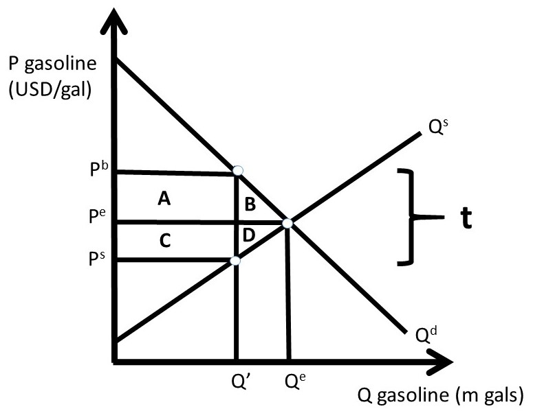
Figure 2.13 Tax on Gasoline
2.5.1 Welfare Analysis of a Tax
The welfare analysis of the tax compares the initial market equilibrium with the post-tax equilibrium.
ΔCS = – A – B,
ΔPS = – C – D,
ΔG = + A + C,
ΔSW = – B – D, and
DWL = B + D.
In Figure 2.13, the incidence of the tax is equal between buyers and sellers of gasoline (Pb – Pe = Pe – Ps). This is because the supply and demand curves are drawn symmetrically. In the real world, the tax incidence will depend on the supply and demand elasticities. The pass through fraction is the percentage of the tax “passed through” from producers to consumers.
Pass Through Fraction = Es/(Es – Ed)
We will calculate this for the gasoline market in the next section.
2.5.2 Quantitative Welfare Analysis of a Tax
Suppose that the inverse demand and supply of gasoline are given by:
Pb = 8 – Qd, and
Ps = 2 + Qs,
Where P is the price of gasoline in USD/gal, and Q is the quantity of gasoline in million gallons. Market equilibrium is found where supply equals demand: Qe = 3 million gallons of gasoline and Pe = Pb = Ps = 5 USD/gal of gasoline (Figure 2.14).
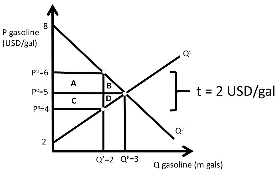
Figure 2.14 Tax on Gasoline
With the tax, the price relationship is given by:
Pb = Ps + t.
Assume that the government sets the tax equal to 2 USD/gal (t = 2). Substitution of the inverse supply and demand equations into the price equation yields:
8 – Qd = 2 + Qs + 2
Since Qd = Qs = Q’ after the tax:
4 = 2Q’
Q’ = 2 million gallons of gasoline.
The quantity can be substituted into the inverse supply and demand equations to find the buyer’s and seller’s prices.
Pb = 6 USD/gal, and
Ps = 4 USD/gal.
These prices are shown in Figure 2.14. The welfare analysis is:
ΔCS = – A – B = – 2.5 USD million
ΔPS = – C – D = – 2.5 USD million
ΔG = + A + C = + 4 USD million
ΔSW = – B – D = – 1 USD million
DWL = B + D = + 1 USD million
Note that the change in social welfare equals the sum of the welfare changes due to the tax: ΔSW = ΔCS + ΔPS + ΔG.
The pass through fraction can now be calculated to find the tax incidence.
PTF = Es/(Es – Ed)
The elasticity of demand at the market equilibrium is equal to -5/3, and the supply elasticity is +5/3. See Section 1.4.10 above for a review of how to calculate elasticities.
This yields:
PTF = Es/(Es – Ed) = (5/3) / (5/3 – (–5/3)) = (5/3)/(10/3) = 0.5.
This result shows that consumers pay for exactly one half of the tax, and producers pay for one half of the tax. The tax achieved the objective of increasing government revenues, but it did lower the quantity of the good produced and consumed, with lower social welfare. In free markets, consumers re able to pay the lower market price and consume more of the good. Producers receive a higher price, and produce and sell a larger quantity of the good than in the no-tax case. Therefore, taxes imposed by the government decrease social welfare, but allow the government to provide goods and services such as national defense at the federal level; highways, schools, and jails at the State level; and roads and parks at the local level. The next section will discuss subsidies.
2.6 Subsidies
The policy objective of a subsidy is to help producers, or encourage the use of a good. The seller’s price is higher than the buyer’s price by the amount of the subsidy (s).
Ps = Pb + s
The subsidy is the vertical distance between the seller’s price and the buyer’s price, as shown in Figure 2.15.
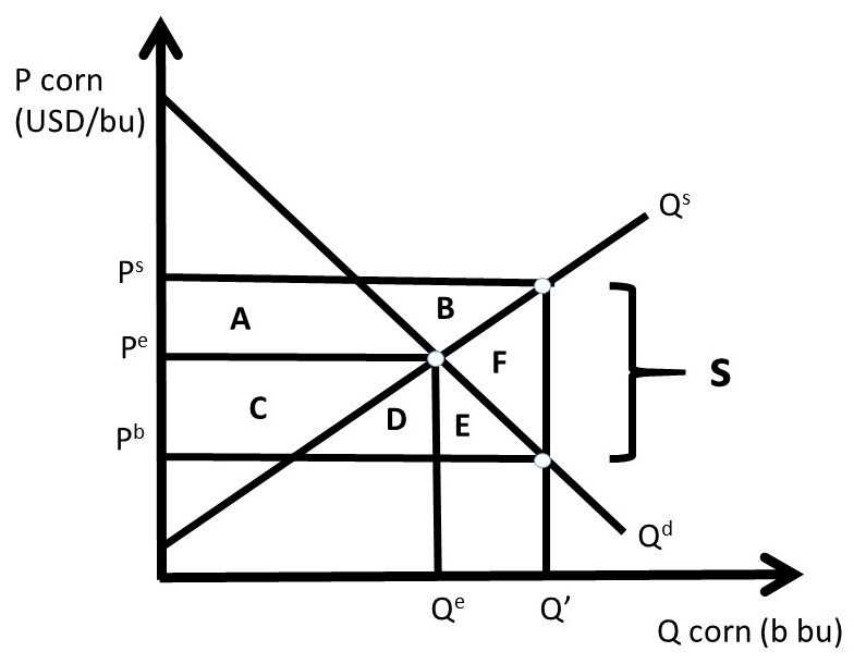
Figure 2.15 Corn Subsidy
2.6.1 Welfare Analysis of a Subsidy
The welfare analysis of the subsidy compares the initial market equilibrium with the post-subsidy equilibrium.
ΔCS = + C + D + E,
ΔPS = + A + B,
ΔG = – A – B – C – D – E – F,
ΔSW = – F, and
DWL = F.
Both consumers and producers gain from the subsidy, but at a large cost to tax payers (the government).
2.6.2 Quantitative Welfare Analysis of a Subsidy
Suppose that the inverse demand and supply of corn are given by:
Pb = 12 – 2Qd, and
Ps = 2 + 2Qs,
Where P is the price of corn in USD/bu, and Q is the quantity of corn in billion bushels. Market equilibrium is found where supply equals demand: Qe = 2.5 billion bu of corn and Pe = Pb = Ps = 7 USD/bu of corn (Figure 2.16).
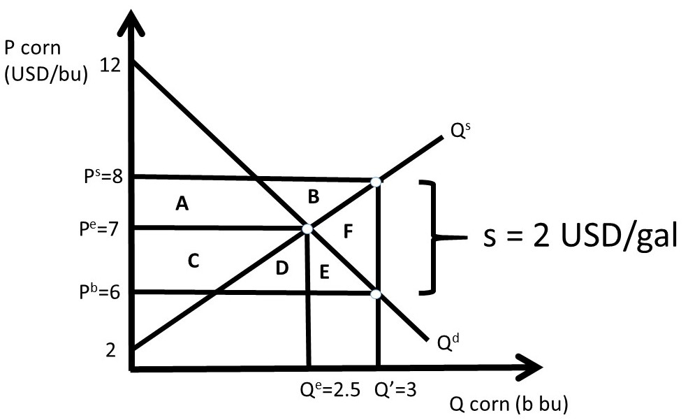
Figure 2.16 Corn Subsidy
With the subsidy, the price relationship is given by:
Ps = Pb + s.
Assume that the government sets the corn subsidy equal to 2 USD/bu. Substitution of the inverse supply and demand equations into the price equation yields:
2 + 2Qs = 12 – 2Qd + 2
Since Qd = Qs = Q’ after the tax:
4Q’ = 12
Q’ = 3 billion bushels of corn.
The quantity can be substituted into the inverse supply and demand equations to find the buyer’s and seller’s prices.
Pb = 6 USD/bu, and
Ps = 8 USD/bu.
These prices are shown in Figure 2.14. The welfare analysis is:
ΔCS = + C + D + E = + 2.75 USD billion
ΔPS = + A + B = + 2.75 USD billion
ΔG = – A – B – C – D – E – F = – 6 USD billion
ΔSW = – F = – 0.5 USD billion
DWL = F = + 0.5 USD billion
Note again that the change in social welfare equals the sum of the welfare changes due to the tax: ΔSW = ΔCS + ΔPS + ΔG. Although the deadweight loss is not large, the government cost is large, making subsidies effective in helping producers and encouraging consumption of the good, but expensive for society.
2.7 Immigration
Labor-intensive agriculture such as fruit and vegetable production in high income nations employs immigrant workers and pays low wages. These workers offer an enormous contribution to the agricultural economy through hard work in the production of food and fiber. However, it is possible that immigration can have a negative impact on rural towns, since the provision of public services such as medical facilities, schools, and housing for low-wage workers is often costly.
Most farm workers in the USA are immigrants, in spite of the massive labor-saving technological change over many decades. Technological change has occurred in many crops through mechanization and the use of agricultural chemicals: over time, machines and chemicals have replaced farm workers in the USA and other high income nations. The number of persons employed on US farms has been stable for several decades, due to two offsetting forces: (1) a large increase in the production of hand-harvested fruits and vegetables, and (2) rapid labor-saving technological change. Most of these farm workers live in “farm work communities,” defined as cities with a population under 20,000 that are typically poor and growing rapidly.
In theory, the economic impact of immigration on rural communities could be either positive or negative. New immigrants can stimulate job and wage growth through induced economic activity from the increased demand for housing, food, clothing, and services. However, it is possible that immigration and growth in the local labor supply could result in lower wages and displaced employment opportunities for existing workers. The actual economic outcome is highly complex, dynamic, and difficult to measure. Immigration has resulted in the description of the USA as a “melting pot” of people and groups all nationalities, ethnicities, races, and religions. Immigration is often controversial, as existing groups may clash with more recent immigrants.
2.7.1 Welfare Analysis of Immigration: Short Run
Welfare analysis can be usefully utilized to better understand the economic impact of immigration. Adjustments take time, so initial impacts can differ markedly from long run impacts. The economic impacts depend crucially on both the number of migrants and the skill level of new migrant workers. Economic theory suggests that the destination, or receiving nation has large economic benefits from immigration, but there are winners and losers. Who wins and who loses depends on the wage structure, and availability and mobility of capital, as explained below.
It is important to emphasize that if capital is mobile, and can adjust quickly, and technology can adapt to changing labor composition, then the economy with migrants is a larger version of the original economy before immigration. In this case, the native-born workers are neither winners nor losers. Economic adjustments to new immigrants require time, and it is during the transition to the new workers that winners and losers occur.
When immigration occurs, goods that are produced using migrant labor have an increase in production. In Figure 2.17, the wage rate is the price of labor, the initial demand for labor is given by Qd0, and the labor supplied by native workers (original workers in the receiving nation) is Qs0, which is assumed to be perfectly inelastic at L0 million workers. The real-world labor supply is not fixed, as it is shown in Figure 2.17, as higher wages will result in more work supplied to the market. However, the inelastic model illustrated in Figure 2.17 is good approximation of labor markets: the qualitative results of the model accurately depict the real world.
The initial, pre-immigration labor market equilibrium occurs at E0, characterized by wage rate W0 and labor supply L0. The total social welfare in this market is the sum of producer surplus and consumer surplus (SW = PS + CS). This is the area under the demand curve at L0 (=ABD). Recall that the workers are the suppliers of labor, thus producer surplus is the economic value of worker well-being. The consumer in this case is the firms, since the employers purchase (hire) labor. The consumer surplus in the labor market shown here is the economic value to the business firms, or employers.
Before immigration occurs, producer surplus is the entire rectangle (BD). The supply curve is vertical in this case, causing the area under the supply curve to be nonexistent. The workers receive this amount of income, since area BD is equal to the wage rate times the quantity of labor employed in the economy (W0*L0). Firms, or employers of workers, receive the consumer surplus, which before immigration occurs is equal to area A in Figure 2.17.
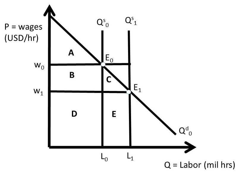
Figure 2.17 Welfare Analysis of Immigration Impact on Labor Market: Short Run
After immigration occurs, the labor force is increased by the number of migrants (M): L1 = L0 +M. In the short run, no adjustments in the labor and capital market take place, and the result of an increase in the quantity of labor is a decrease in the price of labor: the wage rate falls from W0 to W1. Native workers lose area B in producer surplus, with a new level of economic surplus equal to D (W1*L0). Migrants receive wage rate W1, and migrant earnings are equal to area E (W1*M). Presumably, the wage rate earned in the receiving nation is larger than the wage rate available in the immigrants’ nation of origin. The wage rate is also likely to be large enough to induce workers to change locations, which can be a costly transition. Employers in the receiving nation are the winners, as consumer surplus (economic value of the firms who hire either native workers or migrants) increases from area A before immigration to area ABC after immigration.
The welfare analysis of immigration can be summarized in the usual way:
ΔCS = employer gains = + B + C
ΔPSL = native worker gains = − B
ΔPSM = migrant worker gains = + E
ΔSW = net gain to entire economy = + C + E
Notice that there is a net gain in total economic activity due to immigration: the magnitude of economic activity in the receiving nation is larger after immigration occurs. This is due to the influx of new resources, bringing economic value and spending. This differs from government interventions in the free market economy. This is because government programs and policies all result in a loss of voluntary exchange between buyers and sellers, and dead weight loss. In the case of labor immigration into a nation, more voluntary exchange takes place, with large overall economic benefits to the receiving nation. The controversy surrounding immigration is the distributional effects: in the short run, native workers lose, due to decreasing wages. As the economy adjusts to the new workers, the benefits become larger and the negative impacts are diminished, as will be explained in the next section.
2.7.2 Welfare Analysis of Immigration: Long Run
Workers and firms can make many adjustments once the new migrants join the economy. In an economy with many types of skilled and unskilled workers, native workers can take jobs in areas of their comparative advantage, and invest in human capital (education and training) to allow them to increase wages by moving out of low paying jobs and into high paying jobs. Given sufficient time, migrants can do this too, and will move into higher paying jobs as new waves of immigration occur.
Migrants who bring capital or work skills with them can enter growing sectors, such as technology, medicine, and services. The demand for labor in these areas is large and growing, so wages continue to increase together with new workers entering the economy.
In the long run, this type of adjustment in capital and labor markets, together with technological change, will result in economic growth, and broad-based wage and income growth in the receiving economy. The USA has had high levels of immigration simultaneous with high and growing levels of income for most of its history: immigration has catalyzed economic growth in the high income nations of the world. This desirable outcome does require change, adjustment, and in many cases labor migration, both occupational and locational. Growth mandates change, and change is often difficult. This is one of the major features of free markets and free trade. When economic agents are free to make decisions in their own interest, great things can happen. But improvement requires change. When workers and their families are free to locate where they desire to live and work, economic growth is likely to occur, but the transition can be challenging, and when cultures and values differ, controversy can occur.
The long run effects of immigration can be seen in Figure 2.18. New workers joining the economy cause an increase in the aggregate demand for goods in the economy, and this economic growth entices firms to produce more goods. More production requires more workers, and the demand for labor increases from Qd0 to Qd1. The long run equilibrium is found at E1. The increase in labor demand offsets the downward pressure on wage rates, resulting in wages returning to their original level, W0. The economy grows, so consumer surplus (economic value of employers, or business firms) increases to include the area under the demand curve and above the new price line: AFG. Native worker earnings are restored to their initial level (BD), and migrant worker surplus is increased to CHE.
The overall economy gains significantly once these adjustments have occurred. Adding more resources to an economy in the long run, given sufficient time for the transition to occur, will yield large economic growth, as the economy is growing by the size of the new migrant labor force.
ΔCS = employer gains = + F + G
ΔPSL = native worker gains = 0
ΔPSM = migrant worker gains = + C + H + E
ΔSW = net gain to entire economy = + C + E + F + G + H
The potential gains from immigration can be thwarted during periods of economic recession, when the overall demand for goods increases at a decreasing rate. This economic stagnation can lead to a decrease in the demand for labor. When native workers face poor economic conditions, they are less likely to favor new migrants.
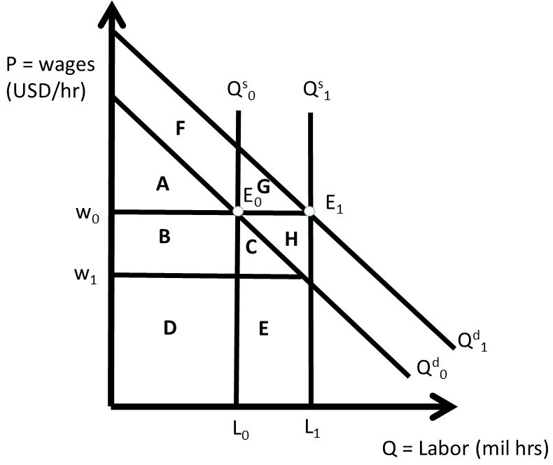
Figure 2.18 Welfare Analysis of Immigration Impact on Labor Market: Long Run
In agriculture, recent immigrants perform many tasks that native workers would not do at the low wages offered to migrants. These tasks can include meatpacking, chemical application, and harvesting fruit and vegetables. The USA currently allows millions of workers to enter the country and work in farm jobs. If this supply of workers were to be eliminated, the cost of labor would rise enormously and the cost of food would increase. To examine the gains and benefits of migration of agricultural workers, the next section broadens the welfare analysis to include a model of two nations: the receiving nation and the nation of migrant origin.
2.7.3 Welfare Analysis of Labor Immigration into the USA from Mexico
To demonstrate the effects of the movement of labor from one nation to another, the three panel diagram of Section 1.6.3 can be usefully employed. The welfare analysis of agricultural labor migration from Mexico to the USA provides a summary of who wins, who loses,, and by how much. The analysis demonstrates that both Mexico and the USA have net gains from labor migration. However, as in all economic changes, there are winners and losers. Figure 2.19 shows labor movements for the receiving nation (USA) in the left panel, and the source nation (Mexico) in the right panel. The trade sector is represented in the middle panel.
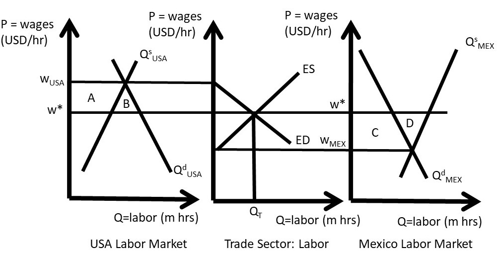
Figure 2.19 Welfare Analysis of Farm Worker Immigration into the USA from Mexico
If the two nations have isolated labor markets, wages in the USA (WUSA) are higher than wages in Mexico (WMEX). This wage differential (WUSA > WMEX) provides the motivation for workers to leave Mexican jobs and migrate to the United States. When the movement of labor is possible, the number of migrants is shown in the middle panel, equal to QT million hours of work. If QT hours of work are transferred from Mexico to the USA, the wage rates are equalized at W* in both nations. Note that this model ignores exchange rates and transportation costs of migration.
The graphical model demonstrated in Figure 2.19 also assumes freedom of movement between the two nations. In agriculture, there is considerable freedom for farm workers to enter the USA from Mexico to supply labor to farms. The H-2A Temporary Agricultural Program allows foreign-born workers to legally enter the United States to perform seasonal farm labor on a temporary basis for up to 10 months. The seasonal needs of crop farmers (fruit, vegetables, and grains) can be met with this program, but most livestock producers, (ranches, dairies, and hog and poultry operations) are not able to use the program. An exception is made for livestock producers on the range, (sheep and goat producers), who can use H-2A workers year-round.
The welfare analysis in Figure 2.19 shows the same results for labor as were obtained for commodities such as wheat in Section 1.6.3. Winners include consumers (employers) in the importing (receiving) nation, and producers (workers) in the exporting (source) nation. In this case, US farmers who employ migrant workers are made better off by area (A + B), but native workers (USA workers employed prior to immigration) are made worse off by area A. The gains and losses are due to the decrease in wages from WUSA to W*. The movement of workers out of Mexico results in gains for Mexican workers (area C + D), but losses for employers of workers in Mexico (area C). This is due to the wage increase in Mexico from WMEX to W*.
Both origin and receiving nations have net benefits: rea B in the USA and area D in Mexico. This result explains why immigration has been a large, significant feature in US history (the United States is often referred to as a “Nation of Immigrants”). The gains and losses in each nation demonstrate why immigration continue to be controversial issue: large economic gains and losses in each nation.
In the long run, the gains to immigration are large for the recipient nation. This is for two reasons: (1) migrant workers are most often complementary to native workers: low-skill immigrants combine with high-skill native workers to enhance productivity for all workers in the receiving nation, and (2) increased population generates increased demand for all goods and services in the USA, resulting in enhanced economic conditions for all workers in the receiving nation.
2.8 Welfare Impacts of International Trade
The welfare analysis of international trade can be conducted using the three-panel diagram (Figure 2.20). The welfare impacts on wheat consumers and producers can be calculated by measuring the changes in consumer surplus and producer surplus before trade (time t=0) and after trade (time t=1). The welfare changes for the exporting nation are shown in the left panel of Figure 2.20. Prior to trade, the closed economy price is Pe at the closed economy market equilibrium, where Qs = Qd. After trade, export opportunities allow the price to increase to the world price Pw. Quantity supplied increases and quantity demanded decreases. Consumers lose, since the price is now higher (Pw > Pe) and the quantity consumed lower. The loss in consumer surplus is equal to area A, the area between the two price lines and below the demand curve: ΔCS = -A. Producers receive a higher price (Pw > Pe) and a larger quantity, and an increase in producer surplus equal to the area between the two price lines and above the supply curve: ΔPS = + A + B (Figure 2.20).
The net gain to all groups in the exporting nation, or change in social welfare (SW), is defined to be ΔSW = ΔCS + ΔPS. Thus, ΔSW = +B, since area A represents a transfer of surplus (dollars) from consumers to producers in the exporting nation (USA). Interestingly and importantly, the exporting nation is better off with international trade ΔSW > 0. However, not all individuals and groups are made better off with trade. Wheat producers in the exporting nation gain, but wheat consumers in the exporting nation lose. Trade has a positive overall net benefit.
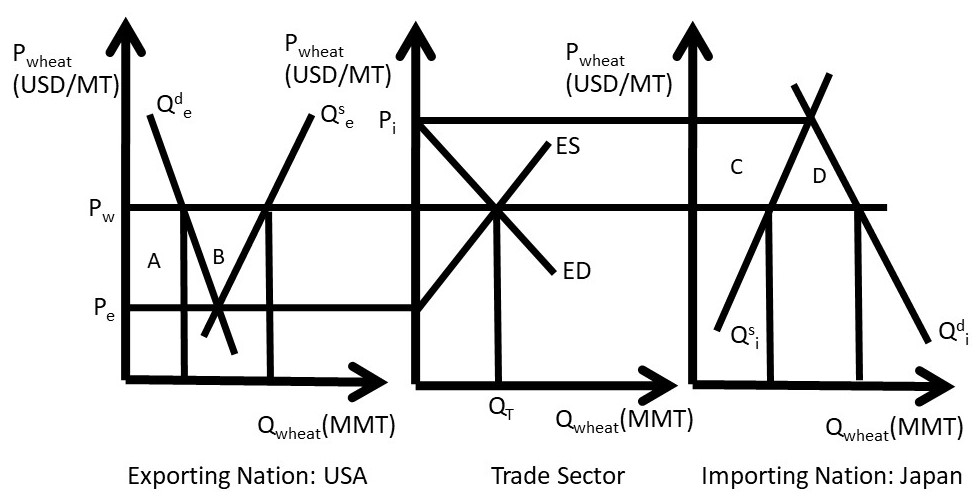
Figure 2.20 Welfare Impacts of International Trade in Wheat
In the importing nation, consumers win and producers lose from trade (right panel, Figure 2.20). The pre-trade price in the importing nation is Pi, and trade provides the opportunity for imports (Qd > Qs). With imported wheat, the market price falls from Pi to the world price Pw. Quantity demanded increases and quantity supplied decreases. Consumers gain at the lower price (Pw < Pi): ΔCS = + C + D. Producers lose at the lower price (Pw < Pi): ΔPS = – C. The net gain to the importing nation, or change in social welfare (SW) is ΔSW = + D. The area C represents a transfer of surplus from producers to consumers in the importing nation. As in the exporting nation, the net gains are positive, but not everyone is helped by trade. Producers in importing nations will oppose trade. This is a general result from out model of trade: producers in importing nations will oppose trade, since they face competition from imported goods.
The results of the three-panel model clarify and explain the politics behind trade agreements. Politicians representing the entire nation will support the overall benefits from trade, brought about by efficiency gains from globalization. However, representatives of constituent groups who are hurt by trade will oppose new free trade agreements. A large number of trade barriers are erected to protect domestic producers from import competition, including tariffs, quotas, and import bans.
The world is better off due to globalization and trade: the global economy gains areas B + D from producing wheat in nations that have superior grain production characteristics. These efficiency gains provide real economic benefits to both nations. However, globalization requires change, and many workers and resources will have to change jobs (and many times locations) to achieve the potential gains. Labor with specific skills and other inflexibilities will have high adjustment costs to globalization. However, there have been huge increases in the incomes of trading nations due to moving resources from less efficient employments into more efficient employment over time.
The three-panel diagram highlights who gains and who loses from trade. Producers in exporting nations and consumers in importing nations gain, in many cases enormously. Producers in importing nations and consumers in exporting nations lose, and in many cases lose a great deal. Industrial workers and textile workers in the USA and the EU used to be employed in one of the major sectors of the economy. Today, these jobs are in nations with low labor costs: China, Indonesia, Malaysia, and Viet Nam are examples.
Should a nation support free trade? The economic analysis provides an answer to this question: unambiguously yes. The overall benefits to society outweigh costs, with the net benefits equal to areas B and D in Figure 2.20. Economists have devised the Compensation Principle for situations when there are both gains and losses to a public policy.
Compensation Principle = A decision rule where if the prospective winners gain enough to compensate the prospective losers, then the policy should be undertaken, from an economic point of view.
The actual compensation can be difficult to achieve in the real world, but the net benefits of the program suggest that if society gain from the policy, it should be undertaken.
Agricultural producers in most high income nations are subsidized by the government. These subsidies can be viewed as compensation for the impacts of the adoption of labor-saving technological change over time. Technological change has made agriculture in the USA and the EU enormously productive. However, it has led to massive migration of labor out of agriculture. Subsidies can be viewed as the provision of compensation for the massive substitution of machines and chemicals for labor in agricultural production.
