2 Sampling and Its Effects
Once people began using computers to analyze data, it became apparent that the data was incomplete, in that we only had the values at set time intervals. This process came to be called sampling. The original work on this was done by two engineers named Nyquist and Shannon and was based on the spectral content of a signal.
Section A) Nyquist and Shannon Sampling Model
The Nyquist Sampling Theorem is based on the following system or model of the sampling process. The analog signal, x(t), that is to be analyzed is multiplied by a stream of impulses.
An impulse is a signal that is defined as [latex]\delta(t) = \begin{bmatrix} 0~for~t \ne 0 \\ \infty for~t = 0 \end{bmatrix}[/latex]
This is shown as a signal flow diagram here:
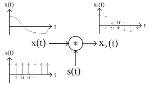
The main point of this system is that the output is a stream of [latex]\delta[/latex] functions with the area under each being based on the value of x(t). To more completely analyze the effects of sampling, we first write an equation for the sampling function s(t) as
[latex]s (t) = \sum_{n=-\infty } ^{\infty } {\delta (t-n T)}[/latex] (2.1)
then based on the system above we can see that the output [latex]x_s (t)[/latex] is
[latex]x_s (t) = x(t) * \sum_{n=-\infty } ^{\infty } {\delta (t-n T)}[/latex] (2.2)
Provided that x(t) is a continuous and properly conditioned function we can move it inside the summation
[latex]x_s (t) = \sum_{n=-\infty} ^{\infty} {x(t) *\delta (t-n T)}[/latex] (2.3)
Please note that we will commonly disperse with mathematical rigor in this text. Not because it is not important, but rather because it has a habit of derailing the reader and inhibits understanding. Similarly since the function [latex]\delta (t-n T)[/latex] is zero, except at (t-n T) = 0 or t = n T, we can rewrite equation 2.3 as
[latex]x_s (t) = \sum_{n=-\infty} ^{\infty} {x(n T) *\delta (t-n T)}[/latex] (2.4)
With the primary result being that [latex]x_s (t)[/latex] is dependent only upon the value of x(t) at the discrete times of (n T).
Now the question is, “How can we analyze this signal to interpret and predict the effects of sampling?” As is common, we begin by looking at the spectrum or Fourier transform (FT) of the signal. For this we will start with the transform of equation 2.2
[latex]X_s (f) = \int_{-\infty} ^{\infty} ( ( x(t) * \sum_{n=-\infty} ^{\infty} {\delta (t-n T)} ) e^{j 2 \pi f t}) dt[/latex] (2.5)
We will now bring in a Fourier transform identity that is not commonly used. It is common to use the identity that the product of two FT’s is the convolution of two time functions. By the duality of FT’s, the product of two time functions is the convolution of their FT’s. In equation form,
[latex]X_s (f_o) = \int_{-\infty} ^{\infty} ( X(f) * S(f_o-f) ) df[/latex] (2.6)
Now the spectrum of the input is given, characterizing the signal we are analyzing, so the question has to be what is S(f)? For this an intuitive description is used in the following video.
Thus the FT of the s(t) (a stream of time impulses) is a stream of frequency impulses.
[latex]S(f) = \int_{-\infty} ^{\infty} ( s(t) * e^{j \omega_o *t} ) dt = \delta(f - n f_s)~for~n = -\infty~ to ~ \infty[/latex] (2.7)
Applying this to the convolution described above we have
[latex]X_s (f_o) = \int_{-\infty} ^{\infty} ( X(f) * \delta(f_o - f + n f_s ) ) df[/latex] (2.8)
As described previously [latex]\delta[/latex] functions have a sifting property, which means that the only points that survive are when [latex](f_o - f + n f_s) = 0[/latex] or [latex]f = (f_o + n f_s)[/latex]. This sifting also has the effect of changing the integral into a summation at these frequencies are [latex]f_o + n f_s[/latex]
[latex]X_s (f) = \sum_{n=-\infty} ^{\infty} ( X(f + n f_s) )[/latex] (2.9)
Note this also did a change of variable from [latex]f_o[/latex] to [latex]f[/latex].
The real result of this is that portions of [latex]X_s (f)[/latex] will translate or alias to appear at other frequencies. For example, consider the case of n = 1 and note that [latex]X(0) = X_s(-f_s)[/latex]. This effect is known as aliasing, since a component of the incoming signal is shifted to another frequency. A more critical affect of this is shown in the following video.
One of the more basic things we can find from the aliasing is that as long as the maximum frequency in our incoming signal is less that [latex]\frac{1}{2}[/latex] of the sampling frequency ( [latex]f_s = \frac{1}{T}[/latex] ) the spectrum of the incoming signal can be preserved. In equational form we would have
[latex]f_{max} \le \frac{f_s}{2} ) )[/latex] (2.10)
or
[latex]f_s \ge 2*f_{max} [/latex] (2.11)
Thus [latex]2*f_{max}[/latex] is commonly called the Nyquist sampling rate. It is easy to remember this since the sampling needs to be at least at the peaks and valleys, or faster.
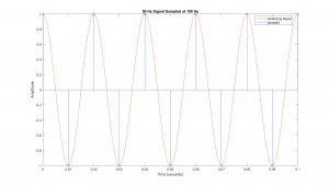
Example of Aliasing via MatLab
% First generate a fine sampling of signals to be sampled.
T = 1/100; % 100 Hz sampling rate.
xF = [0:T/50:0.1]; % Fine sampling rate of 5 KHz (T / 50 = 1/5000 )
CF1 = cos( 2*pi*95*xF ); % One signal is at 95 Hz
CF2 = cos( 2*pi*105*xF ); % and the second is at 105 Hz.
% plot the fine sampling, showing underlying continuous signals.
plot( xF, CF1, ‘b’, xF, CF2, ‘r’ );
pause();
% Now sample at 100 Hz sampling rate
xC = [0:T:0.1];
CC1 = cos( 2*pi*95*xC );
CC2 = cos( 2*pi*105*xC );
hold on % plotting on top of continuous signals.
plot( xC, CC1, ‘bo’, xC, CC2, ‘rx’ );
% Annotate graph.
xlabel( ‘Time (seconds)’ );
ylabel( ‘Amplitude (Unknown)’ );
title( ‘Comparison f = 95 & 105, at fs = 100′ );
legend( ’95 Hz’, ‘105 Hz’, ‘Samp 95 Hz’, ‘Samp 105 Hz’ );
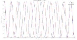
Note how the sampled points, marked with an “o” and “x” align, although the source signal is at a different frequency. This is the basic concept of aliasing in that signals at different frequencies appear the same once sampled.
Section B) Aliasing Diagram
As we observed in the previous section, the affects of sampling can be rather confusing and hard to follow. Thus a process that can help us visualize these affects would be helpful. The Aliasing or Folding Diagram is a graphical technique for estimating the spectral shape of a signal after sampling. Since it is graphical in nature, it is primarily a tool to help estimate and visualize the affects of frequency aliasing.
Aliasing Diagram Procedure
Based on the sampling interval, the aliasing diagram can be laid out as a folded line of frequencies as
shown in Figure 2.3. Here the frequency axis is folded back at fs/2, fs, 3fs/2, …
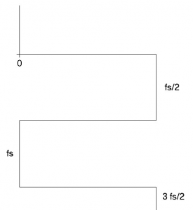
Figure 2.3 Frequency Axis Layout for Aliasing Diagram.
On the diagram that has been laid out, you should sketch the positive portion of the spectrum of the signal to be sampled. Figure 2 shows the diagram with an example positive spectrum sketched in.
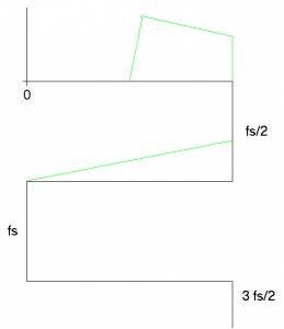
Figure 2.4 Second Step of Drawing in the Positive Spectrum.
Once the spectrum is laid out, a “Resultant Spectrum” is found by adding up all the spectrum’s from all the various folds. The Resultant is shown in red on the 0 to fs/2 portion of the frequency axis in Figure 2.5.
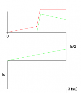
Figure 2.5 Resultant Spectrum Drawn on 0 to fs/2.
The Resultant is then copied to all the various folded frequency axis’. The copied spectrum’s are shown in blue in Figure 2.6.
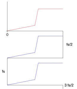
Figure 2.6 Resultant Spectrum Copied into Upper Frequencies.
As a final step, the spectrum of the sampled signal can be drawn by “unfolding” the frequency axis. In Figure 2.7, this unfolded plot shows the resultant in red and the unfolded upper frequency in blue.
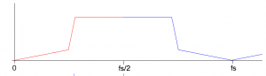
Figure 2.7 Final Spectrum, Unfolded.
Aliasing Diagram Example
A signal is sample every 200 micro seconds, giving a sampling frequency of 5 K Hz. The positive
spectrum of the signal is shown in Figure 2.8.
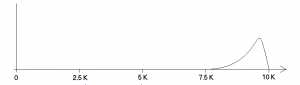
Figure 2.8 Input Signals Spectrum.
The Aliasing Diagram is shown in Figure 2.9, with the original spectrum is in green, the resultant is in red and the other reflected spectrums are in blue.
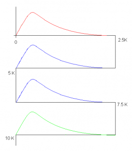
Figure 2.9 Final Aliasing Diagram for Example signal.
With the original, resultant and reflected spectrums we can unfold the spectrum to get the resultant spectrum that is shown in Figure 2.10.
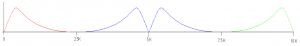
Figure 2.10 Final Spectrum out to 2 fs.
An important aspect of this example is the fact that the original spectrum is still present in the spectrum after sampling. Since the spectrum is not distorted, later in this text we will be creating an approach to recover this signal.
The following video will further exemplify the use of the aliasing diagram to interpret the effects of sampling.
Section C) Digital to Analog Converter (DAC) Reconstruction
Once the sampled data has been filtered by the micro, refer to Figure 1.1, the output sequence is sent to a DAC. The DAC will create an analog voltage that matches the number from the micro. Since the numbers are spaced out at set time intervals, the resulting signal will appear as a blocky (stairstep) waveform. The plot that exemplifies this form is shown in Figure 2.11.
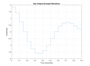
Figure 2.11. Characteristic DAC Output Waveform
Much like the Nyquist model for sampling, we will need to create a system that emulates the shape of this blocky reconstruction. A system like that shown in Figure 2.12 will perform this action.
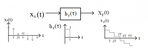
Figure 2.12 Model for Analyzing the DAC Reconstruction
In this model we have taken our input to be a stream of impulses, much like the Nyquist sampled signal, then filtered this stream of impulses with a filter that has an impulse of response that is a square pulse. The following video will show this process in a graphical form.
As with the sampling model, we will use the FT to analyze the input and system to identify the prominent effects of this reconstruction.
We begin by establishing what the FT of a square pulse looks like.
[latex]H(f) = \int_{-\infty} ^{\infty} (h(t) * e^{j \omega *t} ) dt [/latex] (2.12)
Noting that h(t) is one from t = 0 to T, and zero otherwise, we would have
[latex]H(f) = \int_{0} ^{T} (1 * e^{j \omega *t} ) dt [/latex] (2.13)
Now [latex]e^{j \omega *t}[/latex] has an easy integral which is equal to [latex]\frac {e^{j \omega *t}}{j \omega} [/latex] and thus
[latex]H(f) = \frac{(e^{j \omega *T} - e^{0}) }{ j \omega }[/latex] (2.14)
In order to simplify equation 2.13, we will factor out [latex]e^{j \omega *\frac{T}{2}}[/latex] from the numerator, resulting in
[latex]H(f) = e^{j \omega \frac{T}{2}} \frac{(e^{j \omega \frac{T}{2}} - e^{-j \omega \frac{T}{2}}) }{ j \omega }[/latex] (2.15)
Then employing one of the Euler’s Identities we have
[latex]H(f) = e^{j \omega \frac{T}{2}} \frac{2j sin( \omega \frac{T}{2}) }{ j \omega }[/latex] (2.16)
Cancelling out the j in the numerator and denominator and multiplying the numerator and denominator by [latex]\frac{T}{2}[/latex] we have
[latex]H(f) = T e^{j \omega \frac{T}{2}} \frac{sin( \omega \frac{T}{2}) }{ \omega \frac{T}{2} }[/latex] (2.17)
This last step of multiplying the numerator and denominator by [latex]\frac{T}{2}[/latex] was done to have the ratio on the right hand side of 2.16, appear as [latex]\frac{sin(x)}{x}[/latex] which is commonly called sinc(x).
[latex]H(f) = T e^{j \omega *\frac{T}{2}} sinc( \omega *\frac{T}{2})[/latex] (2.18)
To properly interpret equation 2.18, we need to recognize that the first part, [latex]e^{j \omega *\frac{T}{2}} [/latex] has a magnitude of 1 for all [latex]\omega[/latex] and only represents a phase shift. Thus the magnitude response is set by the sinc function, a plot of which is included in Figure 2.13, but the following alterations to the equation is needed to make the plot more understandable. First, we translate from radial to plain frequency by replacing [latex]\omega[/latex] with [latex]2 \pi f[/latex] and also replacing T with [latex]\frac{1}{fs}[/latex]
[latex]H(f) = \frac{1}{fs} e^{j \pi \frac{f}{fs}} sinc( \pi *\frac{f}{fs})[/latex] (2.18)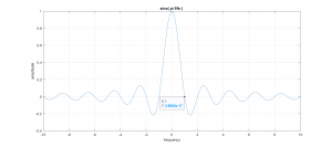
Figure 2.13 Plot of [latex]sinc( \pi *\frac{f}{fs})[/latex] , Normalized to T = 1 Second (fs = 1).
Then the output of the system in Figure 2.12 should be the product of the inputs spectrum with the sinc shown above. In equational form we have
[latex]X_r(f) = X_s(f) * sinc( \pi *\frac{f}{fs})[/latex] (2.18)
We will now work on a Matlab emulation of this process as a way to visualize the effect of the DAC reconstruction.
Matlab Based Reconstruction Emulation
We start with two support functions, ins_replicas and ins_zeros, which emulate the DAC output and Nyquist sampled signals.
function xn = ins_zeros( x, I )
%
% xn = ins_zeros( x, I );
%
n = length( x );
I = I+1;
% Create an array that is has I*n samples
% representing an upsampling.
xn = zeros( 1, I*n );
% Loop through the samples in the original signal.
for k = 1:n
xn(k*I) = x(k); % place x(k) at start of each sample
end % leaving the other at zero.
return
Using these functions we will now emulate the effect from the DAC reconstruction.
% Clear out prior to test.
close all;
clear
% Create index array
n = 0:2047;
% and the test signal that sweeps through frequencies.
x = cos( pi/4096 * n.*n );
fs = 44e3; % (Sampling frequency assumed to be 44 KHz)
% Simulation of DAC reconstruction by inserting replicas of samples.
xr = ins_replicas( x, 7 );
% Emulation of Nyquist sampled signal by inserting zeros.
y = ins_zeros( x,7);
%Fourier Transform of all the data.
X = fft( x );
Y = fft(y);.
XR = fft( xr/8 ); % divide by 8 needed since inserted replicas add to magnitude.
% plot Signals.
subplot( 3,1,1 ),plot( x );
ylim( [-1.1 1.1] );
title( ‘Original Signal’ );
subplot( 3,1,2 ),plot( y );
ylim( [-1.1 1.1] );
title( ‘Signal with Inserted Zeros’ );
subplot( 3,1,3 ),plot( xr );
ylim( [-1.1 1.1] );
title( ‘Signal with Samples Replicated’ );
% plot zoomed view of signals.
figure
subplot( 3,1,1 ),plot( x );
xlim( [0 100] );
ylim( [-1.1 1.1] );
title( ‘Original Signal’ );
subplot( 3,1,2 ),plot( y );
xlim( [0 800] );
ylim( [-1.1 1.1] );
title( ‘Signal with Inserted Zeros’ );
subplot( 3,1,3 ),plot( xr );
xlim( [0 800] );
ylim( [-1.1 1.1] );
title( ‘Signal with Samples Replicated’ );
%Plot the spectrums.
figure
subplot( 3,1,1 ),plot( 22e3*[0:length(X(1:end/2))-1]/length(X(1:end/2)), abs( X(1:end/2) ) );
% Note that 22e3 is one half of fs = 44K
title( ‘Reconstruction Spectrum’ );
grid;
subplot( 3,1,2 ),plot( 176e3*[0:length(Y(1:end/2))-1]/length(Y(1:end/2)), abs( Y(1:end/2) ) );
% And again 176e3 is one half of 8*fs = 352K
title( ‘Inserting Zeros’ );
grid;
subplot( 3,1,3 ),plot( 176e3*[0:length(XR(1:end/2))-1]/length(XR(1:end/2)),abs(XR(1:end/2)) );
title( ‘Spectrum of DAC Reconstruction’ );
grid;
The following Figure is the first generated by the above MatLab script.
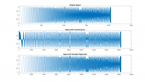
Figure 2.14 Signals for Testing The Effect of a DAC on a Signals Reproduction.
The first plot, at top of Figure 2.14, is the input signal and is a cosine wave who’s frequency is continually increasing. This type of signal will be used repeatedly to allow for a visual display of the frequency response of systems. The second plot shows the same signal with zeros inserted between each sample. This is done to emphasis how the Nyquist sampling model is actually representing the sampled signal. Finally the third plot is signal will each sample replicated 4 times, which react similar to the blocky DAC signal we described previously. To display these signals and their shape more clearly The same signals are plotted here, but zoomed in on the first section of the plots.
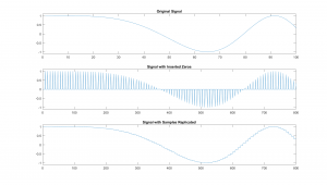
Figure 2.15 First Few Samples of The Signals for Testing The Effect of a DAC on a Signals Reproduction.
Figure 2.16 displays the spectrums of the three signals. This top plot shows the spectrum of the “input” signal, for which it should be noted that it is very wide band. If we could do a true spectrum, feel of the effects of our finite time window it would be flat across all the frequencies. Now to create the second signal, we inserted seven zeros between each of the samples, making it look like the Nyquist sampled signal only sampled at a rate 8 times faster. Note that the spectrum of the zero inserted signal shows 8 copies of the spectrum shown in the top plot. On the other hand, the third plot, which is the replicated signal, shows a distinct roll off of the spectrum. This roll off is the “sinc” that we spoke of previously.
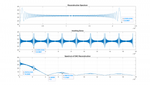
Figure 2.16 Spectrum of The Signals, Showing The Effect of a DAC on a Signals Reproduction.
Looking at the points that have been tagged in the spectrums we can quantify some important facts. First the highest frequency in the input or original signal, at the end of the top plot we have a magnitude of 22.6967, and this is the same as the magnitude in the second spectrum (zero inserted) at the same frequency, indicating that we really do have copies of the original spectrum. On the other hand, the spectrum of the replicated signal shows the roll off. And if we look at the magnitude at the same frequency as shown in the second plot, we see a decrease of 14.5565 / 22.6967 = 0.6413 which is very close to sinc( f / fs ) at f = fs/2 or sinc( 1 / 2 ) = 0.6366.
Thus it can be seen that the effect of the DAC on the output signal can be a problem, especially for signals that contain components that approach fs/2. As we develop more techniques to analyze and filter signals, we will return to this problem and demonstrate ways to correct these frequency components and better recover the signal.
Conclusion
In this section we have looked at how the sampling of a signal can cause a variety of effects, such as causing some frequency components to appear to be a different frequency than they originally were, known as aliasing. We also established that if we are to avoid aliasing of frequency components we will need to sample faster that than the Nyquist rate [latex]f_s \ge f_{max}[/latex]. Finally we showed that sending samples out to a DAC had some unusual effects.
Probably the most important take away from this chapter is how what appears as a purely theoretical model of a process can be used to explain its effects. Such as sampling being modelled as a stream of impulses being multiplied with a signal and explaining aliasing. Or a stream of impulses being filtered by a filter with a square impulse response can identify a frequency roll off.
