1 Visual Analysis

Visual Analysis Assignment Guidelines
In today’s information age we are bombarded with visual images relating all kinds of messages. Advertisers, entertainment groups, media corporations, advocacy groups, the government, and others create visual messages to make a point, to sell a product, and/or to illuminate an issue. Analyzing these images allows us to develop our critical thinking and analytical skills as well as enhance our media literacy, which is our ability to understand the ideas and implications of the various forms of media in our culture.
For this assignment, you will adopt the role of an image analyst for a large media outlet. Your job is to write a 1000-1200 word memo in which you analyze one client’s visual message in order to answer the question: “How do the design features of this image challenge or complicate gender expectations?”
The selection of your visual image will be an important step for this process, so your instructor will likely provide you with 3-4 from which to choose. Many visuals present images that support social expectations of gender, so the visuals you’re provided will work against social expectations or present a more complicated message than the stereotypes. They will also be contemporary American visuals, ones that were created within the last five years or so. Finally, they’ll be static (not moving) images.
Once you have chosen your visual, you’ll need to develop your analysis effectively. This will require careful explanation of the meaningful connections that you identify between the visual’s design features and how they complicate or challenge gender expectations. Your memo needs to briefly but clearly describe the relevant design features, but, more importantly, explain how they challenge or complicate gender expectations. To help you make these connections and to develop your analysis, you must also use at least one outside source (from this textbook or from outside research). However, the source should be in support of your analysis of the image.
To demonstrate above average analytical skills and your critical engagement with course concepts, your memo should present ideas that are generally overlooked by the more casual viewer and should guide your audience to engaging with the visual in a new way. In other words, your analysis needs to move beyond the obvious.
Learning Objectives
By the end of this assignment, you should be able to do the following:
- Analyze the ways the design features of a visual challenge or complicate gender expectations.
- Develop the connections between evidence (design features) and your analytical claims.
- Articulate the common portrayals of gender in American society.
- Use a source appropriately to support your
- Use correct memo
Rationale
The visual analysis assignment meets all of the English 100 objectives, but, more specifically, it works to help students learn to better “analyze and respond to a wide range of texts such as advertisements, websites, informative essays, editorials, and speeches.” It is also important because it asks you to meet one of the most significant objectives in English 100: to “demonstrate critical thinking when examining and analyzing human difference.” In order to fulfill these particular objectives, you will:
- Analyze how authors and designers represent human
- Identify how culture and society impact the ways human beings are
- Analyze how human difference is represented in a visual
Analysis & Media Literacy
The central purpose of this chapter’s writing assignment is to analyze a visual image. To analyze something means to break it down into its different components in order to understand how it works. People analyze things all the time, though we may not always call it analysis or think deeply about what we’re doing. For instance, when we taste a new food, we talk about its texture and flavor; we even try to identify the various ingredients we think we detect. By breaking down the food into categories of texture and flavor, we begin the analysis process. By dividing flavor into subcategories of ingredients, we analyze even further. We are familiar with another common use of analysis by watching TV crime dramas. In these shows, crime scene investigators collect evidence, including unidentified trace evidence, such as powders or fluids. This evidence is taken back to a lab to be processed and analyzed. The lab produces an analysis report that identifies the various components of the trace evidence that, undoubtedly, allows the detectives to determine what the unidentified substance is and solve the case. Studying the various parts of—or analyzing—an object, then, allows us to learn more about the whole object. Analytical processes are used in a variety of fields. As in our TV example, analysis is used in the Sciences, but it is also used in the Humanities. Literature is analyzed; so is artwork, like paintings or sculptures. In fact, the ability to analyze can be applied in almost any career.
For example, analysis is an important aspect of advertising. Students who take marketing and advertising classes and people who work in ad agencies regularly participate in an analytical process called critique, or crit, for short. In her book, AD Critique, Nancy R. Tag explains that critique is the process by which “one deconstructs an ad in order to understand it and construct something better. […] Critique pulls the work apart, examines it, and determines if the elements make sense and if the whole comes together” (5). This analytical process is an integral part of creating advertisements. Once an ad has been designed and drafted, a group of people gather for the critique. They break down the design features of the ad, discussing how it works to create the intended messages. These discussions often highlight what’s successful in the ad as well as what aspects need revision before a final version of the ad is completed. All ads, then, have been carefully constructed; all of an ad’s design features have been specifically selected and arranged to send a particular message to the viewer.
Advertisers design messages using a variety of media formats that are a part of our everyday lives: TV commercials, Internet and magazine ads, billboards, and posters, just to name a few. Often, the central message is quite clear, but sometimes messages are less overt. For instance, ads that sell diet products often use pictures labeled “before” and “after” in an attempt to demonstrate that the product was responsible for the apparent weight loss between the two images. This central claim—our product will help you lose weight—is obvious. However, this ad also suggests that viewers need to lose weight, and that the person in the “before” picture is unacceptable, while the person in the “after” photo is more desirable.
Even though the ad’s message about the general importance of weight loss isn’t the main purpose or meaning, it still has an impact on people’s body image, as well as on our social expectations of others. Being able to analyze all messages inherent in advertising, then, is one way to understand how our social systems are created, perpetuated, and even challenged.
Processing messages in advertisements and understanding what they mean to our lives is also one way of enhancing your media literacy. The National Association for Media Literacy Education (NAMLE) defines media literacy as “[t]he ability to ACCESS, ANALYZE, EVALUATE, and COMMUNICATE information in a variety of forms.”[1] Just as advertisers use analysis to create more effective ads, viewers can analyze media messages to better understand their purpose and value; media literacy also allows us to see how those messages can impact our lives. For example, you may have received an official-looking email in your university inbox that informs you of a problem with your university ID. The email says that, to fix the problem, you should reply with your password or go to a specific website. To understand that this email is NOT official—that it is actually a scam to gain access to your account or to infect your computer with a virus—you have to use your media literacy skills. If you don’t analyze the email carefully to evaluate its authenticity, you could put yourself at risk for identity theft or other crimes.
This chapter’s major writing assignment asks you to closely analyze an example of visual media. In doing so, you will develop your analytical skills and your media literacy, making you less vulnerable to harmful or false media, but also more socially aware of the implications of the various messages present in media today.
Sex, Gender, and Social Systems
As a culture, we are deeply invested in assumptions about sex and gender. For example, even before a baby is born, many of us participate in traditions and functions that revolve around knowing a fetus’s sex: purchasing clothes and toys in gendered colors (pink for girls and blue for boys), elaborate “gender reveal” parties, and even inviting family members to the 20-week ultrasound when the baby’s external sex organs are first discernible. As you’ll see in the discussion below, despite how invested these traditions are in (binary understandings of) sex and gender, they often confuse those two terms. As a reminder, the Visual Analysis Memo is not asking you to express your opinion about sex and gender, but in order to understand how a visual challenges or complicates gender expectations, you will need to understand those traditional gender expectations. Additionally, while definitions can be limiting and often change over time, understanding common terminology can give us the shared language we will need to begin conversations about complex cultural topics.

Sex
A person’s sex is often defined by reproductive functions, presuming a biologically-based binary in which people are considered either male or female. It also suggests that we can group people into these two categories by examining their bodies, more specifically their reproductive organs.
In its most simple definition, then, our culture asserts that those who have a penis are men, and those who have a vagina are women.
While U.S. culture traditionally limits the possibilities for a person’s sex to two categories (male/female), reality is not that simple; in fact, even biology is not that simple. While we have been conditioned to expect a child to be either male or female, the human body is not always easily categorized into just these two groups. Instead of thinking of sex as a dichotomy of male and female, our biological reality is more like a spectrum, with males and females who have clearly defined reproductive organs—and corresponding chromosomes and hormone levels—at each end of the spectrum, and various combinations of those biological features fitting somewhere in between. For example, a person can have what are considered female reproductive organs but XY (male) chromosomes. As most of us have never had a formal chromosomal analysis, we likely don’t know for sure if our “chromosomal sex” aligns with our “physical sex.” In this way, even “biological sex” is more of a social construction than we might have been led to believe.
Gender
Just as sex isn’t really a binary, neither is gender; yet, in the U.S., we often associate certain behavioral and physical traits with males and females based on a cultural understanding of what we expect of men and women. Gender, then, refers to the system of cultural expectations we associate with different sexes. Much of society expects people to perform distinct masculine and feminine gender roles from the moment the ultrasound technician or the gender-reveal cake tells us a child’s presumed sex. Baby boys, for example, are generally considered little MVPs while baby girls are little princesses, and we see these assumptions in baby clothing, decorations for nurseries, and even how friends and family talk to and about baby boys or baby girls. As they grow older, our culture teaches boys to be stoic, adventurous, and physically strong while girls are taught to be more emotional, careful, and pretty. Whether you believe that these traits are innate (biological) or socially constructed – or a bit of both – it’s easy to see how these expectations are transmitted and reinforced through various means: adults, other children, cultural traditions, television, print media, and toys, to name just a few.
In his book Transgender 101,[2] Nicholas M. Teich calls these external performances of gender gender expression. Such social expectations of gender change over time, of course, but they’re also rarely as monolithic as we might imagine. In our own experiences, we probably recognize that we don’t meet all gender expectations all of the time. Not all men are physically powerful, emotionally stoic, and stalwart protectors of the more vulnerable. Similarly, not all women are emotionally open or feel a biological clock counting down the days to motherhood. (And not all people identify as men or women.) These and other expectations for men and women are created and reinforced by much of our society, but, just like our biological sex, our individual genders are more complex than our cultural system. And, of course, many of these gendered expressions and expectations are specific to social and cultural groups. For instance, in other countries, men often cross their legs at the ankle or thigh in what an American might consider a feminine way. Even within this country, gender expectations can vary based on race and ethnicity, socioeconomic class, sexual orientation, gender identity (whether someone is cisgender, transgender, or nonbinary, for example), and even geographic location. Because these expressions of gender differ from cultural group to cultural group, we can see the ways that they are socially constructed.
Despite the fact that much of our society expects people to perform one consistent gender, in reality, gender is much more complicated than many of our social systems reflect or allow. Rather than thinking of gender expressions in terms of either men or women, we can think of gender on a spectrum, just like we did with sex. On the gender spectrum, we can put traditionally masculine traits on one end and traditionally feminine traits on the other end. In between, are all of the various combinations of masculine and feminine traits—as well as nonbinary traits—that people use to express their gender. Women can be driven and competitive and, at the same time, nurturing; men can be both emotionally vulnerable and athletic; and, of course, people can choose to play with gender, expressing aspects of femininity one day and masculinity the next, blending gender performances on any given day, or choosing more nonbinary forms of expression.
While we all perform our gender in multiple and often shifting ways, larger social systems continue to prescribe a pretty narrow view of gender expression. For example, a young girl who likes to play football or get dirty is often called a “tomboy,” suggesting she somehow no longer fits the category of “girl,” even though that’s her gender identity. Similarly, when young boys cry or enjoy playing with dolls, they’re often chided for being “girly” (and we might ask ourselves why this is considered such an insult, when being a “tomboy” doesn’t carry quite the same sting). The boy, too, is excluded from the socially acceptable label of “boy” until he learns to hold his feelings back and demonstrate more traditionally masculine behavior. The social pressures to conform to narrow gender expectations are powerful, as are the social pressures to reflect gender binaries rather than gender spectrums. These pressures can make it very difficult to express the many facets of ourselves, but while social expectations are powerful, that doesn’t mean that they’re not changeable. It’s important to understand them, though, in order to decide how (and if) you want to challenge them. It’s also important to understand them in order to analyze how your visual challenges or complicates gender expectations.
Activity: Practicing Analysis
We use visual images to communicate every day. Often, these visual messages are so familiar that we don’t take the time to consider what other implicit ideas are part of the message. To help illustrate how everyday images communicate messages about gender, let’s examine two different school crossing road signs.


- How are the figures in Sign A gendered? What is the relationship between the two figures? What does this relationship suggest about gender? Do these gender messages compliment, contradict, or complicate American social expectations/stereotypes?
- How are the figures in Sign B gendered? What is the relationship between the two figures? What does this relationship suggest about gender? Do these gender messages compliment, contradict, or complicate American social expectations/stereotypes?
- Compare/contrast the two signs. How are their designs similar? How are they different? How do they communicate similar messages? How do they communicate different messages?
- What other signs/images do you see every day that present ideas about gender? Do their gender messages compliment, contradict, or complicate social expectations/stereotypes?
Activity: Reading Questions
Consider the questions below as you read Edward Timke and William O’Barr’s “Representations of Masculinity and Femininity in Advertisements.” For larger images of the advertisements, visit the website.
- According to Timke and O’Barr, what makes recent advertisements different from those produced over ten years ago?
- In their 2017 survey of advertisements, what are some generalizations that you could make about the gender stereotypes of men and women at different stages in their life? How do social expectations change as people mature? How do they stay the same?
- Which ads in the article break from social expectations/traditions? How does the break from social expectation relate to the ad’s intended message? Does it seem as though the advertisers use the act of challenging the social expectation as part of their advertising strategy? Why/why not?
Representations of Masculinity and Femininity in Advertisements
Edward Timke and William M. O’Barr
1. Introduction
We live in a brave, new, gender-fluid world. Or at least this is what an Adweek article wants readers to think when it declared that advertising has entered “Ungendered” territory.1 In summarizing the advertising industry’s evolving understanding of gender, Adweek argues that retail advertisers have become sensitive to gender identifications beyond a male-female binary. The publication claims many advertisements, especially for beauty and fashion products, are using androgynous (gender-neutral) images to appeal to many audiences and gender identifications at the same time.
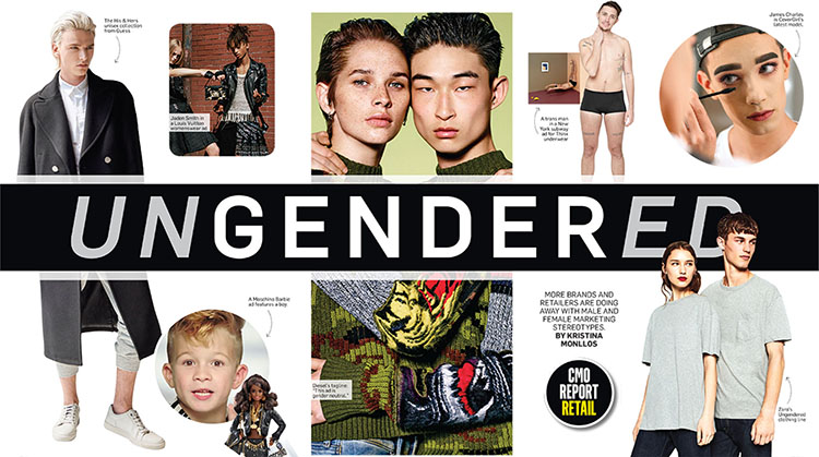
Why is gender ambiguity such important news when studying masculinity and femininity in advertisements? When answering this question, society’s and the advertising industry’s changing understanding of gender is revealed. As Adweek emphasizes, in the new millennium, “we are in the midst of a ‘tectonic shift’” in gender norms that is hard to untangle because more individuals no longer ascribe to clear identifications as male and female, and there are many varieties of masculinity and femininity.3 Summarized aptly by Ruth Bernstein, a New York-based advertiser: “As androgyny and gender fluidity become the norm rather than the exception in today’s cultural landscape, brands are faced with the challenge of tackling gender norms both in their advertising and the products they offer.”[3]

This unit of ADText compares representations of gender in American advertisements from 2016 to advertisements from 2006 The 2006 advertisements were analyzed in a previous version of this unit. Both surveys examine ads in various magazines available at newsstands in May and June of their respective years. Although a summary of the 2006 survey is provided below, the original report (http://muse.jhu.edu.ezproxy.library.tamu.edu/article/202979) should be read to understand how masculinity and femininity have been treated differently and similarly since then.
So why is there now so much concern among advertisers about gender fluidity? What is so challenging about changing definitions of gender beyond the male-female binary? One immediate answer to these questions comes from deeply rooted misunderstandings about the relationship between biological sex and gender identity.
Historically, gender identification has been conceived of as the same as biological sex (i.e. one’s sex organs).6 However, over time, especially from the 1960s to the present, the equation of sex with gender has been challenged by advances in women’s rights, gay rights, and studies of gender and sexuality.7 Among many academic and activist circles, it has become accepted that gender is a socially constructed category that requires serious questioning. From this view, social and cultural institutions—such as family, friends, schools, religion, government, and mass media—have defined the expectations and norms that come with being male or female in a given cultural context.
Further, gender can be seen as a sort of performance that we all make and negotiate within larger cultural and societal norms.8 Many individuals feel like they conform easily to dominant cultural expectations of gender, which are often reinforced in advertising messages, and various forms of media. However, others feel that they do not align with society’s and advertising’s dominant gender expectations, so they may play along with what society expects of them, or they go their own road.
There are four terms related to sex and gender that make it possible to develop richer understandings of advertisements’ messages about masculinity and femininity: gender identity, sexual orientation, biological sex, and gender expression. Gender identity refers to how one sees oneself on a continuum: from woman to man (or an identity in between). Biological sex describes one’s physical sexual anatomy. Gender expression involves how one prefers to present one’s gender: from feminine to masculine, or an expression in between (androgynous). Sexual orientation refers to one’s sexual preferences in a partner: heterosexual (preferring someone of the opposite sex), homosexual (preferring someone of the same sex), bisexual (preferring opposite and same sex partners). A helpful summary of these terms is offered by comedian and activist Sam Killerman in his illustration of “The Genderbread Person.”
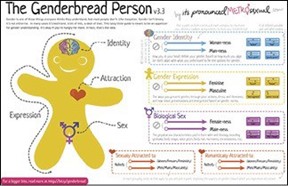
Gender identity, sexual orientation, biological sex, and gender expression are helpful to untangle the virtually infinite complexities of gender and sexual identities. More importantly, these terms help us analyze how advertisers’ messages involve certain meanings and definitions of gender and sexuality that may be overly simplistic, or perhaps progressive and cutting edge. Some advertisements may espouse strict gender binaries, while others may play with gender boundaries which have shifted in recent times.
For this new survey of representations of gender in advertisements, it should be kept in mind that gender is now conceived to go beyond two categories of identity. That is, gender is a multiplicity of identities relative to individuals. As such, age-old gender expectations are being challenged and questioned, which makes it challenging for some, especially those working in advertising, to represent that complexity of our cultural and social lives. How can advertisers successfully appeal to a variety of gender identities, when they may only have one moment to leave an impression on millions of viewers through a thirty-second television spot, a fifteen- second YouTube ad, a one-second Facebook banner ad, a billboard next to a busy highway, or a fashion spread in a magazine? Simplicity and speed are of the essence in our saturated media environment, so how can complex gender identities be treated with such little audience attention span?
To be sure, gender fluidity and the complexities that come with it are especially challenging for advertisers who regularly strive to create certainty in selling products and ideas for their clients.
If there is so much diversity in gender identifications, how can advertisements’ mass-mediated messages effectively resonate with large groups of individuals? Do advertisements solidify certain historically accepted gender norms? Alternatively, do advertisements reflect or fuel changes in gender norms? How have advertisements challenged dominant, binary notions of masculinity and femininity?
As was noted in the 2006 survey, advertising tells important stories about masculinity and femininity and the roles that men and women and boys and girls should play and aspire to at different points in their lives. Gender roles are culturally determined in any particular moment, but this does not mean that what appears at one time does not have relevance or resonance at another point in time. For example, advertisements showing the ideal housewife/mother from the 1940s may express similar ideals as representations of women found in advertisements today, such as the need to take care of the home, and to teach their daughters how to be masters of a clean home, too. In other words, advertisements’ representations of masculinity and femininity can reinforce and legitimate certain gender roles and hierarchies between men and women.
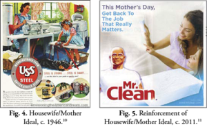
Advertisements’ representations, thus, idealize and model certain roles and behaviors for men and women while ignoring others. What is emphasized in one moment may change or be solidified in the cultural registry. As such, studying changes in advertisements’ representations of gender allow us to see how advertisements may serve as a site of resistance to, or acceptance of, changing views on social and cultural categories like gender.
Therefore, in this unit, by paying close attention to what has changed (and, most importantly, what has not changed) from 2006 to 2016, advertisements’ dual treatment of gender is revealed: advertisements’ representations can solidify and reinforce historic gender norms; they can also shift and adapt society’s understandings and expectations of gender. In the end, advertisements do not merely serve the function of selling products. Rather, their representations can be a site of struggle to hold on to, or let go of, old ways of conceiving of masculinity and femininity.
2. Representations of Masculinity and Femininity in Advertisements from 2006
In the 2006 ADText unit, out of over 1,000 advertisements found in newsstand magazines from May to June 2006, eighty-seven ads were analyzed to uncover how masculinity and femininity emphasized certain gender roles and expectations throughout the human life cycle.
Across many of the ads, boys and men were placed in elevated positions of masculine power and strength compared to girls and women, who were often depicted as passive, submissive participants dependent on, or seeking the approval of, men. It is men who drive the action of a particular scene—such as a dinner night out—or are the center of attention—such as a father holding his baby on his shoulders, while an adoring wife looks on, during a walk outside.
One distinct role for women seen in 2006’s ads, especially for women depicted in their early adult years, was to be objects of desire for men’s viewing or prospective sexual pleasure.

Fig. 9. Woman as Submissive Sex Object.15
Fig. 10. The Ad's Image and Copy Reinforce the Male Faze.16
When women were not something to gaze upon, they often were depicted in the roles of nurturers of children, keepers of order within the home, or cooperative brokers, usually among other girls and women.
In other words, in the sampling from 2006, girls and women were treated with ritualizations of subordination.17 In these rituals, or common practices of representing men and women, advertisements project and reinforce gender hierarchies between men and women through various strategies: making men appear larger than women, putting men at the center of women’s attention, having men stand in more secure positions, using women with large, goofy smiles, and showcasing men actively accomplishing goals, while women were often shown as immobile or passive individuals in a scene. All of these rituals elevate men’s status above women.
Similarly, throughout the life cycle, advertisements’ representations in 2006 tended to prioritize and emphasize boys’ and men’s vigor and accomplishments, while girls and women were often reduced to their more submissive or passive roles—often in interior locations. Even when girls and women were featured in strong positions beyond a caregiver role, such as athletes or businesswomen, their assertiveness was often undermined by their heightened femininity, as seen in their wearing prominent make-up, well-painted fingernails, fashionable clothing, and perfectly coiffed hair.
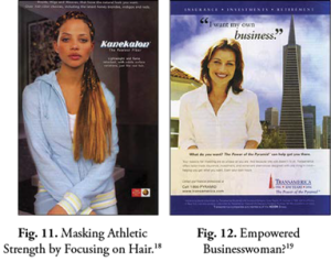
Fig. 12. Empowered Businesswoman?19
In addition to elevating the status of masculinity over femininity, the 2006 advertisements’ representations of parenthood reinforced the importance for both men and women of reproducing clear male-female gender role distinctions in future generations. The term social tableaux—the way in which advertisements depict relationships among people to reinforce certain societal structures—reminds us that advertisements present expected gender roles in society.20 When looking across the 2006 advertisements, one can see representations showcasing fathers teaching their sons traditionally masculine life lessons, such fishing or doing more interesting things than homework.
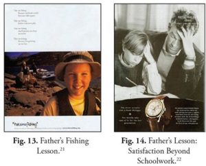
Fig. 14. Father's Lesson: Satisfaction Beyond Schoolwork.22
Similarly, there are representations that emphasize women’s roles as nurturing mothers and caregivers, showcased by representations of a mother teaching her daughter how to be kind and caring through nurturing acts.
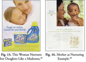
Fig. 16. Mother as Nurturing Example.24
Representations that show fathers giving sons masculine life lessons and mothers giving daughters feminine life lessons function on two significant levels. First, such ads reinforce divided gender roles and expectations along male-female lines, which segregates fathers/sons and mothers/daughters into separate spheres. Second, and more significantly, such messages legitimate ad viewers’ reenactment of separate gender roles in their everyday lives. In other words, ads with gendered life lessons show how fathers and mothers can teach their sons and daughters, respectively, to take on their traditional male and female roles. Such messages, by implication, state that the blurring of gender lines is confusing and troublesome.
Across both men and women, older individuals in the later stages of life were excluded from main newsstand magazines in 2006. If such older men and women were featured, it was often for medications to heal such individuals’ ailments. Men more than women were still shown as active, accomplished, and in control of their lives; older women were relegated to taking care of grandchildren, resting in an interior setting, or being taken care of by her stronger male companion.
Keeping this summary of the 2006 advertisements in mind, along with the Adweek article mentioned previously, an important question emerges: Have ads continued to reinforce gender divisions and a distinct separation of masculinity from femininity? To answer this question, over four dozen ads are analyzed below, from out of over 1,000 ads appearing in major newsstand magazines in May and June 2016.
From this comparison, one will learn that not much has changed in girls’ and women’s subordination. However, there are some notable adjustments in the relaxing of some masculine ideals (perhaps pushing toward more feminine ideals for men), especially for men of the Millennial generation born between roughly 1982 and 2002. Gender’s treatment in advertisements has become slightly more fluid for younger so-called metrosexual men, but much has remained the same in ten years’ time.
3. Advertisements Ten Years Later: Some Changes, But Not So Many
In comparing advertisements from 2006 to 2016, there are some changes, but not as many as Adweek’s “Ungendered” piece would lead one to believe. Although some gender fluidity is seen in many advertisements depicting Millennial metrosexuals, girls and women still are seen enacting rituals of subordination. Hierarchies along gendered lines still persist, leading one to question how far changes have come for breaking from longstanding gender divisions.
In representing the early years of a child’s life, advertisements continue to showcase distinct roles for girls and boys, which is stressed through gender-stereotyped coloring, such as pink for girls and blue for boys. The division between boys and girls through this color scheme reveals more than a simple way to classify and identify girls and boys. Rather, the colors blue and pink provide stability in knowing the sex of a baby. Even before a baby is born, a common question is asked: “Boy or girl?” This question signifies the importance of clearly identifying a newborn’s gender, which leads to the reinforcement of specific expectations for the baby based on his/her being a boy or a girl. Ambiguity in gender can be seen as potentially worrisome.
The following ad for a baby gender prediction kit showcases the desire to know and maintain firm gender boundaries for babies. This ad confuses the difference between biological sex and gender. The name of the product, “IntelliGender,” implies that parents are smart if they know their baby’s exact gender. What is significant to note about this product is that a medical test is being used to determine gender. However, as it has been made clear earlier, gender is an act of culturally-bound self-expression.

The IntelliGender ad also provides a glimpse into societal concerns about knowing a clear gender status of babies. On a basic level, knowing a baby’s biological sex reassures parents of what to buy for the baby—perhaps it will dictate what types of clothes to buy, what color to paint a bedroom wall, and what kinds of toys to purchase. On a deeper level, knowing the baby’s sex helps parents imagine the expectations for the baby, based on culturally and socially subscribed gender roles. In other words, knowing if the baby is either a boy or a girl helps simplify expectations, based on the longstanding divide between males and females.
The product’s assertion that there are only two genders, and the need to label people as either male or female, is strengthened through the ad’s colors. The use of pink for the word “girl” is distinguished from the word “boy” in blue. The black word “or” in “Girl or Boy?” serves to emphasize that distinction. To solidify the importance of gender differences, the father wears a blue shirt while he holds pink baby booties close to the mother. Overall, this advertisement reveals a world where biological sex is expected to match up with gender identity. The colors blue and pink maintain society’s gender binary. The product provides security, relief, and a sense of stability to parents not accepting of gender fluidity.
Even for seemingly gender-neutral products such as a soothing gel for teething babies, or a calming baby formula, blue is coded for boys and pink is coded for girls to create clear gender divisions. Embedded in these representations is the expectation for mothers to care for and tend to their sick children as caregivers. Although there is a father depicted in the Gerber ad, the dominant images for adults soothing the baby girl are women, reinforcing women as central caretakers in a baby’s life.
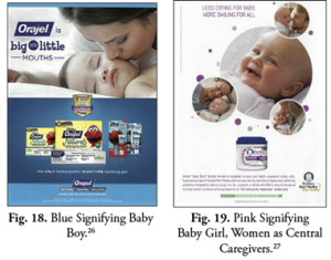
Fig. 19. Pink Signifying Baby Girl, Women as Central Caregivers.27
Although many ads of babies tend to follow the pink and blue convention to distinguish boys from girls, some break the mold by using other colors. In the following Desitin ad, although the baby is designated as a girl through the repeated use of the word “her,” the purple and gray shirt creates some gender ambiguity. In the American context, dark purple and gray may not immediately signify a boy or a girl—such colors could be worn by a boy or a girl. Further, this gendered dissonance is reinforced through the boombox image appearing on the shirt and the color blue dominating the bottom of the advertisement, both of which could be associated with boys. Beyond gender neutrality, the color purple often has lesbian, gay, bisexual, transgendered, or queer (LGBTQ) connotations, as seen in supposedly gay coded children’s characters like the purple Teletubby named Tinky Winky, various LGBTQ organization logos, and Alice Walker’s Pulitzer Prize winning novel The Color Purple, which features a lesbian romance.28 By using a color like purple that is neutral or aligned with LGBTQ identities, advertisers deftly depict babies living in a more gender and sexually flexible society.
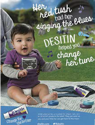
Ads may also use other gender-neutral colors, such as yellow, orange, and green, to break down the pink-blue dichotomy. In such cases, viewers have flexibility in ascribing the gender they see fit depending on their cultural perspective. Advertisements’ increasing play with ambiguous color codes showcases possible appeals to audiences who regard traditional binary gender roles as restrictive and outdated.
In 2006, many ads paired mothers with their children to underscore women’s roles as caretakers for the family. This trend is visible in this new survey of ads, but fathers were increasingly featured in child-rearing and home care roles. A Barilla ad shows how a father can have fun guiding his child on the proper way to eat angel hair pasta. In a Zillow ad, the father is in control of a large children’s party. For TD Ameritrade, a father is in command of his child’s fun. Across all of the ads, though, fathers are the drivers of action and the center of attention. They are goofy providers of fun and laughter who might make a mess and never clean it up. Such a role contrasts sharply to a mother’s serious job of consoling others, cleaning up, or teaching children, usually daughters, lessons on how to keep a beautiful home, as seen earlier in the Mr. Clean ad. Further, even when fathers are depicted in a caretaking role, their strength in other, more traditionally masculine aspects of life are emphasized. In TD Ameritrade’s ad, the father can attend to the house and bring fun to his child. However, as the copy reads, a man’s mastery over his money (and thereby his family’s financial security) is more important than watching over children and a home’s cleanliness: “Get your financial house in order. Your actual house can wait.”

Fig. 22. Goofy Father as Central of Fun and Attention among Children.31
Fig. 23. More Fathers Are Represented in the Home, but Their Strength Still Comes from More Masculine Concerns like Money.32
As seen in the ads from 2006, societal and cultural expectations for girls and boys are reinforced when children reach their adolescent years. The color coding of blue and pink is still often used to distinguish boys from girls, but what is most notable is how boys and girls are separated by what they can and should do. Boys are still often depicted as active and outdoors. They are masters of their destiny and go out into the world exploring and taking risks outside on the playground or playing field.

Girls, on the other hand, are not as active. Girls are regularly featured indoors, cleaning, playing dress-up, cooking, or doing less active hobbies such as reading. From the formative years of a child’s life, then, advertisements represent clear expectations for boys and girls. Boys are told to go out and achieve success outside the home. Conversely, girls are supposed to find their happiness through how they look and what they can achieve in the comforts of home.

Even in instances when boys and girls are featured together outside, boys often take the lead or are the center of attention, revealing the expectation for boys to excel and be the drivers of action and success.
In play spaces, divisions between boys and girls also appear subtly. In a gymnasium scene advertising Lunchables, boys are shown in the most noticeably daring positions—climbing a rope, hanging from a basketball hoop, or pole vaulting across the room. There are girls featured in daring positions, too, but most are tenuous and apprehensive, such as the girl hanging over an exercise ball seeking a boy’s help, and a girl teetering on a tower of equipment. The strength of the girls’ pyramid formation is hidden compared to the boy in the foreground using all of his might to win a game of tug-of-war. From this scene, then, boys are positioned in more prominent positions of strength than their girl peers, solidifying the view of boys as actors in society with girls being apprehensively active. As summarized in a scene with a boy and girl eyeing up a fish tank, girls look on as boys take the adventurous risk of going on “a quest in the deep, blue sea.”
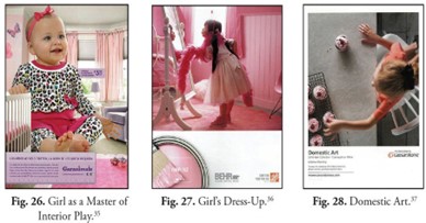
Fig. 27. Girl's Dress-Up.36
Fig. 28. Domestic Art.37
The gender divisions for children in magazine advertisements do not insinuate that there are no challenges to stereotyped images of girls as passive and inactive. In fact, there have been campaigns beyond magazine pages that seek to embolden girls and shift expectations of what it means to be a modern girl. One such effort is Always’ 2014 and 2015 Super Bowl campaign featuring several online videos showcasing stereotyped views of girls, along with messages seeking to quash such visions of girls as unathletic, passive, and docile.
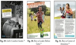
Fig. 30. Boy as Leader Before Girls.39
Fig. 31. Boy as Center of Attention.40
As found in 2006, when girls transition to teenagers and young adults, the ads in this new survey push beyond the seemingly innocuous dichotomy of girls wearing pink tutus and boys playing with toy trucks in blue dungarees. In many advertisements, as girls turn to young women, they are reduced to how they stack up to various standards of beauty and sexuality. Ad messages seek to convince audiences that adhering to such ideals is desirable and necessary for young women compared to other priorities and accomplishments.
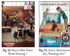
Fig. 33.
Active, Adventurous Boy, Watching Girl.42
Young adult men are featured for their physical attractiveness, too. However, they are often depicted in positions of strength, control, and accomplishment, as seen through their physicality or savviness in work. Further, when depicted with women, men form the center of attention or are the largest people in an image, thereby enhancing the relative size and therefore prestige of men.
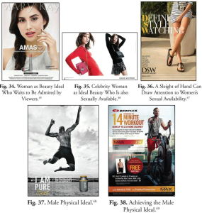
Fig. 35. Celebrity Woman as Ideal Beauty Who Is also Sexually Available.46
Fig. 36. A Sleight of Hand Can Draw Attention to Women's Sexual Availability.47 Fig. 37. Male Physical Ideal.48 Fig. 38. Achieving the Male Physical Ideal.49
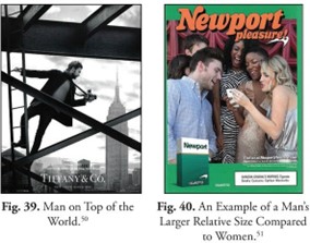
Fig. 40. An Example of a Man's Larger Relative Size Compared to Women.51
Even ten years later, advertisements’ messages about and to women still contradict larger societal messages of feminism and gender equality.52 On the one hand, girls and women are told they can have it all today: a good education, a successful job, and a loving relationship and family. These positive messages for girls and women to achieve their goals are reinforced in many ads, such as one ad for allergy relief, where a successful girls’ soccer team makes the most of its opportunity to succeed. Similarly, in an ad for Travel to Colorado, a woman in a canoe makes the most of the world that is hers to explore. As the copy reads, “Our future has yet to be written.” On one level, the message speaks to the uncharted wilderness of Colorado. However, on a more symbolic level, the ad’s text speaks to today’s women who are at the precipice of writing their own story of success.
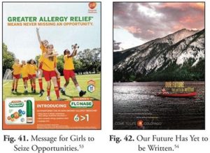
Fig. 42. Our Future Has Yet to be Written.54
On the other hand, many advertisements equate women’s power with their beauty and sexuality, which may undermine messages of gender equality. Women and girls are told that they can be successful through the purchase of beauty products or reenactment of the feminine beauty standards embedded in advertisements’ messages. With such logic, women’s liberation comes through her consuming power and not her intellect or work achievements.
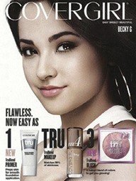
One common way that advertisements try to help women achieve success through beauty products is through recipe, ingredient, or instruction pieces, such as that featured in Covergirl’s advertisement for clear looking skin. The message to girls and women is that they, too, like teen celebrity Becky G., can achieve the “flawless” skin so desired—and expected—for respectable, successful, and noteworthy women. Even more explicit is Murad’s moisturizer ad, which tells women that they can achieve success—a “brighter outlook” and a “beautiful life”—by having bright skin.

Sometimes, ads that seem uplifting for girls and women are subtly counter to such messages. In a Colgate ad encouraging women to “Smile with Strength,” a woman bites down on athletic tape. The word “strength” appears to insinuate that this woman featured in athletic wear is strong, but any notion of strength is challenged by the woman’s wearing a bra-like top, and the message of the ad that women should somehow always be smiling and pleasant. Further, as the concept of the ritualization of subordination reminds us, any power that could come from this athletic woman is absorbed by her use of a clownish smile.57
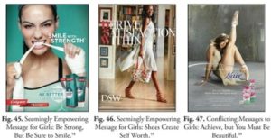
Fig. 46. Seemingly Empowering Message for Girls: Shoes Create Self Worth.59
Fig. 47. Conflicting Messages to Girls: Achieve, but You Must Be Beautiful.60
In another advertisement, for DSW, women are told to “derive satisfaction within,” which insinuates building up one’s innate sense of self. However, closer inspection of the secondary title, it becomes clearer that a woman’s worth and her ability to achieve come through the shoes she buys: “Where will your shoes take you?”
In another ad, for Nair, the explicit message to girls and women is that they can “Free your most beautiful self” through hair-removal cream. However, the ad links women’s freedom with beauty and her necessity to maintain “healthy-looking, radiant skin.” Further, the use of the ballet dancer’s canted head and extended slender legs insinuates that for full enjoyment of freedom, women must adhere to being docile and available. Thus, women’s value comes through their maintenance of their beauty regimen that makes them more attractive and available to others.
Since 2006, there has been a noticeable rise in what has popularly been called the “metrosexual.” This “new man” is a young, urban, and heterosexual male who, ignoring previous, more “macho” ideals for men, is concerned about how his hair looks, what clothes he wears, and how nicely he is groomed.61 Not afraid of being criticized for caring about fashion, his appearance, and his level of taste—once deemed “effeminate” concerns—the metrosexual finds strength and pride in being attractive to others. Like instructional ads for women, magazine ads encourage metrosexuals’ fascinations with achieving the perfectly shaven face or the well- placed untucked shirt.
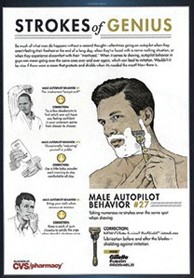

On a continuum of gender identity—with male and female making up extreme poles—the metrosexual, therefore, represents an expansion of what defines traditional masculinity. Rather than masculinity being defined by longstanding images of a man of brute strength and stamina, performing feats through physicality, having rugged and taxing hobbies outdoors, or a successful businessman in professional attire, acceptable notions of masculinity have shifted closer to more traditionally feminine concerns of sharp clothes and a well-groomed body.

The acceptable masculine ideal for men now includes the need to be more concerned about one’s looks and desirability compared to earlier times. This reveals more flexibility afforded to men to express their gender identity. This does not mean that metrosexual masculinities are not challenged among men. Other, more traditional notions of rugged masculinity, such as those found in images of men in the country or woods doing hard work outside, may have an elevated status as being “genuinely” masculine. In other words, there are now more refined and varied notions of masculinity, and there are debates on what is deemed more masculine or manly. In the end, though, men in advertisements are more enabled than they are for women. Women still must adhere to ideal standards of beauty and sexuality that reinforce submissiveness. Men, as seen through the metrosexual, are not submissive objects of desire; they are emboldened and successful through their keeping up with the fashionable times.
This is not to say that unrealistic standards of beauty and sexuality for women are not criticized. One well-known critique is Dove’s 2009 “Evolution” campaign, highlighting the use of digital altering techniques to create unrealistic expectations of beauty and body shape for women. Additionally, critics such as Jean Kilbourne continue to show how objectification of women in advertisements undermines women’s abilities to imagine themselves as anything other than as objects of desire and beauty, or as submissive nurturers.68

Fig. 53. Successfully Suited Man.67
As seen in the earlier survey of ads, men and women in the later stages of life (beyond the “ideal” target demographic of 18–35 year olds) are still often relegated to the periphery in advertising. Today, because of the aging population of Baby Boomers, America has the largest number of older individuals in its history.70 Despite their significant number, older men and women are still not as visible as their younger counterparts in many newsstand magazine advertisements.
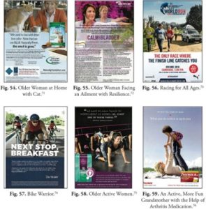
Fig. 55. Older Woman Facing an Ailment with Resilience.72
Fig. 56. Racing for All Ages.73
Fig. 57. Bike Warrior.74
Fig. 58. Older Active Women.75
Fig. 59. An Active, More Fun Grandmother with the Help of Arthritis Medication.76
However, the new survey presents some changes in how older men and women are represented in advertisements. Given longer lifespans and the aging Boomer population’s active lifestyle, older men and women are depicted in more lively situations. Older women and men are still regularly featured in some ads within interior spaces or facing ailments, but many are now shown in more active situations: running races, partaking in a serious bike ride, and doing yoga. Additionally, older women remain associated with watching their grandchildren, but they are more energetic and fun with the enabling enhancements of medication, as Tylenol demonstrates.
Older people are still not sexualized like their younger counterparts, but this does not mean that older people’s sexuality is not a target of discussion, as seen in advertisements for sex-enhancing drugs such as Viagra, or even sex-enhancing devices for older women, such as Estring. Because of older individuals’ relative absence in advertisements, and older men and women having their sexuality and physical beauty striped away, one can see that society prioritizes young adult life as the peak moment of ideal femininity and masculinity.

As noted earlier with the stereotyped images of girls and women, the idealization of youth has also been questioned. One prime example is the “Disrupt Aging” 2016 campaign from AARP, the American Association of Retired Persons. The goal of this campaign was to “celebrate all those who own their age,” and to “feature new ways of living and aging.”78 In one of the campaign’s most prominent spots, AARP seems to follow Always’ lead by showcasing and disrupting stereotypes. In this case, young Millennials are paired up with older individuals to do various physical activities like yoga, dancing, and push-ups; the older folks end up outdoing their younger counterparts, which encourages viewers and the Millennials in the commercial to question their preconceived notions of what it means to be an “old” man or woman. Advertisements like the AARP spot show increasing efforts by brands and other organizations to question dominant definitions of masculinity and femininity and the other identifications that intersect with gender identity: ability, age, ethnicity, race, religion, socioeconomic status, among other identities.
Representations of lesbian, gay, bisexual, transgendered, and queer (LGBTQ) individuals in advertising are more prevalent in the new survey, but most representations from the sampled magazines do not deviate much from major 2006 trends. There are no representations of LGBTQ children. Although there is a diversity of ethnicities and races present, couples are often kept within their ethnic and racial group. Further, when couples are present, gay men and women tend to take on heterosexual roles—with one partner taking on a more dominant “male” role and another taking on a more passive “feminine” role. Gays and lesbians from higher socioeconomic situations are still dominantly represented, too. In other words, advertisements tend to present an idealized vision of gays and lesbians as able-bodied, fit, well-groomed, wealthy, and in heteronormative relationships.

Fig. 62. Well-off Lesbian Couple within Same Racial Group.81
Fig. 63. Reenactment of Heteronormative Roles: Insinuation of Gay Men's Promiscuity.82
Fig. 64. Reenactment of Heteronormative Roles.83
Fig. 65. Able-bodied Gay Ideal.84
5. A Gender-Fluid Future?
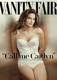
At this unit’s start, it was noted that there may be more gender fluidity today than ever before. The longstanding gender binary of male-female has been challenged on many fronts. In the ten years since the original analysis of magazine ads, there have been changing policies recognizing LGBTQ individuals’ rights in society (i.e. gay marriage), media have increased their representations of transgendered individuals, and famous individuals such as Caitlyn Jenner have come out to share their stories of being transgendered. National Geographic even dedicated an issue to exploring the different expressions of gender around the world.

Today, one’s gender identity does not have to coincide with one’s biological sex. Rather, gender identity may fall along a virtually infinite continuum of gender identifications and expressions. However, there are many people who resist such gender fluid thinking. As such, there is still an unsettled question about whether the diversity of gendered identities can and will be represented in advertisements as society comes to understand and slowly accept more fluid conceptions of gender.
Advertisers, as noted earlier in Adweek’s “Ungendered” piece, are sensitive to changes in how masculinity and femininity are culturally conceived. Yet, as found through this unit’s comparison of advertisements between 2006 and 2016, advertisements’ representations of masculinity and femininity excel in maintaining specific gender roles that have been standard for some time.
In the future, will advertisements’ treatments of gender become more malleable as individuals in society come to slowly understand and accept gender fluidity? Or, will advertisements continue to reinforce more rigid notions of gender expression and identity? The answers to these questions will unfold with time, but we can be certain that advertisements’ representations of gender are not a static or benign force. Advertisements’ representations of masculinity and femininity may hold on to certain historically accepted ideals while breaking and reshaping others. The process is slow with some radical shifts along the way. As citizens and consumers, it is our job to decipher and question advertisements’ ideals of masculinity and femininity and the expectations they place on us and future generations.
Please see the website for additional video examples, author biographies, and footnotes.
Activity: Visual Message Analysis Guide
When students first wrote different versions of this assignment, they usually focused on print advertisements from monthly magazines that they subscribed to or could easily access. The world of advertising and social representation has changed rapidly, though, and you may find yourself in the same position as corporate, governmental, or other institutional marketers who are hoping to represent their companies or organizations in ethical and diverse ways. If you go to Koch Industries, to name one controversial example, you will see how this Wichita-based company is shaping its image for twenty-first century American audiences. On its “Life at Koch” page, which was designed to attract interns and future employees, the webpage designers have included 11 photographs that depict the wide range of diversity – in terms of age, gender, race, and ethnicity – that reflect their ideal employee community. Although critics may be uncomfortable by how this webpage markets Koch Industries’ commitment to the environment and to diversity, it is obvious that Koch has been careful to craft its public image.[4]
Other examples of how corporations, charitable organizations, and politicians use images in interesting ways are the following:
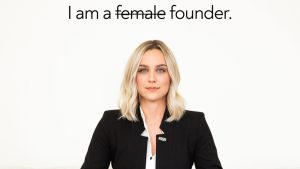
- The CEO and founder of Quilt, Ashley Sumner, was depicted in a widely distributed meme in which she was arguing that she should no longer have to qualify her corporate title with “female” as an adjective.[5]
- Deb Haaland, the first Indigenous person to lead a cabinet-level government agency in the United States, was photographed in “traditional Indigenous dress” during her swearing-in ceremony as Secretary of Interior. Haaland’s clothing choices were intentional, and she stated the following: “Wearing it in this day and age is an act of self empowerment and reclamation of who we are and that gives us the opportunity to proudly make bold statements in front of others who sometimes refuse to see us. It allows us to be our authentic selves unapologetically.”[6] Below, you will find a campaign poster for Deb Haaland, which includes her “Be Fierce” message.

Analyzing the design features of your visual is the first step in working toward your Visual Analysis memo. Note: Remember that you will be analyzing how this visual challenges or complicates traditional gender expectations.
Design Features
All visual messages have to use elements of design to communicate with their audiences. Therefore, to analyze the message, you have to closely study the different features to figure out what they contribute to the overall message. Answer the questions listed below for the design features of layout, people, context, color, and text and images.
Layout
Layout is the overall arrangement of elements and the general use of space in the visual. Placement and size of the features within a visual in relationship to other features can imply meaning about those features. Consider:
- The arrangement of the visual’s elements. Which elements are larger or more dominant? Which elements are smaller or less dominant?
- Is the visual divided into sections? How are the elements arranged within the sections?
- How are elements in the visual framed? Does the visual use empty space? Does the visual use shapes and lines?
- How does the placement of text influence what the audience reads first? What might be meant by emphasizing that information?
- How does the placement of the text relate to the placement of the images? What meaning could be implied by placing the text and images together in this manner?
People
Studying how people are presented in the visual is vital to understanding the message about gender. Consider:
- What kinds of people are in the visual? Describe their age, gender, race, ethnicity, size, able-bodied status, and perceived class.
- How are the people portrayed? Describe their clothing, hair styles, body posture, including which portions of their bodies are shown, their facial expressions, hand gestures, etc.
- What kind of camera angle does the visual use? Are the people in focus, shot from above, shot from below, close up or far away? A low camera angle (where we’re looking up at the subject) suggests that the subject, or feature in the shot, is powerful or high-ranking; a high camera angle suggests that the subject is inferior or low-ranking.
- Does there seem to be a relationship between the people in the visual? Are the people arranged in a way that projects a feeling, such as dominance, superiority, love, or friendship?
- What are the people in the visual looking at? Are they looking at something in the visual or something outside? Are they looking at you, the reader? Are their eyes closed? Can you even see their eyes or faces? What someone looks at and how someone looks at it can create meaning. If the visual does not show someone’s eyes, it can suggest deception or mystery. If you can’t see someone’s face, it can suggest a lack of identity, or even objectification, which is a lack of humanity.
Context
- Context includes the created environment, or set, within the visual. Some visuals may tell a story while others may be a snapshot moment in time. Knowing the context can help you find meaning about the visual message. Consider:
- Where does the visual appear to be set? Consider the time of day, the year or decade, the place (inside, outside, rural, urban, etc.), and the season.
- What kind of story is the visual telling? Can you imagine what might have taken place before or after the picture shown?
- What props are in the visual? Are they new, old, clean, dirty, neat, or disordered? What do these items and their condition suggest?
- What social meaning do we associate with these props? A sports car, for example, means something different than an SUV. What cultural impressions are created by the visual’s props?
- What kinds of people might relate to the story being told? What kinds of people might feel left out?
Color
Color is an important design feature that can catch the audience’s attention while simultaneously conveying meaning. Meaning can be conveyed by using colors with symbolic associations and by using colors that work together to create contrast to emphasize other design features. Consider:
- Is the visual only black and white? What might be the reason for the lack of color?
- Where is the most color used? Where is the least color used? What might be the reason for the difference in use of color?
- Do the colors work to create contrast between light and dark? Our eyes are drawn to stark contrasts first. What might the visual be emphasizing through contrast?
- What kinds of emotions do the colors suggest? For example, red suggests passion or anger. Green can suggest envy. Whose emotions might be associated with these suggestions?
- What associations might someone make with the colors? For example, pink and pastel colors are often associated with girls and are considered feminine; blues and other primary colors are often associated with boys and are considered masculine. What other colors have cultural symbolism?
Text and Images
Text is often used in visual messages to connect the images in the visual with the overall message. This meaning can be created through the literal meaning of the words as well as through the graphic representation of the letters themselves. What the text looks like can convey as much meaning, if not more, as the words themselves. Consider:
- What text is in your visual? Is there any fine print? If your visual doesn’t have any text, what might the lack of text suggest about the visual’s meaning?
- Does the visual have a major headline, or prominent, primary text? How is the headline different from other text in the visual?
- How do the text and the graphics work together with the other features, such as people or color? What does the text literally say through its words?
- Describe the text in terms of font, size, style, and color. What attitude does the text project? Is it serious, silly, scary, or some other attitude?
- What tone does the text use (formal, informal, comic, authoritative, etc.)?
- Are any symbols or logos used? What meaning might they have?
Drafting Activity: Applying Gender to Design Feature Analysis
As the central purpose of this assignment, analyzing gender is a crucial part of your study of each design feature in the Visual Message Analysis Guide. Consider the questions below to help you narrow your analysis to those details of the visual that relate the most to the concept of gender.
- From the notes you have taken above, which features of your chosen visual seem to be gendered? What details from the visual gives you these impressions?
- What elements of the visual seem “feminine”? What elements seem “masculine”? How do you know?
- Do the elements in the visual generally reinforce feminine and masculine stereotypes, or do they complicate them? Which, if any, elements seem to reinforce gender expectations and which, if any, seem to complicate them?
- How does this visual’s message(s) about gender challenge or complicate society’s gender expectations? Which features create the message? How, exactly, do those design features convey that idea about gender?
Activity: Visual Analysis Memo: Making Connections
For this assignment, you are required to use at least one source to support your analysis. You can independently identify an appropriate source and/or you can apply ideas from the readings in the book; appropriate readings from this chapter include “Sex, Gender, and Social Systems” and Timke and O’Barr’s “Representations of Masculinity and Femininity in Advertisements.” To help you find support for your ideas in a source, create a chart like the one below to connect ideas from sources to the gender-specific messages you’ve identified in your visual.
| Gender-Specific Meaning Identified in the Visual | Source Information (include the idea & the location of the idea) | Explain how the source information relates to your visual’s gender message |
|---|---|---|
Drafting Activity: Drafting the Analysis
The above activity should help clarify your ideas about your visual as well as help you draft the body paragraphs of your memo. As you continue to develop your analysis, it’s important to remember that the body paragraphs of your memo will all share the purpose of analyzing the visual. Because they share the same purpose, each body paragraph will need to perform similar functions. Some paragraphs will achieve their purpose with source material, other paragraphs will focus on the visual’s design features, and some might do a mix of both. The different types of information that might be included for analytical body paragraphs are:
- Body Paragraph without Source Info
- Description of a key design feature of the visual
- Explanation for how the design feature communicates a message about gender
- Sentences that directly state the visual’s message about gender
- Body Paragraphs with Source Info
- Description of a key design feature of the visual
- Explanation for how the design feature communicates a message about gender
- Information from a source
- Words/phrases that introduce source information
- Explanation of how the source information relates to the visual
- Sentences that directly state the visual's message about gender
- Description of a key design feature of the visual
To see how these types of information work in a paragraph, let’s look at a student example. Below is paragraph 6 of Sarah Haley’s Visual Analysis of Nike “Thunder Thighs” Ad (the entire memo is included at the end of the chapter). This is an analytical paragraph that includes source information. The color system used in list 2 above correlates with the colored sentences in the paragraph to identify the function of that sentence within the paragraph.
The variation in colors throughout this ad also makes it come together. The image of the woman’s legs is placed in black and white. This is done to draw attention to the advertisement because it is the only object in the frame and has no color. By using black and white it shows the true image and does not cover up or compensate for the muscular legs. It simply shows them and draws the consumer in. The femininity appeal to women is evident by bolding “I have thunder thighs,” in the ad with hot pink. Kim Lynn, an interviewee of MSN’s online article states, “It’s as if they’re [Nike] taking a derogatory statement—and making it not be that” (“Nike” 1–2). By using the “girly” colors that symbolize love and passion with the negatively associated statement, it suggests that women should love their bodies. This is because women are told by society to be passionate, emotional, and loving. Thus, by using colors that embody love, Nike’s message translates to women that they should love their “thunder thighs.” This statement, also, is the only colored text, other than Nike’s slogan, which emphasizes even more the focus of the ad. The other sentences, which are in black, zigzagging across the rest of the ad in smaller font, are important to keep the reader engaged but are not the most important subject of the advertisement. The variation in color separates the Nike ad into sections; however, as I have explained, the image’s black and white color is to express true beauty and the statement in hot pink is to highlight and add to the image.
The sample paragraph includes all the different types of information that might be expected of an analytical paragraph that includes source information, but you can also see that the paragraph includes a large amount of black text. These parts of the paragraph are not directly developing the analysis of the paragraph’s focus (the hot pink text “I have thunder thighs”) nor explaining how the quoted source information helps us understand the gender message conveyed through the pink text. While the sections of the paragraph that are not colored describe design features and even raise interesting points, these sections might serve better in separate paragraphs that analyze color in different ways. For instance, she might develop a paragraph that analyzes the black-and-white images and how they create or contribute to the ad’s gender message; she might also develop another paragraph that analyzes the ad’s black text and how it contributes to the gender message in the ad. By reorganizing information, the writer could develop the analysis of each type of design feature—including the analysis of the pink “I have thunder thighs”—more fully and with a clearer sense of purpose.
Drafting Activity: Body Paragraph Mini-Workshop
Exchange at least two paragraphs from the body of your paper with your partner. At least one of these paragraphs should include source material. First, you and your partner should explain to each other your overall analytical claims about your respective visuals. Then review your partner’s paragraphs and determine which set of questions applies to which paragraphs. Finally, answer the appropriate set of questions below.
For a Paragraph Using Source Material:
- How is the source information relevant to the visual’s message about gender? What work does it do for the writer’s overall claim?
- How might the paragraph introduce, integrate, and/or explain the source more clearly in relationship to the visual’s message about gender?
For a Paragraph Without Source Material:
- How does the specific design feature from the visual challenge or complicate gender expectations? Note that this question isn’t asking what the design features says, but how itsaysit.
- Does the writer include enough information explaining how the design feature challenges or complicates a gender expectation?
Activity: Organizing Your Memo
For this assignment, you are adopting the role of an image analyst for a large media outlet; therefore, you will need to use an appropriate, real-world genre such as a professional memo. When formatting your memo, use appropriate headings and white space in a way that helps the reader to understand the content of the different parts of the memo.
You will probably want to organize your memo into at least three main parts that include:
- An introduction that states your purpose for writing and what you will discuss in the rest of the memo.
- An analysis section that discusses how the features of the visual challenge gender expectations. You will want to divide this section into subsections using headings that coordinate with section content.
- A conclusion that can either restate the main points of your memo, pose new questions that the reader may pursue later, or present a call for action.
- A works cited page.
Remember, too, that each section can have more than one paragraph in it.
Memo Format
Even though the example below is not a model for this assignment’s content, you can use it as a template to structure your memo and give you a sense of what it should look like.
To: Pi Beta Phi Executive Board
From: Annie Bachman
Cc: Deborah Murray
Date: November 20, 2006
Subject: Involvement of Multicultural Greeks
After experiencing my first collegiate homecoming week, a major thing I noticed was the absence of the multicultural Greek organizations in the mix of activities. I find this lack of participation opposite of what K-State strives for—diversity. I have done some research to find out who or what this deficit can be attributed to: communication barriers, event conflicts, and a lack of inclusion of Multicultural Greeks.
Communication Barriers
In my research, I focused most on the fraternities and sororities that are members of the National Pan-Hellenic Council (NPHC) and the National Association of Latino Fraternal Organizations (NALFO) on campus. I sent an email to chapter presidents but got little response until Amanda Ebert, the president of Sigma Lambda Gamma, provided an informative response to my questions.
Along with the insight she provided, her response also implied that the issue in question was an even more sensitive subject than I had thought. She said she would be “surprised if [I] got any response to this email [because] it is worded poorly and comes off as complete ignorance” (Ebert). I reread my first email, and didn’t find anything terribly offensive, but I got the feeling that events in the past gave me an ignorant predisposition in her eyes. Since she and her sorority sisters are a minority group, she probably deals with a lot of ignorance and prejudice from others, which immediately made her doubt my motives for contacting her. She also probably read into my word choice and phrases, making me sound ignorant, despite what I actually said in the email. However, I sent an apology email asking again for more feedback, but to no avail; I only received one more response from Sigma Lambda Beta, the Latino fraternity. So I decided to narrow my focus to the Gammas and their involvement in the Greek system.
The headings at the top of the memo let the reader know who is writing the memo and what the memo is about. Your memo should be addressed to your Supervising Editor. It should also be single spaced.
The introduction of the memo presents your purpose for writing and previews what the rest of the memo will be about. You should make it clear why your audience should care about this topic.
Headings are often used in the body of a memo to help the reader see how the information is organized. Use bold font to make the headings stand out. Notice that the introduction does not have a heading.
Citing Sources
Using citations correctly is a way to show your audience that you have used credible sources of information in your memo. This credibility is especially important when you are writing in a professional situation, such as the scenario created for this assignment. Use the guidelines below to present your memo in a credible and professional way to the reader.
Works Cited Page
When you cite a source from your textbook, you are citing information that has been reprinted. The authors of (Re)Writing Communities and Identities found essays that had been previously printed in books, journals, or on Internet sites and received permission to reprint them.
Therefore, you must include information about the original place of publication as well as this textbook when writing your citations. The first part of the citation will depend on the type of source (e.g., book, magazine, or journal). The second part of the citation will always be the same for each entry (except for the specific page numbers) because it’s the citation for (Re)Writing Communities and Identities. For example, the citation for the Timke and O’Barr’s article would start with the information about the publication it appeared in. This information would be followed by the abbreviation “Rpt.” for reprint and then the information about (Re)Writing Communities and Identities. The complete citation for the Timke and O’Barr article is given below:
Timke, Edward, and William M. O’Barr. “Representations of Masculinity and Femininity in Advertising.” Advertising & Society Review, vol. 17, no. 3, 2017. Rpt. in (Re)Writing Communities and Identities, edited by Phillip P. Marzluf et al., 6th ed., New Prairie Press, 2021, pp. 31-54.
If you use a source that isn’t from the textbook, use the guidelines from the Handbook at the end of the book.
In-text Citation
When you incorporate source material, it should never have to stand on its own. Note the attributive tags/introductory phrases (“According to . . .”) used in the sample paper. Also, be sure to use parenthetical citations, when needed, after any quotations or paraphrases you use. You will use the textbook page numbers for your in-text citation, as in the student example. See Chapter 7 for more information about parenthetical citation.
Activity: Visual Analysis Full Draft Workshop Guide
- Read the writer’s memo and examine their chosen visual. What design features does the writer analyze? Do you think these are the most important design features in terms of challenging or complicating gender expectations? Why or why not?
- What is the writer’s main analytical point in the memo? Underline this sentence or sentences. If no main point is stated, try to write the main point in your own words.
- Remember that the most important part of this analysis is to explain how the design features work together to create a message that challenges or complicates common gender expectations. Does the writer explain, using the readings and their own analysis, how the visual challenges or complicates social expectations of gender? Where does that happen in the draft? Put a check mark by the strongest passage of analysis and put [brackets] around a passage that needs more explanation. Write down questions that the writer still needs to answer.
- Does the draft meet the bulleted objectives? Look at the Assignment Guidelines at the beginning of this unit and number each objective. For each objective, rate the memo’s effectiveness in meeting that criterion 1–5 (5 as excellent, 1 as poor). For any 1, 2, or 3 you give, offer suggestions to the writer for how to improve the memo to meet the objective.
Student Examples
Visual Analysis of Nike “Thunder Thighs” Ad
Sarah Haley
Sarah Haley wrote this visual analysis in Alison Schufelt’s Expos I class.
To: Supervising Editor
From: Sarah Haley
Cc: Alison Schufelt
Date: September 12, 2011
Subject: Visual Analysis of Nike “Thunder Thighs” Ad
I, like millions of other Americans, can instantly recognize that this simple yet profound statement is the famous slogan used by the multi-billion-dollar Nike Corporation. It is found on billboards, their apparel, in magazines, commercials, and numerous other media. Nike is known not only in the United States, but throughout the world, for their inventive and top of the line athletic merchandise/equipment to improve performance. Being a passionate and dedicated runner myself, I too have bought into Nike’s persuasive slogan that inspires me to “just do it.” Therefore, when I was preparing to purchase some new running shorts for my marathon training, I looked only to Nike to provide the best attire. When doing so, I found a new women’s ad campaign for Nike that reaped the very words I have always told myself while looking troublesomely into the mirror. “I have thunder thighs.” I hated my muscular, toned, and built thighs for years because of how big they were, but there those familiar words read on the Nike Women’s advertisement affirming the statement I hated admitting.
I asked myself, “Could my biggest flaw really be seen by millions in an advertisement around the world?” Nike was making a vivid point that toned women were beautiful, which I was always told in high school was not an idealistic trait of beauty. Therefore, I chose the Nike Women’s ad that states, “I have thunder thighs” to illustrate the various aspects that made many other women and me realize that our bodies deserve compliments. The layout, color, text, and images all demonstrate Nike’s unique message to women.
Layout and Color Variation
The layout and the color used in the Nike’s Women ad are individually important yet share an interesting relationship that causes this ad to stand out. First, the layout is based upon the main image of the muscular, toned legs of a woman in the left of the advertisement. The image is enlarged to draw attention to her first and is also in black and white. Second, the initial statement that reads, “I have thunder thighs,” is bolded and colored hot pink with the rest of the advertisement having sentences that are zigzagging across the right in black. The statement is describing the image but creating its own attention all at once.
The layout of the image and the text is designed so that attention is instantly gained by the consumer by invoking a sense of the common ground. Many women know or can associate with “thunder thighs,” and, therefore, feel connected to the image and its bold affirming statement. The reason Nike does this is because they are going against what the body image of women is portrayed in society. Instead of showing a picture of a woman’s legs in pretty high heels, Nike shows in their ad a muscular toned woman. Therefore, the black and white enlarged image and bolded and centered statement is designed to coincide with one another.
The variation in colors throughout this ad also makes it come together. The image of the woman’s legs is placed in black and white. This is done to draw attention to the advertisement because it is the only object in the frame and has no color. By using black and white it shows the true image and does not cover up or compensate for the muscular legs. It simply shows them and draws the consumer in. The femininity appeal to women is evident by bolding “I have thunder thighs,” in the ad with hot pink. Kim Lynn, an interviewee of MSN’s online article states, “It’s as if they’re [Nike] taking a derogatory statement—and making it not be that” (“Nike” 1–2). By using the “girly” colors that symbolize love and passion with the negatively associated statement, it suggests that women should love their bodies. This is because women are told by society to be passionate, emotional, and loving. Thus, by using colors that embody love, Nike’s message translates to women that they should love their “thunder thighs.” This statement, also, is the only colored text, other than Nike’s slogan, which emphasizes even more the focus of the ad. The other sentences, which are in black, zigzagging across the rest of the ad in smaller font, are important to keep the reader engaged but are not the most important subject of the advertisement. The variation in color separates the Nike ad into sections; however, as I have explained, the image’s black and white color is to express true beauty and the statement in hot pink is to highlight and add to the image.
The Words Create the Image
As I have continuously expressed, the Nike ad wants women to accept their active and toned bodies for what they are, perfect. However, the other words in this ad also define the image and its message even more.
The words that zigzag across the advertisement read as follows, “I have thunder thighs. And that’s a compliment because they are strong, and toned, and muscular, and though they are unwelcome in the petite section. They are cheered on in marathons. Fifty years from now I’ll bounce a grandchild on my thunder thighs and then I’ll go out for a run.”
Now doesn’t that sound like something to be proud of? I cannot think of a better way to accept a body image and numerous other women had the same response to this advertisement. Nike promotes a healthy body image, which is opposite of what women are told by society. They do this because they want women to be proud of what their body is and not feel forced to conform to a petite, slender size that is promoted in the media industry. According to the MSNBC online article, random women were surveyed in Portland, Oregon, and they reported that the words in this advertisement did not suggest a fat woman, but a healthy woman. They could recognize and relate to not only the image, but to all of the words included in the Nike ad (“Nike” 1–2). Nike must be doing something right if they can allow a majority of women to agree on a body image and a motivating and inspiring one at that.
Conclusion
The Nike Women’s Advertisement Campaign that features the “I have thunder thighs” ad truly does empower women to accept their bodies as seen through analysis of their targeted audience, layout and color, and text and image. The clear message that Nike is declaring is body image acceptance, which speaks much farther than my initial need for new running apparel. It made myself realize that I no longer should cover up my own “thunder thighs,” but let them compliment my body like other women have embraced from seeing this advertisement. Who knew that true beauty could lie within muscular, bulky thighs?
Works Cited
Brennan, Christine. “In Nike Ad Campaign, Big Isn’t Just Better, It’s Celebrated.” USA- TODAY.com, Sports, 18 August 2015. USA TODAY, usatoday30.usatoday.com/sports/columnist/brennan/2005-08-18-brennan_x.htm.
“Nike Jumps on ‘Real Women’ Bandwagon.” U.S. Business on NBC NEWS.com, 18 August 2005.
NBC News, www.nbcnews.com/id/8998863/ns/business-us_business/t/nike-jumps-real- women-bandwagon/#.WV_cWdPyvGI.
Visual Analysis of “This Girl Can” Ad
Ashley Griffin
Ashley Griffin wrote this visual analysis in Cailin Roles’s Expos 1 class. Though Griffin writes about a British advertisement, you will be able to determine how her visual analysis strategies can be useful for an advertisement in the United States.
To: Supervising Editor
From: Ashley Griffin
Cc: Cailin Roles
Date: September 18, 2018
Subject: Visual Analysis of “This Girl Can”
For an ad in the 1950s, it was commonplace for a woman to be put in an entirely lower place than a man. The ads told women their only job was to clean and look pretty for their husbands. Today, ads aren’t nearly as blatant in their message. However, women are still being subjected to demeaning representation in advertisements. While ads aren’t as upright in the harmful messages, many have the same common theme as they did in the 1950s: look good and do what the man wants. Some ads, however, go against this message, and tell women to be strong and unique. These messages can be hard to find, but when they are apparent, they help to uplift women, instead of putting them down. One such ad is from the “This Girl Can” ad campaign, sponsored by the National Lottery.
Description
The ads in the “This Girl Can” campaign focus on empowering women, particularly older women, and encouraging them to get involved in physical activity. In this ad, there is a middle-aged Black British woman slightly to the right of the center of the image. She is weightlifting with her legs in the ad. She is wearing a look of a determination, and there is sweat on her face. She is wearing mainly gray clothing, with accents of blue, green, and yellow. The background behind her is mainly a bright yellow, with a patch of black near the top. In the center of the ad are the words: “This Girl Can” and then, in bigger font, “Girl. Power.”
Target Audience
This ad seeks to encourage women, especially middle-aged to elderly women, to become more active physically and take charge of their own health. The focus of the ad is a middle-aged woman clearly pushing herself with weights. Her age is very atypical of an ad: usually, ads targeting women won’t choose women that are past their twenties. In fact, many things about her in this ad aren’t usual for a woman’s exercising ad: her clothes, her activity, and her race, for example. She has a look of determination and she’s sweating. She looks powerful and healthy. It sends the message to women that it is possible to do anything they set their minds to and to take control of their own strength.
People
The only person shown in the ad is a middle-aged Black British woman, clearly working hard at exercising, leaning back on a machine, and pushing weights up with her legs. There’s a light sheen of sweat on her forehead. She’s wearing a T-shirt and some leggings, which are not brightly colored or patterned. She’s not particularly thin, but looks healthy. She’s not conventionally beautiful, but still looks very good. This image deviates from the models usually chosen for ads. Women in ads are usually extremely attractive and very thin. Their clothes usually show quite a bit of their skin, and they are posed in a way that emphasizes that. Even in ads for the exercise industry, the model’s hair and makeup is typically flawless and there is not a drop of sweat on her. However, in the “This Girl Can” ad, the woman is very obviously pushing herself, as shown by her fierce look of determination and the sweat on her face. She’s not posed in any sexual way, but instead is focused on the weightlifting.
The woman in the ad is not smiling. She isn’t making an effort to appear attractive: she’s focusing on her task at hand, the weights. Women are rarely portrayed this way. Since society wants women to be pleasing, they are typically shown in ads as very welcoming, happy, and bubbly. This ad, however, twists that stereotype. It’s showing that another’s opinion doesn’t matter and that a woman can take control over her own body.
Her age is also very unusual for an ad. With the stereotype that women need to be attractive and pleasing to men, younger, more fit girls are typically chosen to model. However, this ad chose a middle-aged woman. Society doesn’t really think of older woman as strong too, but this ad is clearly showing her power, regardless of age.
The model’s race stands out as well. Typically, models with lighter or white skin tones are chosen, because these skin colors are represented as more beautiful in Western society. However, this model is a Black British model with a darker skin tone. The ad is showing her as just as powerful as anyone else, regardless of gender, race, age, or appearance.
Color
Most of the background of the ad is a bright yellow. There’s a patch of black shown in the upper left corner. The women’s clothes are mainly gray, with accents of green, blue, and yellow. This color scheme is extremely different from the typical woman’s ad. Most ads with women are filled with colors that are typically associated with femininity, like pink and purple. As stated by Edward Tinke and William O’Barr, colors such as pink, which is generally associated with femininity, draw a clear line between the sexes, and show the expectations for women to be docile caregivers, instead of strong and independent. These colors showcase a softness, and seem to imply a weakness. However, in the “This Girl Can” advertisement, yellow is the main focus. Yellow is associated with energy, enthusiasm, and increased muscle energy. There are also the accent colors of her clothes. Blue is considered beneficial to mind and body, while green symbolizes growth. All of these colors tell a story of growth, power, and strength, instead of softness and submission, which is what is usually expected of an ad targeting women.
Text
The text in the ad is very simple. In the middle of the left-hand side, small in enclosed in a square, are the words “This Girl Can.” Then, bigger and running across the center of the ad, are the words “Girl. Power.” These words differ largely from the text usually found in an ad for women. Even in an ad promoting physical activity, women’s ads usually have words that make one think of gracefulness, softness, and things of that nature. Words like power are rarely used. However, even in such few words, this ad makes the impression that a woman can actually be strong and powerful, and do whatever she sets her mind to, without the need of being softer or weaker.
The font of the ad also differs strongly from what is normally used for women. Usually, fonts in women’s ads are cursive, flowy, and pretty. These, just like the text typically use, imply a softness and quietness, which is what is typically expected of women. However, the font used in the “This Girl Can” ad is plain and simple. It doesn’t have any pretty curves or cute little “quirks.” It’s not saying women should be flowy and pretty, which is typically expected. It’s letting them be a normal human being.
Layout
The layout of the ad is very simple. There is the single woman in the ad, weightlifting, and only the one line of text. The focus is less on how pretty the ad can be and how many graphics can fit on the image, and more on the overall message of strength and empowerment. Usually in women’s ads, there is a lot of clutter. The words are all over the place; there are graphics stuck to it, and things are made very pretty and cute. This is how the “This Girl Can” advertisement challenges the stereotype of a woman in the way it’s laid out: it focuses on the actual message of the ad instead of drawing the eye with how pretty it is. It doesn’t assume women will be distracted by pretty pictures and want to buy their product because of some nice graphics. Ads that do assume these things seem to convey that women are scatterbrained, and easily pleased with “pretty toys.” However, the “This Girl Can” campaign accepts the power of women and made the ad simple to convey that a woman can be just as strong, instead of needing to be soft and pretty.
Conclusion
This “girl power” ad focuses strongly on empowering woman to feel strong and accomplished. The choice of model helps empower women who rarely get a chance to feel so: middle-aged to elderly women, women of color, and women who are not today’s ideal beauty standard. The ad also uses color, word choice, and fonts that are typically used in ads targeted towards men, instead of choosing ones that are typically associated with softness, as another means to help women feel strong and confident. The layout also serves this purpose by deviating from how women’s ads are typically arranged. Each element turns to strengthening women, instead of forcing ideals on them like most modern advertisements. The media needs to incorporate more messages like this in today’s world.
Works Cited
Timke, Edward and William M. O’Barr. “Representations of Masculinity and Femininity in Advertisements.” Advertising & Society Quarterly, vol. 17, no. 3, 2017. Project Muse, http://muse.jhu.edu/article/202979. Rpt. in (Re)Writing Communities and Identities, edited by Phillip P. Marzluf, et al, 4th ed., Fountain Head Press, 2018, pp. 69-90.
“Weightlifting.” This Girl Can, http://www.thisgirlcan.co.uk/activities/weightlifting/
Visual Analysis of Disney Pixar’s Brave Movie Poster
Sophie Swearingen
Sophie Swearingen wrote this visual analysis in Maggie Cody’s ENGL 100 class.
To: Supervising Editor
From: Sophie Swearingen
Cc: Maggie Cody
Date: February 6, 2020
Subject: “Brave” Enough to Challenge Traditional Gender Stereotypes
Since the late 1930s, Walt Disney Studios has created a name for itself as being the primary provider of princess movies, such as Snow White and the Seven Dwarfs, Cinderella, and Sleeping Beauty. In these earlier films, the portrayal of princesses complied with what society considered to be respectable for women living during that—everything that a “perfect lady” should be. The designs of classical Disney Princess advertisements commonly depicted the main female character, perfectly groomed and dressed to the nines, positioned alongside a supporting male character—who, in many cases, played the role of the love interest of the princess. In these advertisements, similar to that of the original Cinderella movie, the princess would be shown gazing with a look of fulfilled contentment into the eyes of her “True Love”— almost as if to say that she would never have been sincerely happy with her life if the two had never met.
In this advertisement for the Disney Pixar movie Brave, the depiction of the main character, Merida, goes against the customary depiction of a princess, and ultimately challenges the expectations of females in advertisements as a whole. Through the analysis of the various people, the overall layout, and the context present within the visual, the viewer is able to decipher the overall message of the advertisement.
Intended Audience
As an advertisement for a princess movie—and a Disney Princess movie, nonetheless—this visual for Brave is predisposed to attract the eyes of a young, female audience. Unlike previous Disney Princess advertisements—which were marketing in order to captivate the “girly-girls” of their target demographic—the “naturalness” and visible athleticism of the princess in this image appeals to the “tomboy” of their female audience. Rather than catering to what is traditionally expected from a Disney Princess, this advertisement presents a unconventional princess to the unconventional girl.
People
One of the predominant design features of this advertisement is the people that are within the visual. At first glance, the viewer is drawn to the prominent adolescent female in the foreground. According to Timke and O’Barr, this diverges from the usual depiction of females in advertisements, who “… are typically pictured as less active and more concerned with their physical appearance and beauty” (75). This female, however, is pictured with wild and unruly hair, similar to that of the males in the background of the visual. Her simple, navy blue dress— that appears to have a large tear at the elbow—also conveys that physical appearance is not something of great importance to her. She is also positioned in a very athletic stance, bearing a bow and arrow in her hands, with a very serious and focused expression upon her face, conveying a message of power, strength, and athleticism—traits more commonly associated with masculine images, according to Timke and O’Barr (68).
While the depiction of the teenage female undoubtedly challenges typical gender expectations in advertising, the other people featured in the background of the visual act in accordance with these stereotypes. “When men are depicted in paternal roles,” Timke and O’Barr state, “they often appear as adult playmates,” such as the adult male that is present in this visual (85).
Additionally, the males in this advertisement do not seem to be concerned with their physical presentation—as demonstrated by their wild and unkempt hair—and are also carrying weapons, which are most commonly associated with masculinity. This depiction of the men, though supporting traditional gender expectations for males, helps to support the argument that the similar presentation of the adolescent female indicates a diversion from the stereotypical female representation in advertising.
Layout
Another element of design that challenges gender expectations is the overall layout of the advertisement. The first thing that is noticeable in this visual is the size of the girl in the foreground. Because she is so prominent, the advertisement gives her a sort of dominance over the other featured characters in the visual, a trait that is most commonly associated with masculinity (Timke and O’Barr 68). Without the teenager present, the advertisement would once again support traditional gender representations. The large stature of the adult male gives him a superiority over the other characters in the background and appears to be their protector—an appearance commonly accredited to males in advertisements. However, by positioning the girl in front of the other characters, and by including the title of the movie, Brave, in front of the girl, the visual leads the viewer to assume that she is, in fact, the brave protector of the family, and not the adult male. In this way, the creators of this movie poster are trying to communicate to the viewer that all females, regardless of age, are capable of being brave and standing their ground.
Context
The final design features of the advertisement that gives a significant insight to how it challenges gender expectations are the props that present within the visual. The presence of weapons in the hands of the adolescent female poses as a challenge for stereotypical portrayals of females in advertisements. Weapons are generally used as representations of war, death, and fighting—such concepts that are not ordinarily associated with women, let alone with young women.
Furthermore, the weapon in the hands of the young female is a bow and arrow—a weapon that requires much more skill to use properly than it takes to use the swords present alongside the males. Not only does the presence of the bow and arrow in the girl’s hands signify that she ha some athletic ability, and is therefore not like other Disney Princesses, but it also indicates that she must be very dedicated to practicing and without a doubt knows how to use it.
Conclusion
Though the movie poster for the Disney Pixar’s movie Brave includes aspects that coincide with gender expectations in advertising, its ultimate effect poses as a challenge for the representations of femininity in the media. By analyzing the different design features, it is apparent that had the visual been devoid of the presence of the young female in the foreground, bearing a weapon that requires skillful operation, in such a dominating stance in comparison to the supporting characters featured, the overall impact of the advertisement would be lost—that to be a princess does not mean that you cannot be tough.
Work Cited
O’Barr, William M. “Representations of Masculinity and Femininity in Advertisements.” Advertising & Society Review. 7.2 (2006). Web 20 Feb 2014. Rpt. In (Re) Writing Communities and Identities. Ed. Cynthia Debes et al. Southlake, TX: Fountainhead Press, 2014, pp. 68-92.
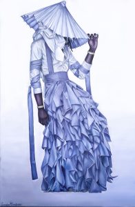
Visual Analysis of Young Thug’s Jeffery Cover
Taryn Lubbers
Taryn Lubbers wrote this visual analysis in Hunter Scott’s Expos 1 class.
To: Supervising Editor
From: Taryn Lubbers
Cc: Hunter Scott
Date: February 16, 2021
Subject: Gender Analysis of Jeffrey Album
The 2016 album Jeffery by Young Thug has a very unique cover that sent shockwaves through the rap community, which was the targeted audience of the album and the cover. The reason the album cover was so staggering, especially in the rap culture, is because of the social gender expectations that were being challenged by Young Thug. He wore a traditional feminine outfit and incorporated many other feminine aspects into the album cover. It is highly unlikely to see a man dressed like this and even more unlikely to see a rapper dressed like this. A lot of his listeners are men who are very much in line with their masculine side which means this cover would most likely not resonate with them. But Young Thug completely abandons the typical male stereotype when it comes to his outfit and does not care what anyone else thinks about him. Men are supposed to adhere only to the traits of masculinity which make them strong and dominant but Young Thug throws out these gender norms and replaces them with his own set of values. He risked his career in order to get his message across and show that men can have a feminine side as well. Through the use of people, colors, and context, Young Thug was able to complicate the traditional standards for masculinity in order to educate his listeners about this gender stereotype. This social construct is challenged by Young Thug posing statically, choosing a contradictory color and a gender-neutral color, and using designer Alessandro Trincone.
People
One key design feature in the album cover is Young Thug himself and this is because he happens to be the only person in the picture. He is a 29-year-old African American man who is married with six kids. But two of the most important things to notice about him are his posture and his gaze. His posture is slightly leaned back and his gaze is at the ground. In an essay titled “Representations of Masculinity and Femininity in Advertisements,” Timke and William O’Barr point out that “boys and men were placed in elevated positions of masculine power and strength compared to girls and women, who were often depicted as passive, submissive participant” (Timke and O’Barr). His posture being leaned back and his gaze being down at the ground are usually postures of women. Women are meant to be shown as amenable and demure whereas men are meant to be shown as big and strong. Young Thug’s leaned back posture makes him shorter and gives the appearance that he is taking up less space. His gaze downwards also suggests submissiveness which is inherently thought of as feminine. Young Thug is portraying through his posture and gaze that men do not always have to show aspects of strength and dominance for them to be considered successful and masculine.
By analyzing the picture more we can see that Young Thug’s positioning also has a story to tell. And that story is that there really is no story being told by the picture. His static position and the lack of context clues in the picture leaves no room for the audience to imagine that there is any activity going on in the image besides standing. Other than his one arm raised, there is no movement in the picture. His other arm is limp at his side and it is easy to tell that there is very little, if any, movement at all in the picture. The background is also very plain with no other images which leaves no context clues to suggest that he is actively doing something. Men are almost always pictured being active or doing something important while most women are depicted as still and not doing much. Timke and O’Barr write that the media is often “showcasing men actively accomplishing goals, while women were often shown as immobile or passive individuals in a scene” (Timke and O’Barr). By choosing a static pose for his album cover, Young Thug is sending the message that men can be accomplishing goals while at the same time not fitting into the normative gender constructions that men must be active to accomplish such things.
Color
Another important element present in the picture is color. This image is unique because it only has two main colors that dominate the entire picture. The first and most noticeable color present is blue. While young thug’s outfit seems to be more feminine than masculine, it is also the color blue which is most often associated with the male gender. However, the dress is a light blue which is much softer than a darker blue. This light blue also seems to have some hints of lavender which adds another layer of meaning as well. Even though blue is seen as masculine, lavender is more closely associated with beauty and femininity. So the color seems to almost contradict itself because overall it is a masculine color but it does have a very strong sense of femininity lying beneath. This color perfectly embodies Young Thug and his message that it is completely normal for men to have a feminine side to them.
The second major color in the album cover is white. The top part of Young Thug’s outfit is white as well as a majority of the background. In a technical sense, white is not actually a color but is described as the absence of color. The absence of color can easily be seen as symbolizing the absence of gender lines and stereotypes. The background of the picture is blue at the bottom and slowly fades to white. This can be seen as Young Thug wanting to symbolize the fact that he is blurring these gender lines. The blue fading to white is showing the transition from a society that enforces stereotypical gender constructs to a society where everyone is allowed to express themselves and express their gender however they want. Young Thug is expressing that we have made a lot of progress in the right direction but that we still have a long way to go and that is why he is using his album cover to bring attention to it. The choice to use a color that contradicts itself and another color that has no gender associations at all and then show a clear color gradient between the two, continues the overall theme of the image that men can possess both masculine and feminine attributes.
Context
The outfit that Young Thug wears is quite recognizably the focal point of the image which means that it is the element that challenges the masculine stereotype the most. He is wearing what most people consider to be a feminine outfit: a dress. It is a very elaborate piece of clothing that is made even more feminine by the presence of ruffles and a high waist. The piece was designed in 2016 by Alessandro Trincone and was a part of his “Annodami” collection.
When describing his “Annodami” collection, Trincone said, “The emphasis on the waist expresses my idea of protection, redefining tightness as a synonym of strength. The androgynous identity of my inspirational garments reinforces my belief of no-gender boundaries between men and women” (Trincone). The high waist on the dress completely redefines the masculine stereotype of what it means to be strong. Society tells men that in order to be strong they must be physically capable by being able to move or lift heavy things. Trincone takes this idea of masculine strength and gives it a new meaning by symbolizing strength through a high waist, which is considered feminine. The fact that Young Thug chose this designer and a piece specifically from this collection speaks volumes. He chose a designer who unabashedly designs and promotes androgynous clothes because he wanted to amplify his voice and his message that society’s traditional thoughts about masculinity need to be reevaluated. In this way he is able to complicate the gender norm that only females are allowed to wear dresses and other clothes considered feminine.
Conclusion
In summary, Young Thug is able to use his album cover for Jeffery to break down society’s stereotypes about masculinity. He uses himself, the colors in the image, and the context of the designer to help get his message across. There were several photos taken of Young Thug in the outfit during the photo shoot but he chose the image where he was positioned in a demure and traditionally feminine way. He also chose two very interesting colors to dominate the picture, blue and white. The presence of both colors together and the gradient between them shows the transitioning of society from a restrictive one to a more gender fluid one. And the boldest decision Young Thug makes in regards to his album cover is choosing Alessandro Trincone as his designer. Trincone is a well-known designer who specializes in making androgynous clothes.
Choosing a piece from one of Trincone’s collections emphasizes that Young Thug is trying to battle against gender norms. Young Thug was able to produce an incredible image and use it to represent his album while also educating his listeners and the rest of the rap community about the normalization of femininity in men.
Works Cited
Timke, Edward and William M. O’Barr. “Representations of Masculinity and Femininity in Advertising.” Advertising & Society Review, vol. 17, no. 3, 2017. Rpt. in (Re)Writing Communities and Identities, edited by Phillip P. Marzluf et al., Fountainhead Press, 2018, pp. 69-90.
Trincone, Alessandro. “Annodami.” Alessandro Trincone, 2020, https://www.alessandrotrincone.com/annodami-ss-2017/#. Accessed 16 February 2021.
- “Media Literacy Defined.” NAMLE, National Association for Media Literacy Education, 4 April 2014, namle.net/publications/media-literacy-definitions/. ↵
- Teich, Nicholas M. Transgender 101: A Simple Guide to a Complex Issue. Columbia UP, 2012. ↵
- Originally published in Advertising & Society Review, vol. 17, no. 3, 2017. Project Muse, muse.jhu.edu/article/648423. Reprinted from ADText (www.adtextonline.org) which is a publication of the Advertising Educational Foundation (www.aef.com). Used with permission. ↵
- “Life at Koch.” Koch. https://jobs.kochcareers.com/pages/culture. ↵
- Rosman, Katherin. “She Wants to Kill the Girl Boss.” New York Times, 24 March 2021. https://www.nytimes.com/2021/03/24/style/linked-in-ashley-sumner-female-bosses.html. ↵
- Friedman, Vanessa. “Deb Haaland Makes History, and Dresses for It.” New York Times, 19 March 2021. https://www.nytimes.com/2021/03/19/style/deb-haaland-history-native-dress.html. ↵

